
The current technical landscape is completely different from what it was this time last year. As the software development industry is busy evolving its understanding of automating early and often in the presence of new AI capabilities, we have been focused on feature work. However, it's equally important to make sure we are adapting our UI to match up to the experience and addressing, where necessary, the misalignment between the two.
In a scaling product, where issues are competing to be prioritized, it might feel convenient to tackle the next feature issue as opposed to focusing on small visual design improvements. Advocating for the value that a small visual design change in isolation brings to the product is never easy for all the practical reasons, and this is where the "Beautifying our UI" initiative becomes useful at GitLab. It allows a product designer and a frontend engineer to voluntarily pair up, like we did, and make self-directed improvements to the usability of GitLab.
We collaborated on many pipeline-related features in the past three years. As our responsibilities pulled us in different directions, we had to put many of our aspirational plans for improving the presentation of CI/CD features in GitLab on hold in favor of other more important things.
However, once those were addressed, we decided to volunteer for a session of Beautifying our UI in the 16.1 milestone. To make the most of a single milestone, we began preparing a couple months in advance, soliciting ideas from team members and getting the design proposals ready in an issue. After a quick prioritization exercise to understand which of the suggested improvements would be most meaningful to our users, we made a number of contributions to the product.
Here are some of those contributions:
Improvement to pipeline detail page
In the process of troubleshooting a failing pipeline, users often have to visit their detail page for better insight into what's causing the failure. The top of the page previously had a table with all the metadata around that pipeline. Over the years, a lot of information was added to this table but the layout was never optimized to accommodate that information, which in return impacted the usability of the page. The page headers were also very different from other examples found in GitLab.
By critically looking at every piece of information displayed on the page, we made informed decisions using the qualitative insights and the usage data at hand to completely redesign the pipeline header.
 Before
 After
After
This work was substantial and while we did our best to avoid any negative impact to our users, we realize there might be a few issues. Please share your comments in this feedback issue about the redesign and we'll prioritize addressing them.
Redesigning the pipeline header came with a few technical challenges because a lot of the code was a mix between HAML and Vue. We had to slowly refactor the pipeline header over to Vue/GraphQL to allow our code to be more performant and maintainable. It’s pretty much like building a completely new feature — we had to get creative with passing data to the Vue app from Rails.
Harmonizing badges and link styles on pipeline list view
The pipeline index page (list view) is one of the most visited pages in GitLab because users need to make sure any failing pipelines are identified quickly for troubleshooting. Since there's a lot going on on this page, it is critical that the UI leads users' attention to the right areas. Previously, almost every link presented in the pipeline column had a different visual treatment, which made the page visually noisy and harmed the usability and scannability of the information. Our goal was to remove anything that isn't required and harmonize the visual language so it is easy for CI/CD users to perform their jobs effectively.
 Before
 After
After
Linking runner number to runner admin page
To allow easy management of runners across an instance, we've now provided easy access to the runner admin page right from the job detail page. Previously a static test, now the runner number can directly take users with the runner admin page where they can make changes to the specific runner's configuration.
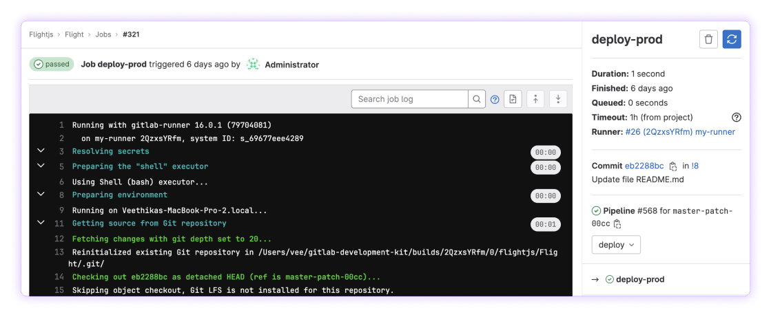 Linking runner admin page from job logs page
Improving tooltips and button text
The tooltips on the jobs list view were using native browser tooltips. We've changed those to use a design-system-compliant tooltip for consistency and better readability.
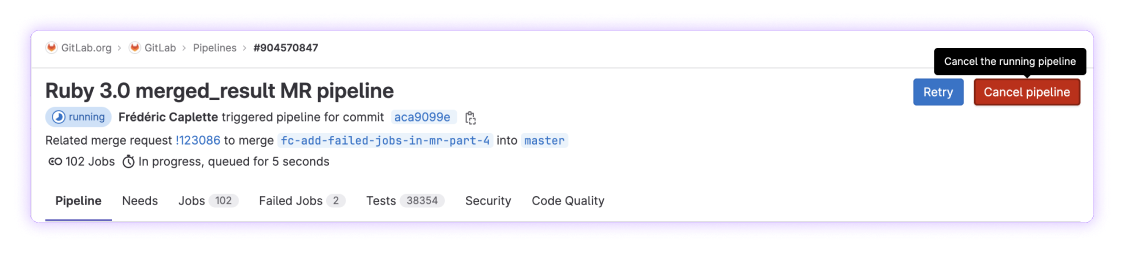
We gathered some useful feedback on the usability of the button labels and took this as an opportunity to improve a few of them. Here's one example where we changed the label text for the button for canceling a running pipeline from Cancel running to Cancel pipeline and added an appropriate tooltip to clearly communicate the action.
 Button with new label text
More to come
We are not stopping with this list! We will continue our partnership to bring in more visual and usability improvements to the continuous integration area in the coming months. If you are interested in taking a look at the complete list of changes we have made and the ones we still plan to make, you can find the issue here.