
Continuous integration and continuous deployment (CI/CD) are a crucial part of the product development workflow. Companies depend on CI/CD to get new software features, bug fixes, and improvements out the door quickly. At GitLab, runners are at the core of CI/CD and are needed to build, test, and deploy code. GitLab Runner is the open source project that is used to run CI/CD jobs and send the results back to GitLab. However, since GitLab's early years, GitLab Runner has been code-centric with limited UI capabilities. We recently embarked on a journey to change that – follow along to see how we gathered user input and made desired improvements to the visibility and metrics of the GitLab Runner Fleet dashboard.
Managing runners
As GitLab scaled as a company, so did the number of GitLab users with complex and evolving use cases. In the past five years, we have seen a radical increase in the need for a best-in-class experience when managing a large number of self-managed runners. This need has led us to put more time and focus into improving how GitLab manages runners and how it supports users in making decisions quickly and effectively.
To that end, we’ve been making incremental changes to the runner fleet management experience, including improving the general usability of admin and group runner pages, providing more data around runners such as jobs run and status checks, and improving the runner creation process so it’s more secure and easier to follow. By doing this, we built a better underlying system so we could add new features easily.
However, runner admins and platform engineers shared this recurring problem with us:
- It is difficult to get an at-a-glance view of my fleet of runners, including how they are performing (how fast they pick up jobs, which ones are running the most jobs, etc.) and what issues (if any) are present that need to be fixed.
In addition to this problem, the GitLab Runner Fleet team was also running into issues with the performance of runner pages and with scalability when trying to add new features. This was a perfect opportunity to learn more about the problem users were facing and to innovate to extend our runner offering.
Gathering insights and exploring proposals
To fully understand the problem at hand and help make the requirements more clear, we carried out problem validation research. We held moderated in-depth interviews and sifted through much of our existing data from previous interviews. As we gained confidence in our understanding of the problem, we created a first iteration of the design to be tested with users through moderated usability testing, which would determine whether the solution really did solve the problem.
This first design proposal focused on:
- a general overview of the fleet, broken down by types (instance, group, project runners) and status
- visibility into runner system failures
- a general concept of runner load - how many jobs are running at once out of how many possible jobs the runner can run?
- how long it takes for runners to pick up jobs = a list of runner events (job failures, status changes, upgrades, etc.)
Testing the usability of iteration
We ran moderated usability testing sessions so we could measure user responses and satisfaction based on a set of consistent questions across multiple participants. We used a Figma prototype and had participants complete tasks that connected back to the problem we were solving.
An advantage of running moderated sessions compared to unmoderated sessions is that we could tailor our follow-up questions as required once participants completed a task or provided an answer. After completing these sessions, we summarized the data we received into the following key insights to create the MVC (minimal viable change) of the runner fleet dashboard:
- Runner failures/errors are crucial to identify problems (voted the most important feature on the dashboard).
- Online and offline runners matter the most in terms of status breakdowns for a fleet.
- Visibility into busy runners (tied for second most important feature on the dashboard) helps users see individual runner load.
- Wait time to pick up a job was tied for the second most important feature on the dashboard and seeing this over time with more configuration options can help identify where to make optimizations in the fleet.
There are many other features requested by participants that should be handled in follow-up iterations of the dashboard. See this epic for more information.
Updating the designs
Our next step was to update the designs to consider the research we ran.
Responding to feedback
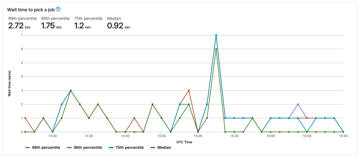
- Wait times
What we heard:
- “Right now, there is very little information available as to how soon a CI build might start. Oftentimes, users are left wondering why jobs won’t run.”
- “It's mostly reactive for us at this point anyway when, as you know, we get users reporting problems, we might want to go look at wait times here. And be able to dig down on those to see who's waiting...”
What we did:
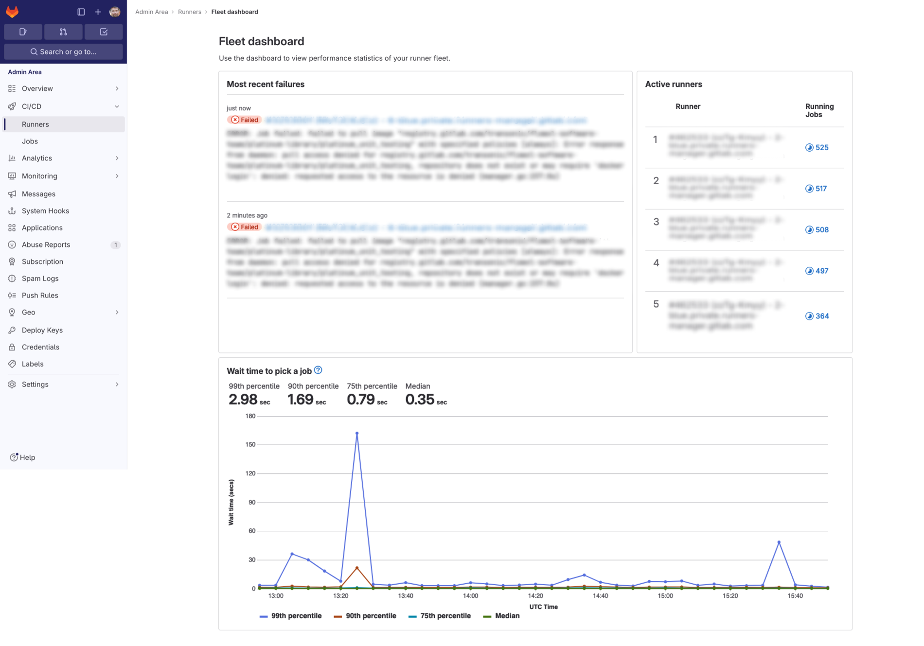
- Added an in-depth visualization of wait times for all instance runners in the fleet in the past three hours and included percentiles to give users a true representation of the wait times. By providing the data over this interval, we enable runner admins to quickly get a sense of how their runners are performing and if there are any issues with the fleet that would cause jobs to stay in pending state.
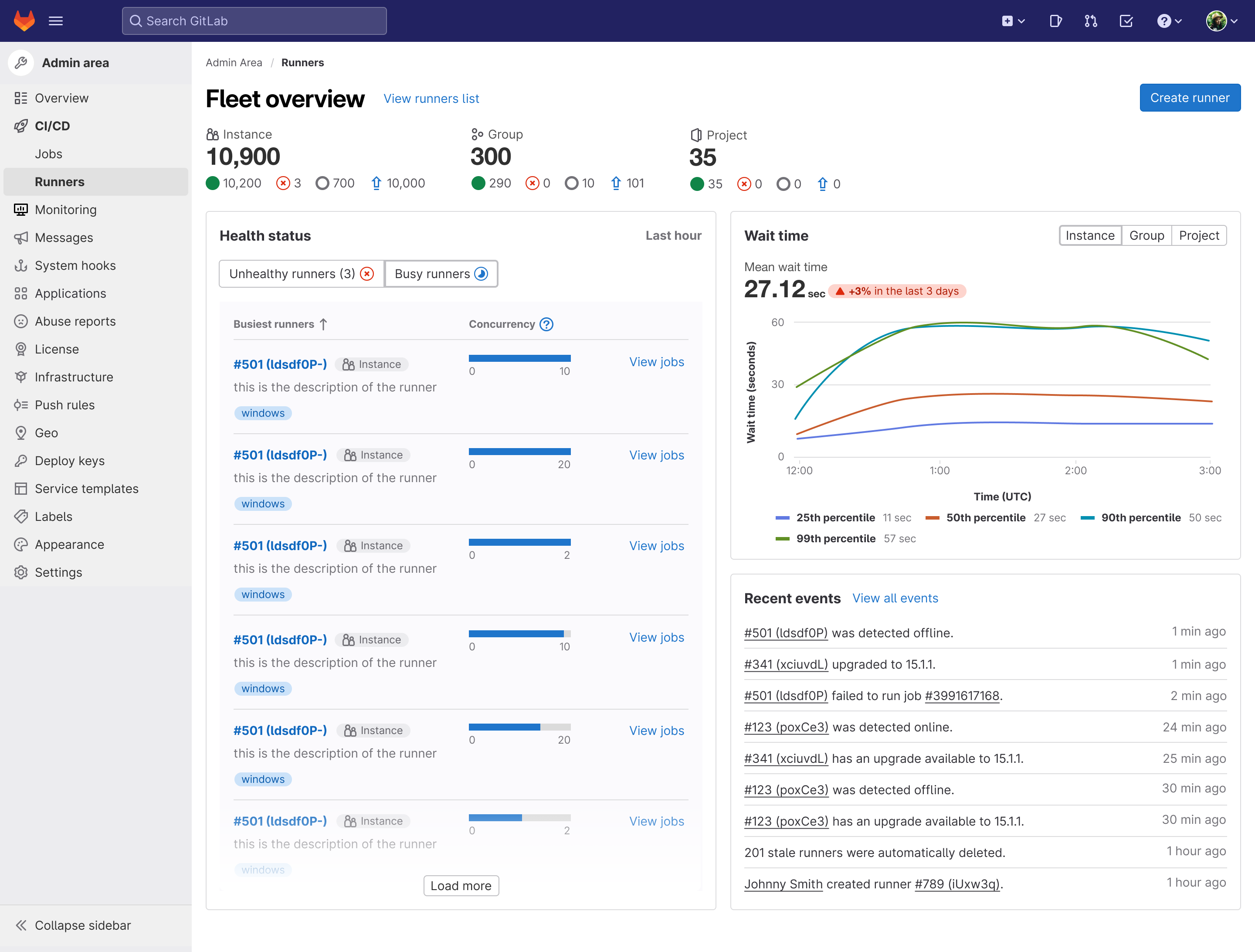
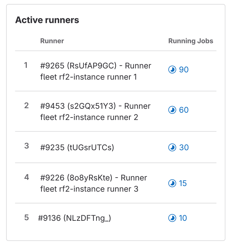
- Runner loads
What we heard:
- “I have three build servers that are shared amongst many projects and in order for me to ensure each build server is properly set up, it's important for me to track builds by server. So, if one particular server is having issues, I need to be able to focus on that server.”
What we did:
- To start indicating some data on runner load, we’ve added a list of the top five busiest runners based on the number of running jobs they have at the moment, ranked from highest to lowest. This should help when analyzing concurrency settings and seeing if runners really need the capacity set for them.
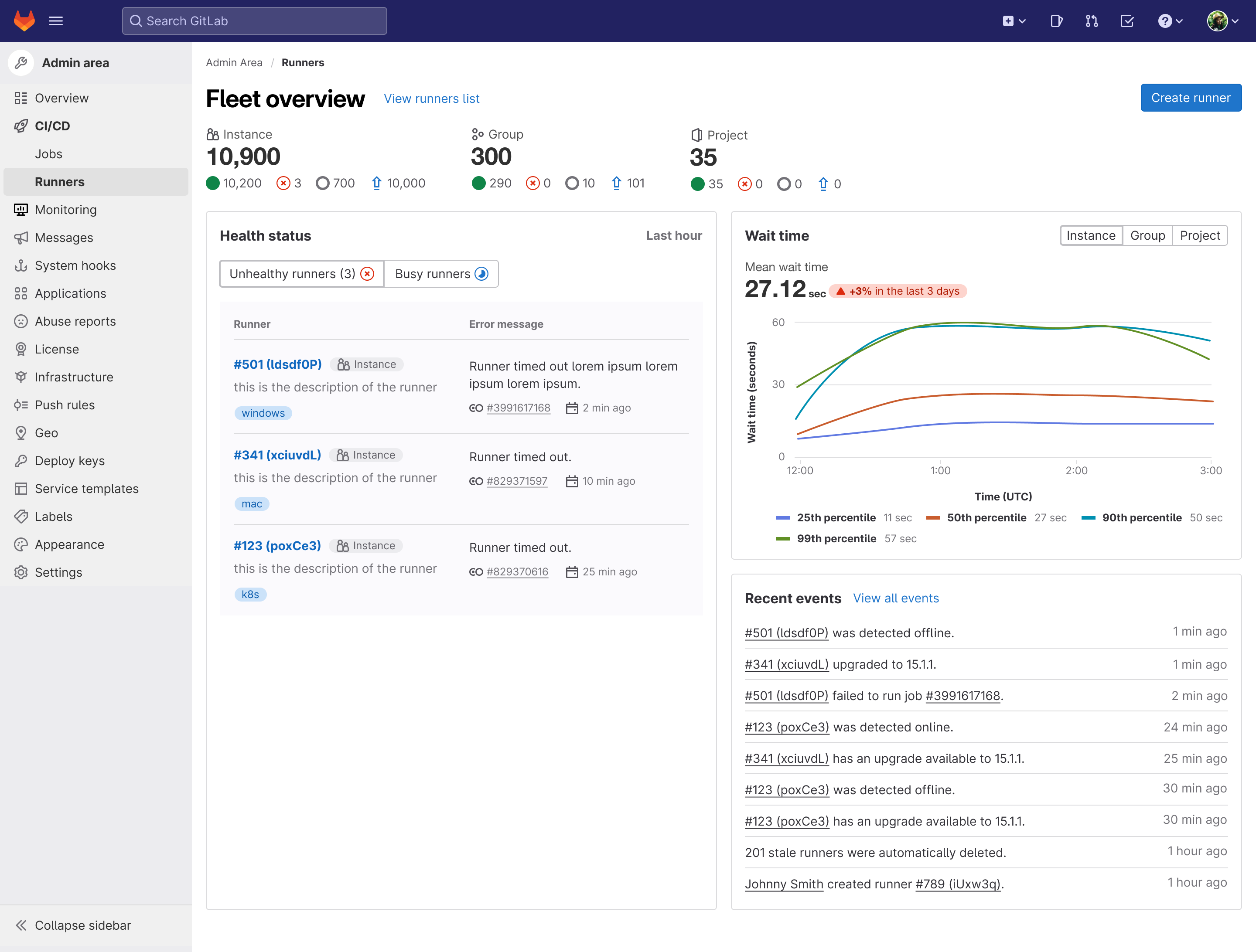
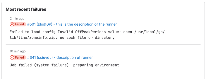
- Understanding of most recent failures
What we heard:
-
“We actually have a dashboard on Datadog that gives us error counts and errors coming from the runners themselves. But you know, without a dashboard, we have no visibility on anything inside of GitLab, like queue lengths or wait times or anything like that.”
-
“Our setup is not perfect...some of the runners run on spot instances and can disappear, which means the background engine can die. You get this very strange error that the job failed because of something and we need to retry the job using a different runner.”
What we did:
- Created a list of most recent failures in the last hour for instance runners. Not only can you quickly navigate to the job log and details, but you’re also given a short summary of the error so you get insight into it immediately and can get on your way to fix it.
The full dashboard:
What's next?
This first iteration of the dashboard is not the end. We have many iterations planned to improve the dashboard over the next year. To first get feedback on how it works for users, we will run an Early Adopters Program for GitLab Ultimate self-managed users. We will work with teams to set up the feature on their instance and continuously ask for feedback once it is being used. This will also help us understand user satisfaction levels and help our team prioritize fixes and new features as we continue improving the experience.
Do you want to provide feedback now? We would love to hear what you think! Please add your thoughts about the Fleet Dashboard to this feedback issue. To learn more about how we built this dashboard, watch this technical demo by Miguel Rincon, Pedro Pombeiro, and Vladimir Shushlin.

