
After GitLab 8.5 was released, we looked for a way to improve the current user interface for both new and experienced users. One of our biggest concerns was that it was easy to get lost in the navigation hierarchy with what we currently had. New users were quite confused by how the left sidebar constantly changes with new links to different pages. At the same time, as an experienced user, I was annoyed by the old navigation too.
So Andriy (our UX designer) and I decided to do something about it. It's been almost 4 months now that we are working on it, and in this post I will guide you through our journey. Feedback is welcome!
How it all started
One day, while on a call, Andriy and I both agreed that we were not satisfied with the current UI. I even made a messy screenshot with the default project's navigation to illustrate my confusion:
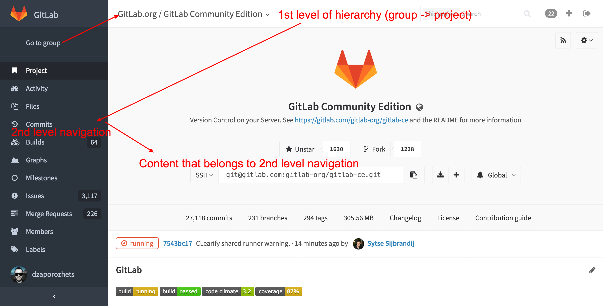
There were quite a few things we did not like:
- The current navigation is not well organized. There are places where it does not follow logic or best practices.
- We cannot use muscle memory with the collapsed menu sidebar for fast click on links because the menu has too many items with new ones added every once in a while.
- It's hard to navigate when you come to GitLab via a link from another app (like chat, for example) because of the lack of a logical hierarchy in our UI navigation.
A few days later, Andriy came up with a prototype where the project's menu was displayed within the dashboard navigation. So when you visit the dashboard page you see one level of links, and when you visit a project or group page the dashboard links get collapsed to icons and the next level of navigation is displayed.
UX is more important than you think
We were very excited with the new concept and proceeded with the implementation, which was pretty straightforward: we made a merge request, got feedback and review, and in the end we merged it. Then we waited for the next release candidate to bring the new navigation to our community.
Then came the bad news. User testing and feedback during that release candidate was far from what we expected. Instead of making things easier to understand and use, we confused users even more! Our community feedback is invaluable to us, so we made the decision to rollback the change. At that point we gave up for a while...
It wasn't until a few weeks later that we decided to take a different path.
A different approach
We split GitLab's layout of different areas by color, and tried to follow the navigation hierarchy as close as we could.
Global navigation would now have a dark color in the left sidebar, and would be static. No matter which page should you visit, you can always find GitLab's logo, your profile picture, and the main links for your projects, issues and profile settings.
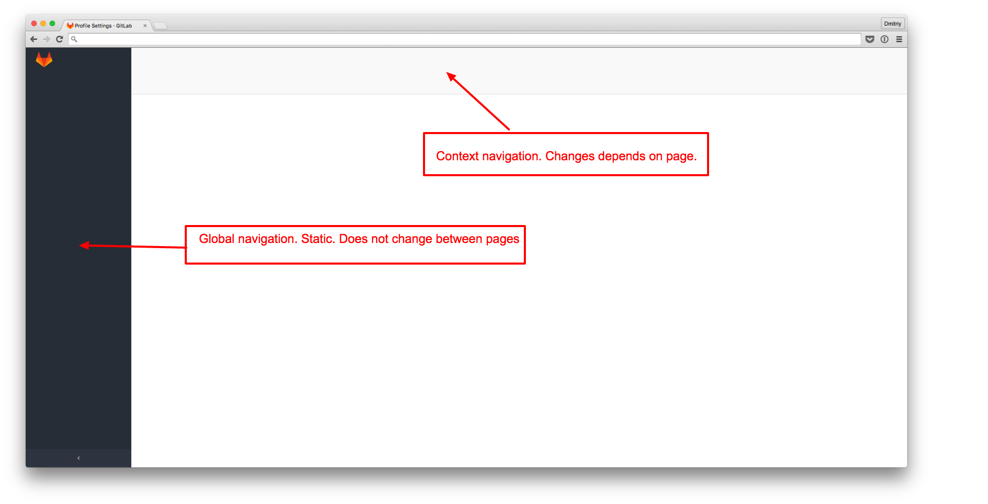
The whole page, except for the left sidebar, is a dynamic area with its corresponding navigation and content. If you visit a project's page, the context menu will be on the top, and the content just below it. The same happens for group and profile pages. So, when you visit any page from within GitLab or from an external application, you'll always know that the left sidebar is the same, and the header describes exactly where you are via name and navigation links.
When you visit a GitLab page several times a day, you scan the page from top to bottom starting with page/group/project name, followed by the navigation, then the content just below it.
You mostly ignore the left sidebar until you need to return to one of the main pages, like "Projects" or "Groups". So after some time using the new UI, you might consider collapsing the left sidebar as it's easier now to remember the icons related to the links there.
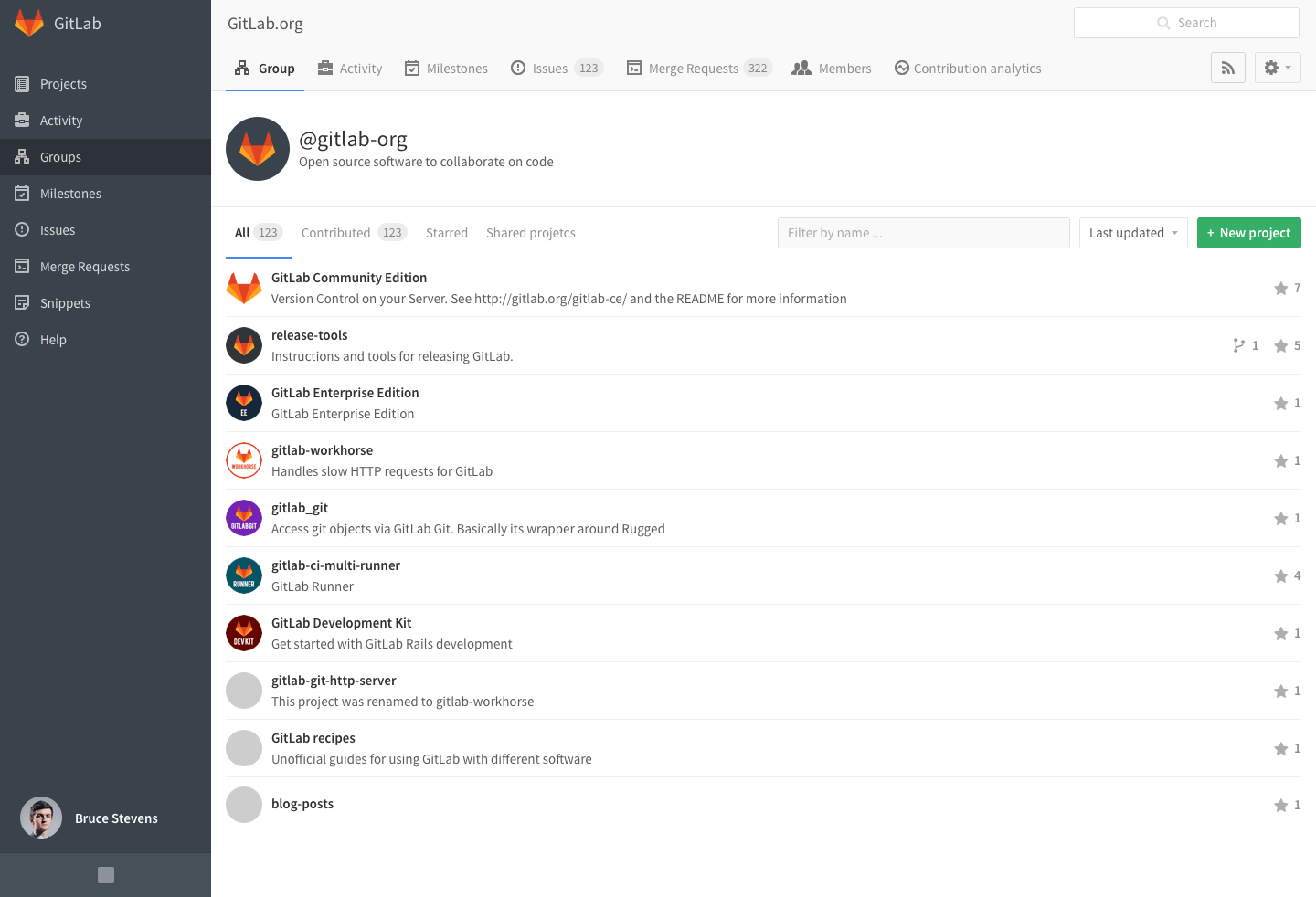
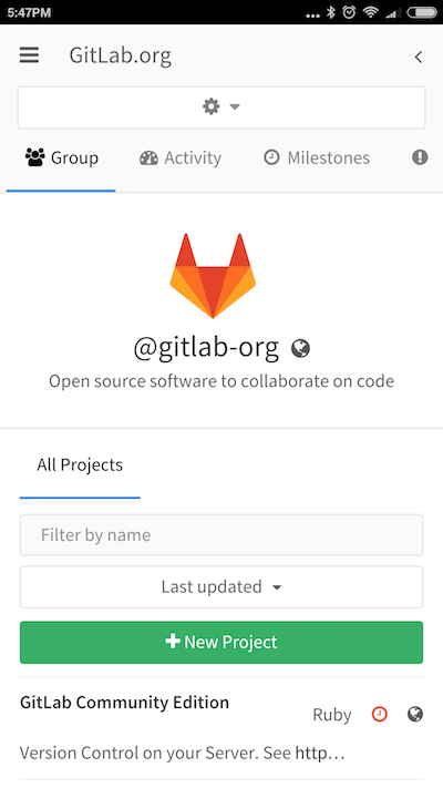
First we tried it on the profile pages and later on the group ones. The feedback we received was mostly positive, it passed the release candidate and got in the 8.8 release!
Here's how the group page with the new navigation layout looks like:
Mobile improvements
Thanks to these changes, we were able to improve the mobile UI as well. We now hide the left sidebar by default when on mobile and you can toggle it by clicking the link on the top-left corner. This allowed us to save a lot of horizontal space which is really valuable on mobile screens.
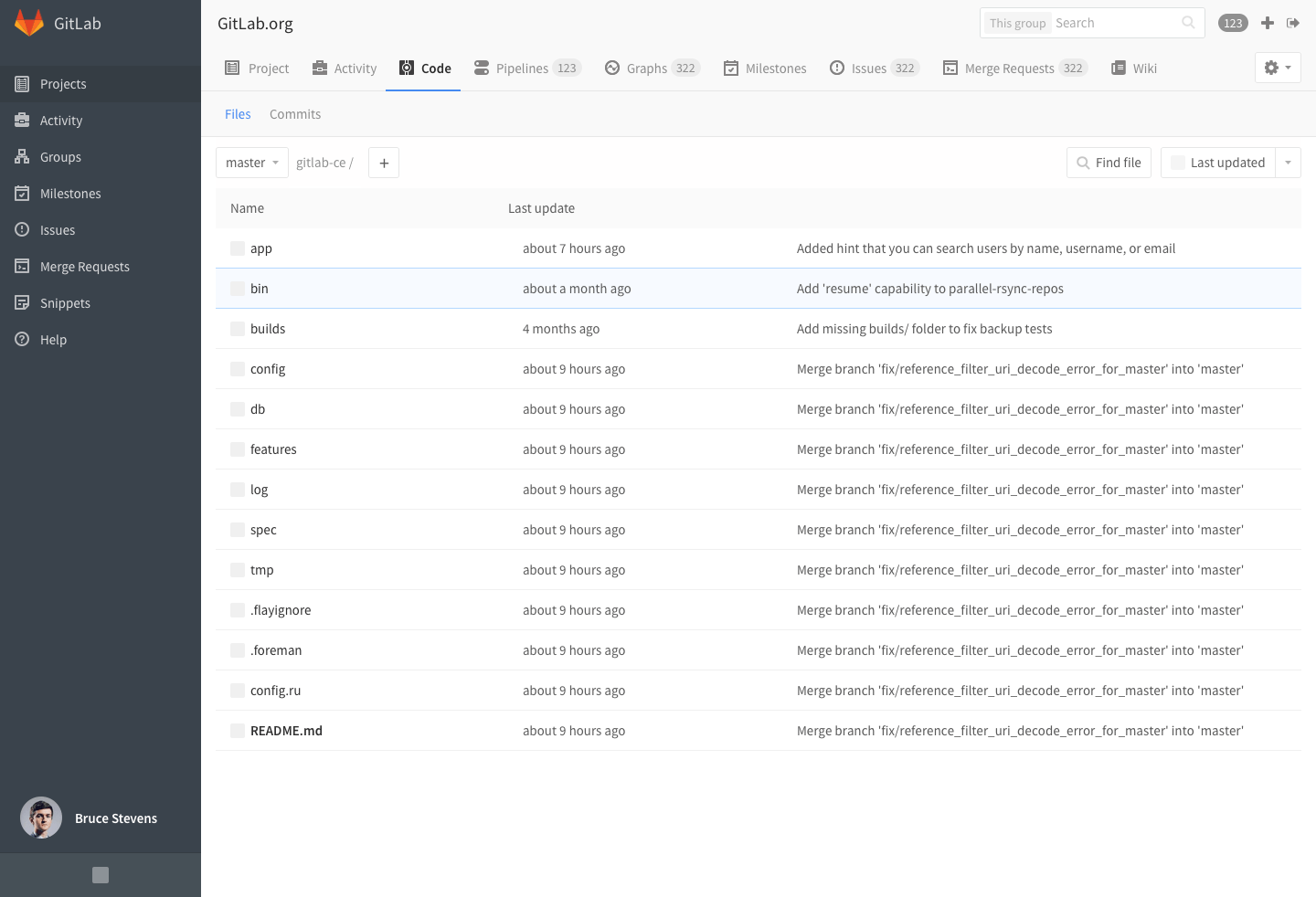
What's coming with GitLab 8.9
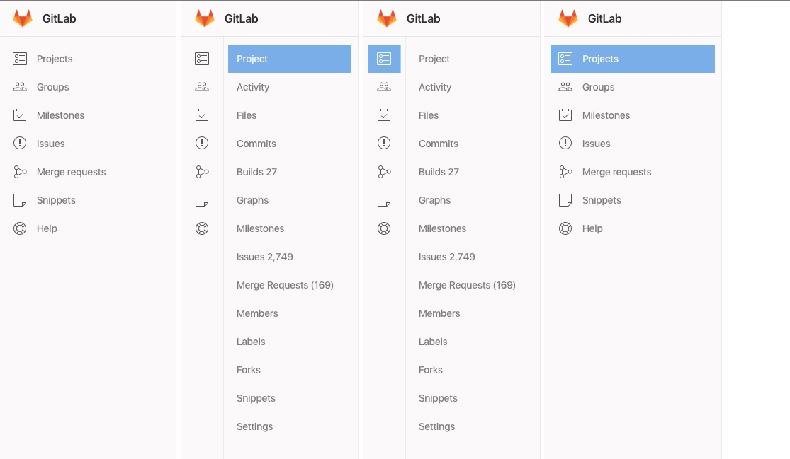
Our next milestone is GitLab 8.9 where we will strive to finish the navigation redesign by touching the most-used page type: Projects. Probably this change will bring a lot of feedback from the user's side. We have too many menu items there, which is not good for the user experience.
So, besides actually applying the new navigation style, we also need to re-group logically connected pages under fewer tabs. The old project navigation had up to 15 menu items (!) which is too much for most screen sizes.
Here is a preview for 8.9:
Resources
The Google design guide was good for inspiration and you can read the issue for new navigation where a lot of discussion took place.
We would love your feedback so don't hesitate to comment here or in the above issue! Hopefully you'll find GitLab 8.9 much more easier to navigate.