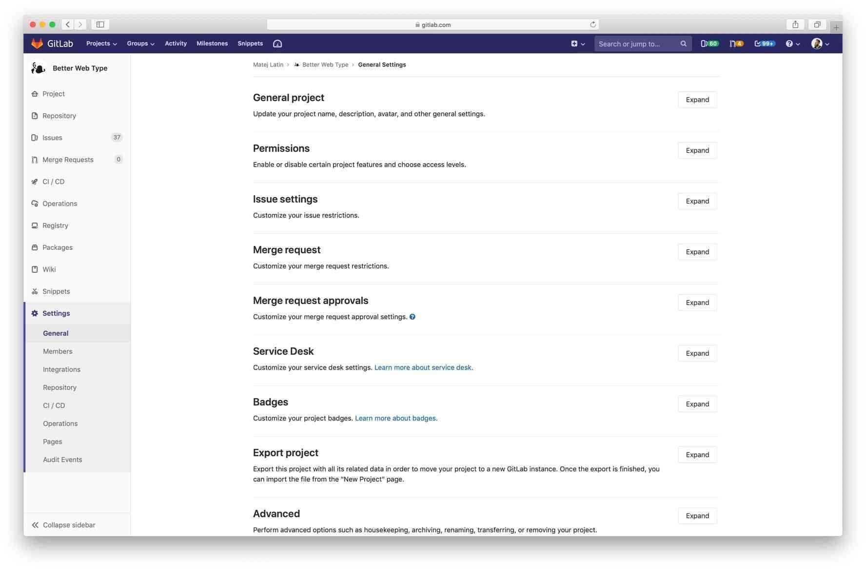
There are three main settings pages in GitLab: group settings, project settings, and admin settings. Shortly after I joined GitLab, the group settings page was redesigned to match a recent change that was implemented for the project settings, to “tidy up” all content into expandable sections. The idea was well intended, because these settings pages can be extremely long, full of diverse content and forms, and they’re very hard to read. It’s also difficult to find information when everything is simply “out there.”
The group and project settings pages were both redesigned in a short amount of time. Both are critical to using GitLab, which means that many users engage with them. This is great, because when that’s the case, we get lots of feedback after introducing changes. Unfortunately, in this case, the feedback was negative. Users began to tell us that it was even harder to find the setting they needed after the change was introduced. Instead of scrolling through the page and scanning it for relevant content, they now had to expand the sections and look for it there. The labels of these sections weren’t descriptive, so they often had to resort to guessing.
Improvements to the settings pages
I came up with some somewhat basic changes that could lead to significant improvements. In the issue titled Improve settings pages design by prioritizing content: Discovery I suggested we:
- Prioritize the content by following the 80/20 principle (what do most users look for on these pages?).
- Improve the labels for the expandable sections by making them descriptive.
- Make the titles clickable (instead of just having the “expand/collapse” button) and
- Shift content around if needed.
The 80/20 principle, also known as the Pareto principle, suggests that 80 percent of effects come from 20 percent of causes. Further research suggests that this principle can be commonly observed in pretty much anything. So, in our case, applying the principle means: Can we prioritize the 20 percent of content that 80 percent of users look for?
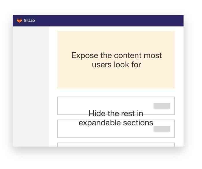
This meant that we needed to rethink the information architecture (IA) of the page. If we introduce a section with prioritized content, as suggested in the improvements above and illustrated below, could we take some of the content that is commonly searched for and move it into that section?
Soon after the discovery issue in milestone 11.2, I came up with a redesign that would accomplish all of the above. We started with the Group settings because it’s the simplest settings page, with the least amount of content. It took us longer than originally anticipated to implement the changes, and we shipped in 11.5, a little under three months later.
Some thoughts on designers conducting their own UX research
Ideally, I would have done some UX research/validation before implementation to see if the new designs are actually better. But in this case, the changes were mostly general best practices in terms of UI design and information architecture, so I was confident that they were all going to result in improvements.
But I wanted to quantify the results and confirm whether they were actually better, and if so, by how much? Confidence in design is good (and even required sometimes), but we should never replace measurement of results with it. Besides, the group settings redesign was a pilot: if all turned out well, we would redesign project settings and admin settings in a similar fashion, so I wanted to be 100 percent sure and ran the test.
In addition, the UX department at GitLab has been striving to get into a position where designers can conduct their own UX research. We want designers to conduct research in a quick way that allows them to get the results they need to move forward. This can be done with some guidance from the UX research department, but it is not necessary for them to always be 100 percent involved.
Why should designers do their own research?
In this particular example, the validation was done after the implementation of the redesign, but ideally, this type of research would be done before a single line of code was written. Even sooner, it can be done on the same day that the designer mocked up the UI solution. The greatest benefit of doing this is that it eliminates waiting and speeds up the cycle of feedback. A lot. Instead of waiting for weeks for something to get implemented, a designer creates a test by themselves, coordinates with UX research, get participants to solve the test, and analyzes the results – all in the same day.
How do we validate UI design and IA changes?
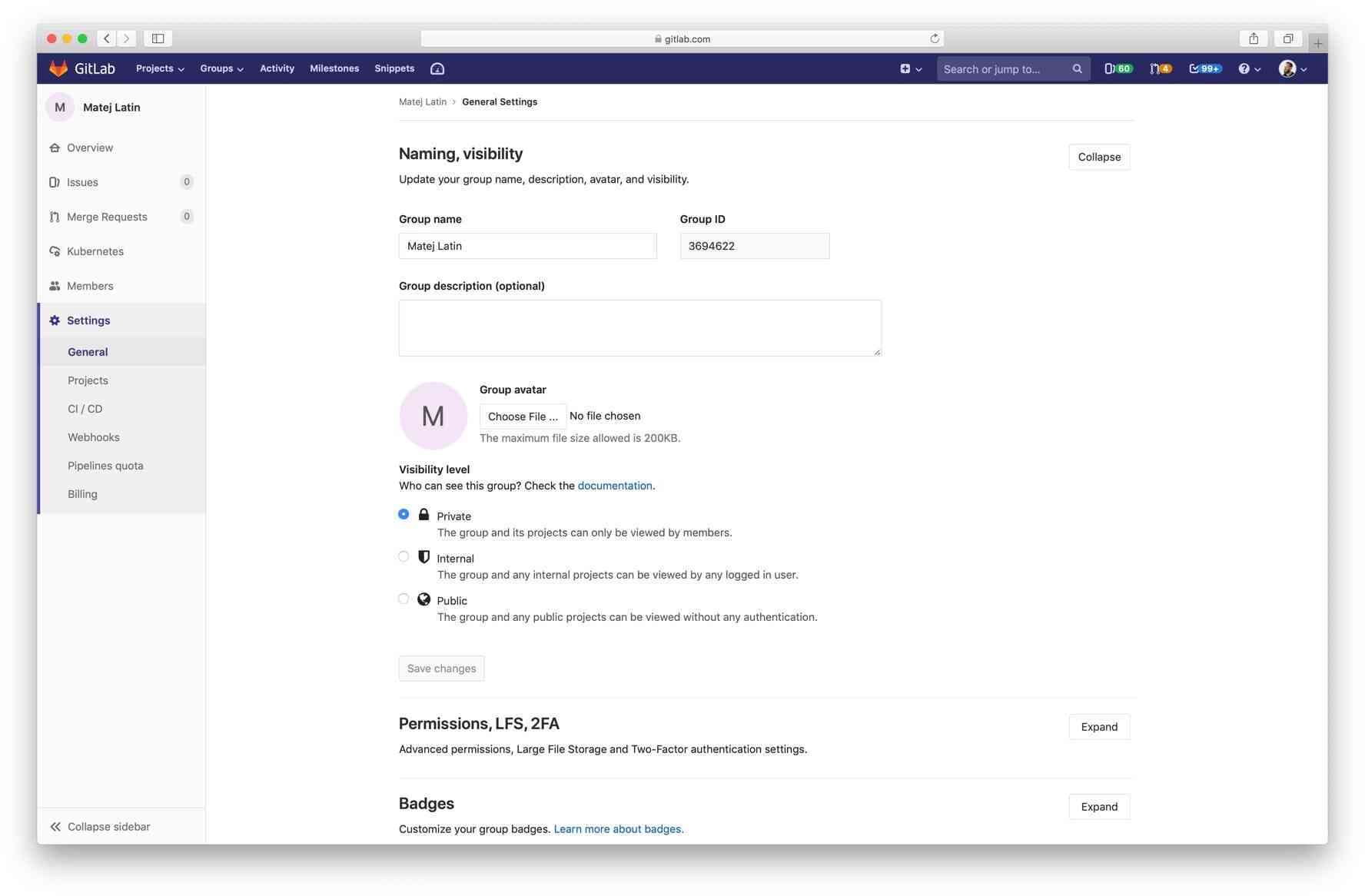
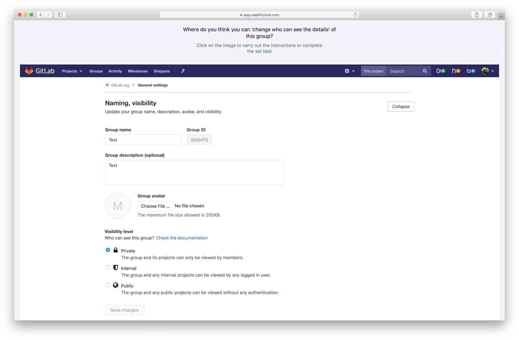
In this case, the redesign introduced mostly UI and information architecture (IA) changes. How do you test these kind of changes, especially when you work remotely? The answer is surprisingly simple: Create two “click tests” on Usability Hub: One for the design of the page as it is now (original) and one for the redesign. Most users complained that they didn’t know which section contained the item they were looking for. This was the most important problem that needed to be solved, so I came up with a simple test: show the participants the design (either original or the redesign) and ask them questions which they answered by clicking on a design. For example, they would see the following (the redesign):
And they would answer the following questions:
- Where do you think you can change who can see the details of this group?
- Where do you think you can add an extra layer of security for signing in?
- Where do you think you can change the URL of this group?
Each of these three questions were followed up by two additional ones:
- How easy/difficult was it to find?
- How confident are you that the setting is in the section you selected?
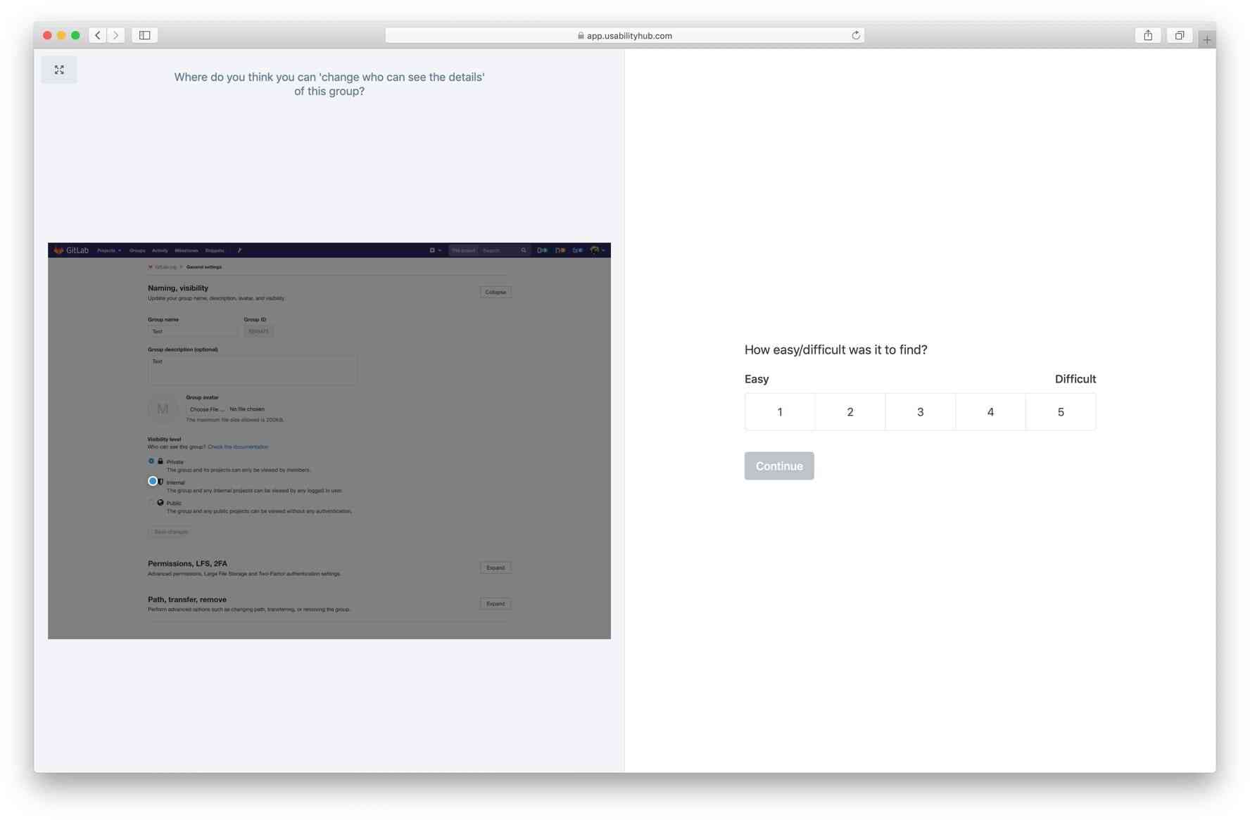
The participants responded with a rating of 1 to 5 for each of the follow-up questions. With the main questions, we measured the time required to answer (click) and whether the answer was correct or not. The follow-up questions helped us measure perceived difficulty and confidence.
Assumptions to validate
We wanted to validate the following assumptions:
| Assumption | Validated/invalidated |
|---|---|
| Users will need less time to find the settings | ✅ / ❌ |
| A greater number of users will click on the correct areas | ✅ / ❌ |
| Users will be more confident in their section choices (new compared to old) | ✅ / ❌ |
| The perceived difficulty of the tasks will improve | ✅ / ❌ |
We decided that if three out of four of those assumptions were validated we would consider the redesign a success. You can preview the tests at the following links (feel free to complete them, but they’re not collecting results anymore):
Results
We shared our tests on Twitter and with GitLab First Look, our UX Research mailing list. We received more than 600 responses, and the results were evenly distributed between the original versus the redesign. The findings weren’t really surprising, but they validated our redesigns. We knew our work improved the experience of our users and we could now apply a similar approach to the other settings pages.
| Version | Task | Time required | Correct answers | Confidence (mean)* | Perceived difficulty (mean)* |
|---|---|---|---|---|---|
| Original | 1 | 19.4s | 77% | 3.6 | 2.1 |
| Redesign | 1 | 25.9s | 78% | 4.1 | 1.9 |
| Original | 2 | 14.6s | 34% | 3.2 | 2.4 |
| Redesign | 2 | 8.7s | 97% | 4.1 | 1.9 |
| Original | 3 | 6.4s | 49% | 3.9 | 1.9 |
| Redesign | 3 | 16.1s | 92% | 3.7 | 2.5 |
Confidence: higher is better
Perceived difficulty: lower is better
*I only counted the correct answers for confidence and perceived difficulty.
Original test: 389 participants — Results
Redesign test: 266 participants — Results
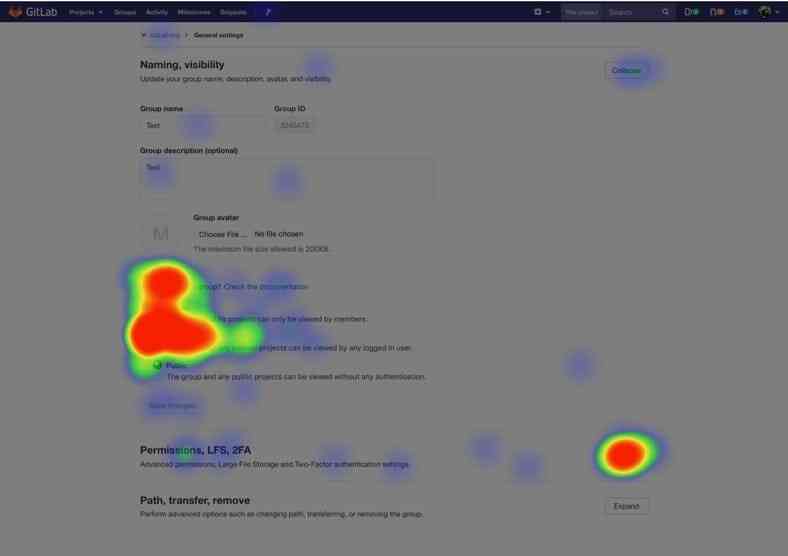
The heatmap feature in Usability Hub allowed us to see that the majority of users were clicking in the correct area, so they were finding what they were looking for.
By running such tests, we now have data that can help us quantify the user’s experience – in other words, we can measure the design’s impact. It took some users longer to find what they were looking for in the redesign, but their confidence in the correctness of their answer improved and the tasks were also perceived as less difficult.
Most encouraging was the huge difference in how many respondents answered correctly compared to the original. We saw an increase from 34 to 97 percent in the second question and 49 to 92 percent in the third question, which proved that the redesign solves the problem that most users complained about: finding things.
If we look back to our assumptions, we validated three out of four, fulfilling the success criteria that we established at the start. The only assumption that wasn’t validated was that "Users will need less time to find the settings." It took the participants longer to answer two out of the three questions.
| Assumption | Validated/invalidated |
|---|---|
| Users will need less time to find the settings | ❌ |
| A greater number of users will click on the correct areas | ✅ |
| Users will be more confident in their section choices (new compared to old) | ✅ |
| The perceived difficulty of the tasks will improve | ✅ |
What’s next?
We want to continue building on this success and improve all settings pages. Unfortunately, the project settings redesign did not make it into 11.7, but we are hopeful it will be included in one of the next few releases. We will then proceed to improve the other settings pages, as well as other improvements, such as adding inline search. You can follow our progress through the Improve and align settings pages UX epic.
As we move forward, we want to do more of this kind of validation/research. We want to come to a place where designers have enough time and confidence in doing their own UX research and do it before implementation starts, in a single milestone, so we can keep moving fast and shipping more awesome things. If you have UX research skills and experience and want to work at GitLab, check out our Careers page.
You can also read more about how we conduct remote UX research at GitLab.
Cover image by Alvaro Reyes on Unsplash