Using quantitative data to find insights
This page defines quantitative data, describes the primary advantages and disadvantages of using quantitative data in UX research, describes best practices, and provides examples for quantitative analysis.
What is quantitative data/research?
Quantitative data is any kind of data that can be quantified through counting or measuring. In contrast, qualitative data is descriptive and not easily distilled into a number. In the context of UX research, quantitative data usually is one of two types:
- Usage related data, such as clicks on features within GitLab.
- Survey data of volume (at least a sample size of 30).
What can quantitative data tell us?
Quantitative data can tell us more about the who, what, when, and sometimes how of our product’s usage. As an example, quantitative data can answer the following research questions:
- How many users engage with CI Pipeline templates?
- Which GitLab features are used by Executives? (for users who provide their role)
What can’t quantitative data tell us?
Quantitative data cannot tell us the “why”, because there are always aspects of a user’s situation that aren’t understood or under our control. For example:
Imagine two users. One is a student who has been following some tutorials they found online to learn how repositories work. The other user is a software engineer who uses GitLab occasionally on their freelance projects. Both users use the same features at around the same time, and neither have their profile information filled out.
From this point of view, there is no way to tell the difference in use cases through usage analytics, and over time these users will end up being misrepresented in the product. While quantitative data is powerful, it’s important to recognize the limitations of what it can provide.
When to consider using quantitative data?
If your hypotheses and research questions are similar to the examples below, then quantitative data may be one tool you consider using. Remember, this doesn’t mean that quantitative data is the only tool to use, because there are still limitations as to what analytics can tell us.
Examples of questions that point towards using quantitative data:
- What do users click on when they are on a certain page?
- How many users begin and finish a process?
- How does the usage of one feature compare to another?
- When is a certain feature used?
- How often is a feature used?
- Which different types of options do users select?
You can usually spot these questions, as they tend to start with “what,” “how," or “when.” Here is a walkthrough of how designers are using data to make decisions.
What is the process of conducting quantitative research?
The typical process is as follows:
- Form questions and hypotheses that can be answered by quantitative research
- Collect data
- Interpret/analyze the data
- Summarize findings
Why do I need to generate questions and hypotheses prior to conducting quantitative research?
Before starting any kind of quantitative research, it is important to identify your hypotheses and questions to avoid the problem of “data snooping.” In data snooping, a lack of defined hypotheses/questions leads you to find results that seem meaningful, but are actually misleading and misrepresentative of the user population. Hypotheses/questions serve as an anchor for your overall analysis.
How do I collect data?
At GitLab, there are two main approaches to collecting data: 1) querying from usage data in Snowflake or Tableau - see this handbook page for more information on GitLab’s data sources - and/or 2) using survey data.
You can use these two data sources to build a comprehensive understanding of your problem. For example, you might use usage data to first understand the user population you are looking at and then identify where you will need to go to get more data. Once you understand your user population, you might use a survey to uncover additional insights.
How do I look at/interpret quantitative data?
One way to look at data is with data visualizations. Data visualizations are graphical representations of data, commonly seen as charts or tables. Data visualizations are used to represent a trend in your data, or display a summary of your data.
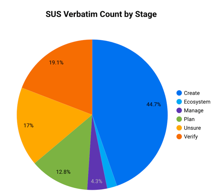
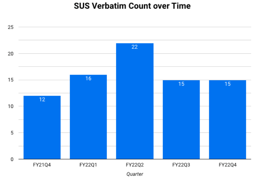
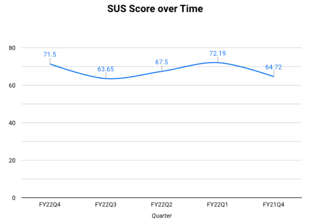
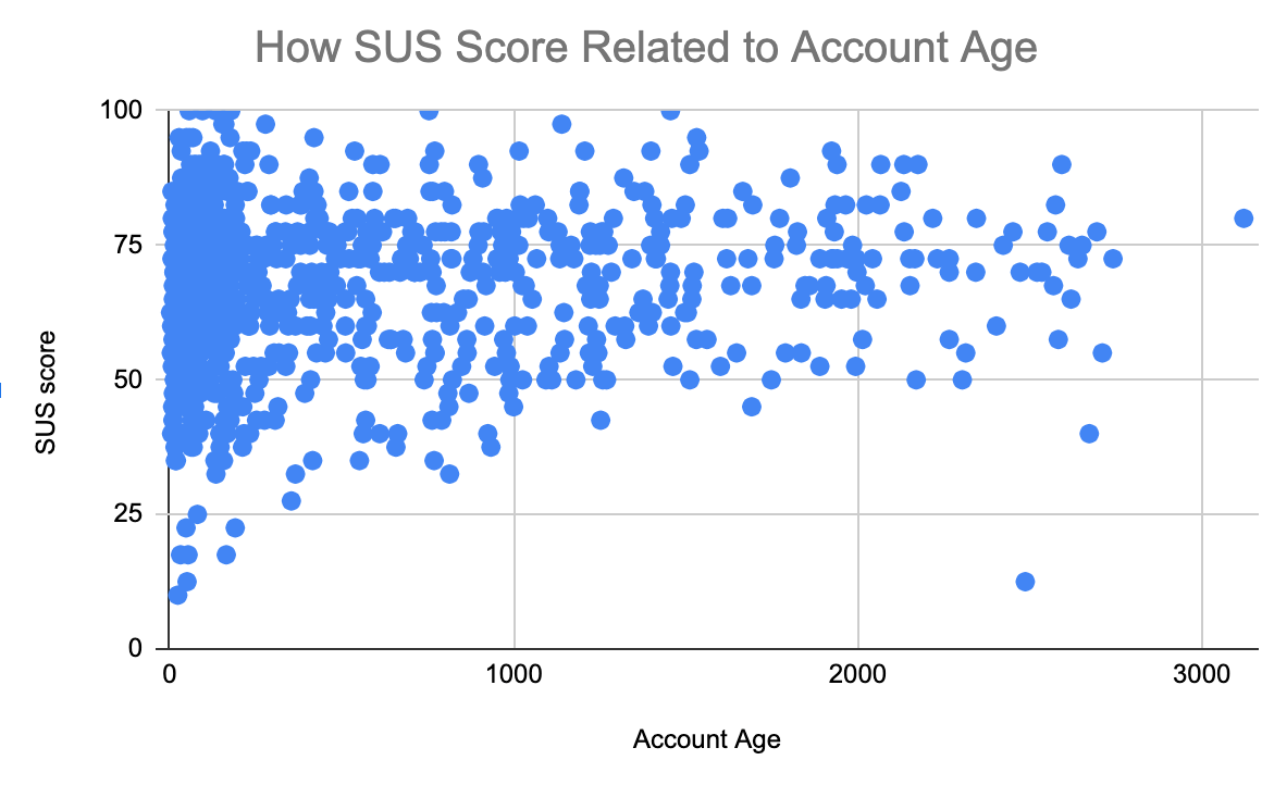
There are many types of visualizations, and each one may suit a particular situation better than another. Below is an overview of common visualizations using example charts driven by SUS data, but you may also want to visit this helpful blog post for additional examples.
- Tables are good to use when you want to summarize a portion of your data or display aggregations.
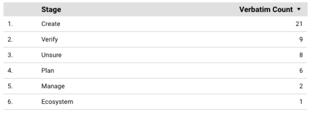
- Pie charts are used to compare data in different categories.
- Bar charts are used to compare data across distinct categories, like fiscal quarters.
- Line charts can be used to see trends. Time series are a type of line chart where the x-axis is always time.
- Scatter plots are used when comparing two numeric variables. These charts can have some of the most flexibility, but that also comes with the risk of creating overly complex visualizations.
What should you avoid when creating visualizations?
There are dozens of ways to lie with visualizations, even by accident. Some tips when creating your visualizations:
- Visualizations should be quick and easy to interpret. The visualization should not result in more questions than answers.
- Each of your axes should be understandable and practical:
- Always start your axis at 0.
- Do not skip or remove large sections of your data by limiting the axis.
- Do not use double Y axes unless absolutely necessary.
- If you are comparing two graphs, ensure the axes are on the same scale and range.
- For chronological studies, always put time on the X axis.
- Keep it simple. Titles should be clear and concise, and there should be enough context for a team member unfamiliar with the topic to understand the message.
- State the limitations, including the date the data was pulled, and where it was pulled from. Use subtitles for references when needed.
- Consider your audience’s familiarity with the data set. A simple and informative graph can often have more impact on your audience than a “flashy” graph with multiple groupings and axes.
Summarizing quantitative data
This section covers how to read visualizations, look for trends, and turn the results into insights. Start by looking for any kind of patterns. Some examples are:
- Cyclic patterns based on time
- Similarities or differences when comparing across one category or more
- Data that is consistently increasing or decreasing.
- Two variables that are correlated with each other. The correlation could look like:
- As one metric goes up/down, another metric cosistently goes up/down with it.
- As one metric goes up/down, another metric consistently does the opposite.
Once you have identified patterns, summarize those patterns as best you can while considering your original hypotheses/questions.
An example of quantitative data summary
The following is an example of using quantitative data to investigate Actionable Insights (AI). The research question was, “What are the potential factors in whether an (AI) issue is successfully completed or not?” First, the researcher pulled usage data in Sisense related to GitLab issues with the Actionable Insight label. Then, they created these charts:
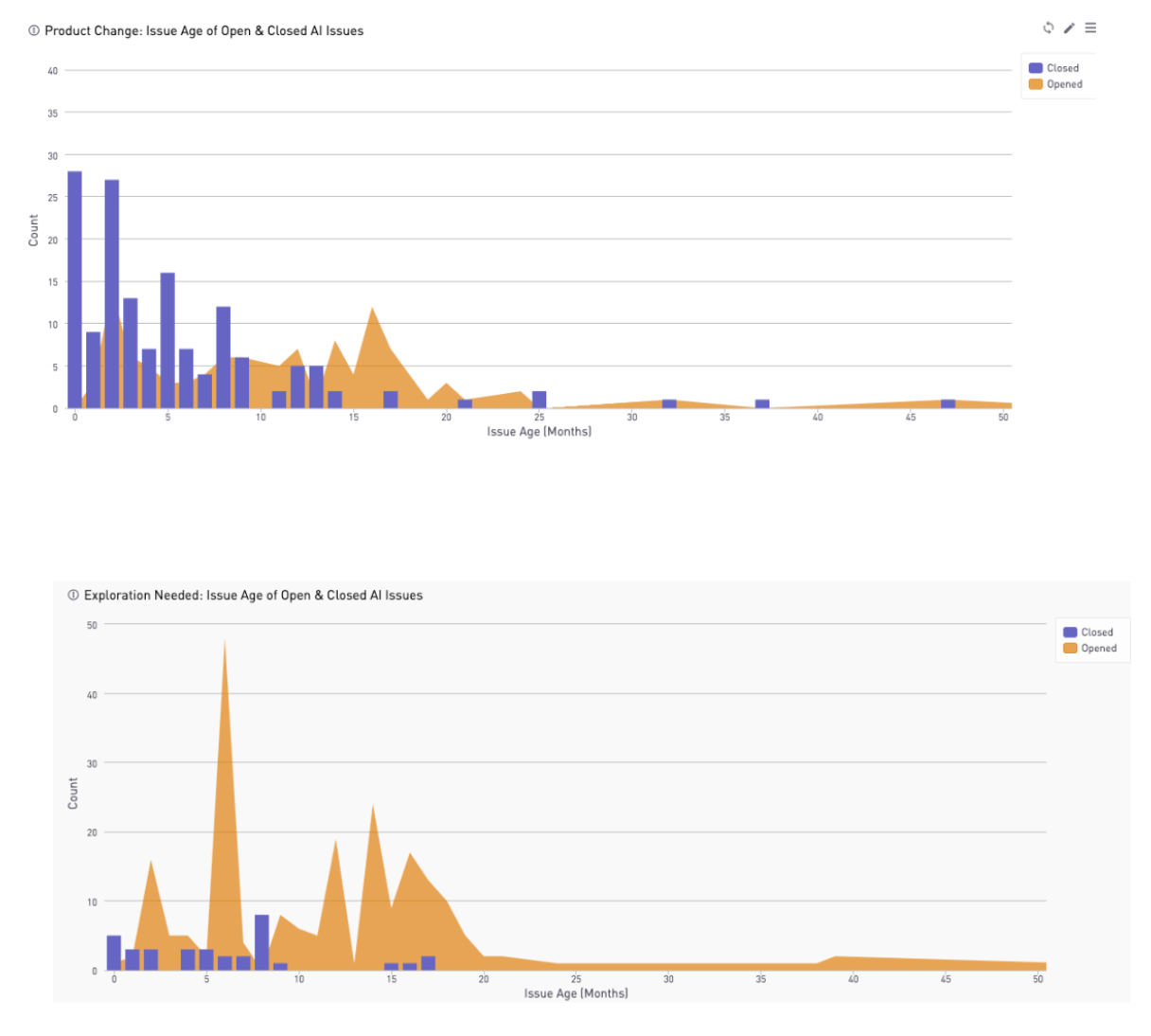
Based on these charts, it is evident that there is a huge decline in issues closed after 7 months. So the finding were presented as, “If Actionable Insight issues are not addressed within 7 months of creation, they are likely to be left open.”
Additional examples of Product Designers using data for decisions
State the limitations of your data
When sharing your research, state what you believe are the limitations that may have impacted your results. For example, if your data:
- Is missing a collection of users
- Includes usage from only the last 3 months
- Has concerns about its accuracy
- Does not directly measure your research topic
Be sure to include a description of the limitations in your summary. This information is just as relevant to the research as the metrics, and it provides context to the data. In some cases, you may decide it is not worth presenting the data, because of multiple problems.
Best Practices
Using quantitative data to track the success of a feature
Tracking key metrics that are formed through analytics can help you understand how a feature is performing in production over time.
Consider adding analytics to features as they are developed and improved. This will enable you to track how successful the design or new feature was.
Using quantitative data alone
There are some instances where you can use quantitative data alone. Some examples are:
- Are users finding a new feature?
- Which pages are visited the most?
- Which browser types do users use to access our application?
- Are more users accessing a page now compared to last quarter?
While the examples above can be answered solely with quantitative data, pairing with qualitative data will provide you with a more complete analysis. That’s because qualitative data helps you to understand the “why” behind what’s happening.
The perfect combination: quantitative and qualitative data together
Some of the most useful research designs come from mixed methods. Both quantitative and qualitative methods have their limitations, but you can use them together to answer complex questions and provide a more complete story. By combining methods, you are able to answer both the “why” and the “how” or “what” of the problem.
Example 1: Understand how users interact with a specific page.
- Use analytics to find out how many users visited a specific page and which features they used on that page. Focus on general characteristics of those users (account age, stages they visit, and so on).
- Launch qualitative research that includes personas with any chance of overlapping with your page/feature. Be sure to expand your sample to more than just your analytics, remembering that our analytics aren’t always comprehensive (for example, we have limited data on Self Managed users). Use subject matter knowledge to see the possible gaps in your data, making sure to advocate for the hidden use cases.
- Use interviews or walkthroughs to understand user motivations.
- Incorporate your enhanced understanding in the proposed solution.
Example 2: Finding areas for improvement of a new feature for future iterations.
- Monitor usage analytics with the feature flag after launching the new feature. Examine things like time on page and how many users interacted with other features during the workflow.
- Understand high-level goals by interviewing users with personas that have any chance of interacting with the new feature, as well as any persona identified in the usage data.
- Pair usage analytics and the interview insights to visualize workflows that interact with other features.
- Include priorities based on user input and time-on-page trends.
- Use those insights to help map future iterations in the roadmap.
What do you do when you don’t have enough quantitative data?
There are many common scenarios where you might not have enough data. For example:
- A new metric was implemented, but you only have a month’s worth of data.
- Data is only reported from SaaS users and not self-managed.
- There was an error/bug in data scrubbing, and you are missing a period of time.
There are a couple of different ways you might address this.
(1) Expand research by supplementing your quantitative data with qualitative research. For example:
- During a quantitative investigation of a navigation element, you see an incredibly small number of users who consistently click on a different element than other users.
- After more investigation, you connect several character demographics and possible user personas to this user group. However, this research is unable to answer the question of why those users behave the way they do.
- To attempt to answer this, you launch user interviews using the personas you found. After summarizing the interviews, you see that the users had a small set of overlapping use cases due to their shared industry, which leads to a newly identified JTBD for those personas.
(2) Continue forward with the current product roadmap while summarizing your insights and the possible shortcomings. For example:
- During problem validation, you find some data that points in the opposite direction of your hypothesis and assumptions and may contradict parts of your product roadmap. However, the data has a low sample size and perhaps leaves out some context in the workflow.
- When writing the results, speak to the facts of the data and your possible assumptions or biases. Explain how the data does point to one direction, but there is not enough evidence to suggest changing the roadmap.
- Additionally, determine whether the insights are worth preserving and investigating more if an opportunity arises.
It is NOT recommended to fill your analysis with data from another project. This can create problems due to sample sizes from different populations making the data look different than reality.
3165d431)
