This is a guest post by Tobias Günther, founder at Tower.
GitLab and Tower, the popular Git client, have more in common than just "Git". They share the same goal: to make working with code easier. And just recently, with the release of Tower 2.3, they work together more seamlessly than ever.
You would think that cloning a remote repository was a simple process. And yet it can be quite a drag: You have to find the repository you want to clone, get hold of its URL, remember your authentication credentials (and method!) and fumble them onto the keyboard…
Solving such minor and major annoyances around Git has always been our motivation for creating Tower - a GUI client for Git that's now used by over 50,000 customers like Apple, Google, and Twitter.
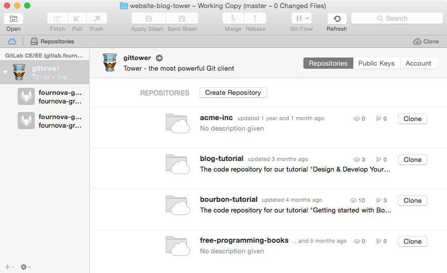
Since our recent update to version 2.3, Tower makes working with GitLab even easier. You can access your repositories right from within Tower and clone them with just a single click:

Long gone are the days of wrestling with usernames, passwords, tokens, or URLs. Even creating new repositories in your account can be done via Tower. Cloning and managing repositories has become quite a bit easier.
Let's look at some other pain points that developers face day after day.
Undoing Mistakes
One reason why I love Git is that I can undo almost anything. However, actually remembering all the different ways, commands, and parameters to achieve this tends to make my head spin.
That's when I love to have Tower open: the GUI guides me so I can easily fix my last commit, restore any historic version, revert a certain commit's effects, or discard local changes in my working copy. It's great to know that I can't mess up.
Dealing with Merge Conflicts
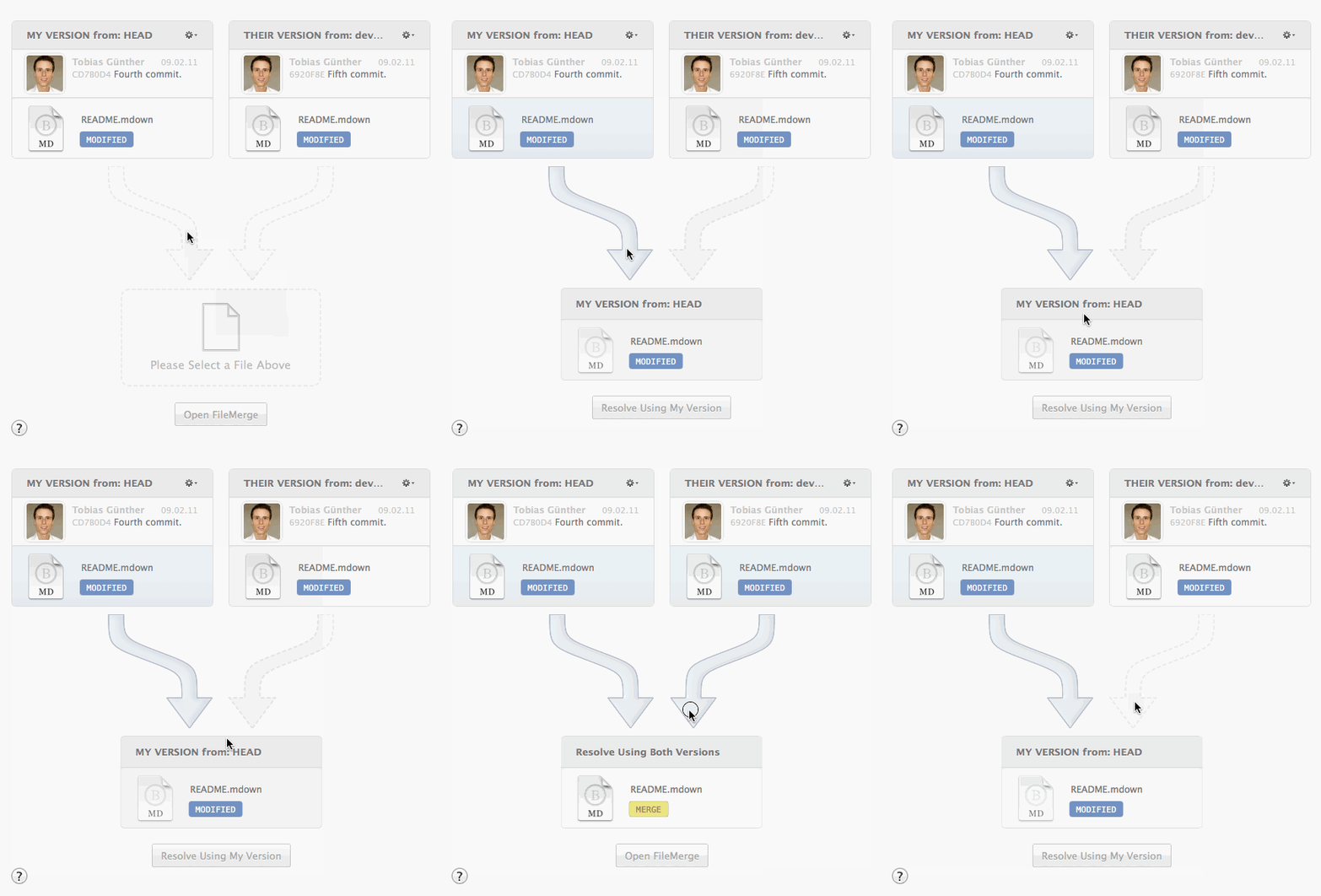
Admitting this one is a bit embarrassing: I had always been a bit of a coward when it came to merge conflicts. I had a hard time understanding what had happened - and an even harder time knowing what my options were. We've managed to find a visual way of presenting conflicts in Tower, which helps a lot in understanding the scenario.
I can clearly see which files clashed, how exactly they looked, who worked on them, and which commit introduced the changes. And, with this knowledge, I can decide what the solution should look like - simply by clicking the files I want in the final resolution.

Optimizing Your Workflows
In my opinion, a graphical user interface has to provide some real advantages. Just a handful of pretty colors won't cut it.
A Git example is that I don't want to check for new changes manually all the time. That's why Tower automatically and regularly performs a "Fetch" operation in the background for me. Thereby, I know when something new is available on my GitLab remote repo.
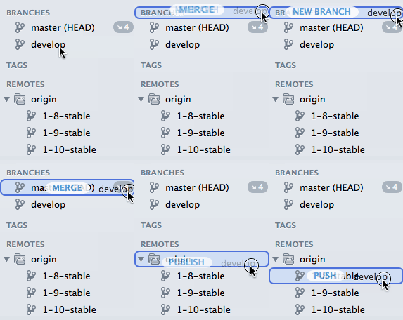
Also, tapping the full potential of a modern environment like macOS means (to me) that I can use drag & drop for many actions. From creating and merging branches, to cherry-picking commits or applying even parts of a Stash.

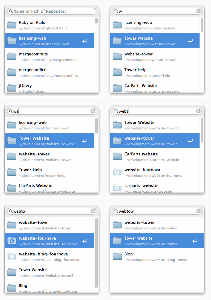
Other things, like finding and opening any project, has to be a matter of seconds. Tower has a new "Open Quickly" dialog that lets me type just a few characters from the project's name to open what I was looking for.

Lastly, Tower's "Auto Stash" feature is a perfect example of the app's philosophy - to take Git to the next level: Tower automatically saves your current changes to the Stash when you're switching branches, pulling, or rebasing. Actions like these are best performed with a clean working copy - and Tower saves you the hassle of remembering and doing it.
Feel free to give Tower a try and see how it works with your GitLab account. You can download and test it 30 days for free.
P.S.: I'm curious to know what you are struggling with in Git and version control. Let me know in the comments!

We want to hear from you
Enjoyed reading this blog post or have questions or feedback? Share your thoughts by creating a new topic in the GitLab community forum.
Share your feedback