
A new navigation redesign provides an excellent opportunity to build upon the existing experience and improve accessibility. With navigation, it’s important to review accessibility at every opportunity, refine the experience with findings, and respect people’s existing relationship with GitLab’s navigation.
Here are the steps we took, what we learned, and the impact on our navigation redesign.
Review accessibility early
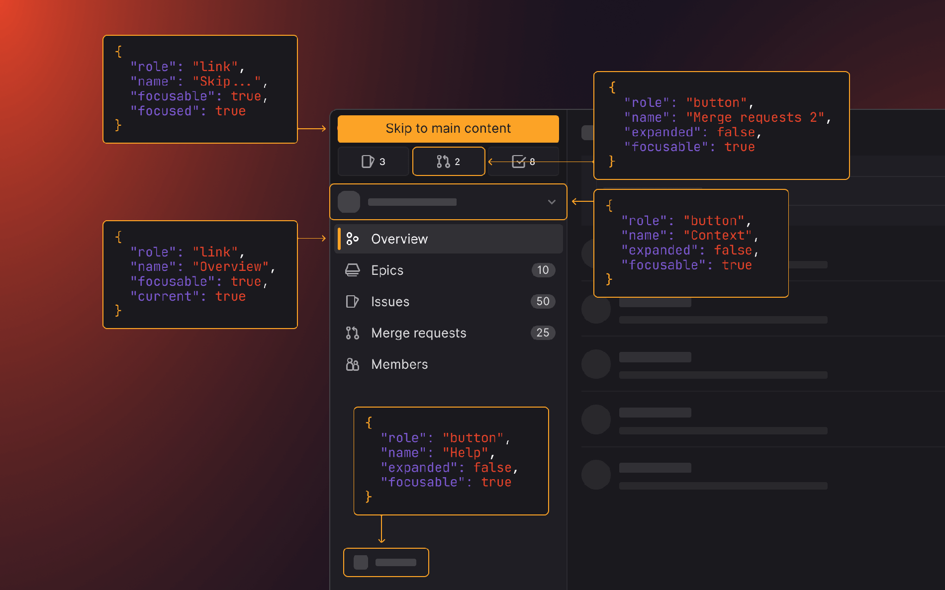
To know what we needed to deliver, we had to understand what the existing navigation experience was for people using assistive technologies (AT) such as screen readers. An effective evaluation technique is mapping the navigation accessibility tree. This provided detail into the order of elements as well as their accessible roles and labels that are communicated by AT. Reducing major changes to the accessibility tree minimizes disruption to people’s memory of navigation items.
Early experiments with a low fidelity HTML prototype of the new navigation design provided insight into how HTML elements with appropriate ARIA attributes could achieve an intuitive and meaningful accessibility tree. This exercise allowed for a collaborative evaluation of the proposed designs, identifying tweaks to improve accessibility.
Review accessibility frequently
Early prototyping gives a top-level view of accessibility, it is helpful for determining the order of tab stops and selecting the appropriate landmarks elements. More complex interactions, such as interactive menus, are better suited to individual reviews.
Accessibility reviews of interactive menu components ensure they deliver a desirable experience in isolation. When implemented within the navigation, these components can then be reviewed in context by themselves (keyboard interactivity and accessible labels), and in relationship with other menus (logical tab stops and consistent behaviors).
Review with popular accessibility technologies
Automated testing tools like aXe DevTools are excellent at highlighting Web Content Accessibility Guidelines (WCAG) criteria violations directly on elements. This makes it simple to identify the required changes to markup and styles for semantic meaning, readability, and contrast.
It’s important to manually test web accessibility with popular screen reader and browser combinations to evaluate the 75% of criteria which automated tools miss. When manually testing with screen readers, we identify accessibility issues, such as the logical order of elements, keyboard interactivity, and descriptive labels of elements and states, which improve the experience for people using AT or alternative input modes. It's crucial to providing an inclusive and accessible experience for all users.
While reviewing the new navigation, we manually tested with the following screen reader and browser combinations using local devices and Assistiv Labs:
Findings from testing were logged into an epic where they were prioritized, actioned, and tested again.
Here are some key findings from our manual accessibility testing:
- Using
aria-expandedandaria-controlson<button>elements which toggle menu section to provide meaningful state descriptions to screen readers (WCAG 2.1 3.2.3: Consistent Navigation, WCAG 2.1 4.1.2: Name, Role, Value) - Using
aria-current="page"on the current page link<a>element to announce current page when focused (WCAG 2.1 3.2.3: Consistent Navigation, WCAG 2.1 4.1.2 Name, Role, Value). - Including a "Skip to main content" link to allow keyboard and screen reader users to bypass repetitive content (WCAG 2.1 3.2.3: Consistent Navigation, WCAG 2.1 2.4.1: Bypass Blocks).
- Excluding navigation contents from focus order when collapsed (WCAG 2.1 2.4.3: Focus order).
Leverage browser behavior
One of the interesting implementation challenges of the new navigation was excluding interactive content when it’s collapsed.
Early interactions used the aria-hidden attribute in combination with inert to ensure content was hidden for keyboard and screen readers. When testing with different browser and screen reader combinations we discovered content was still interactive for browsers that did not support inert.
Instead of aria-hidden, we could use the visibility: hidden CSS property, which proved to work as expected. The catch was that it also affects the visibility (hence the name) for sighted users and would need to be applied only once the transition between expanded and collapsed state is complete. Adding to the complexity of the implementation. This became even more complex, as there are different default collapse states between viewport sizes, as well as a mouse-hover peek behavior. In the end this solution was not as maintainable and robust as hoped. Back to the drawing board.
Collaborative efforts of browser vendors to implement web standards through Interop meant that the inert HTML attribute became fully supported as of Firefox v112. Now the inert attribute allowed the navigation to be marked as non-interactive and simplified the approach whilst also providing a consistent experience in modern browsers (last two major versions) and screen readers.
Using HTML standards produces a consistent experience across devices and browsers that is more familiar to users, as well as improving maintainability and robustness of the implementation.
Make iterative improvements
We’ve reviewed the navigation at key milestones to find and resolve accessibility issues, and refine the accessibility tree. Thanks to these efforts, we’ve iteratively improved upon the existing navigation accessibility, satisfying relevant WCAG criteria, and delivering an intuitive and familiar experience for AT.
What’s next
Accessibility is never done, while we’ve carefully considered accessibility throughout the design and implementation stages, we need your feedback on how we can continue to iterate on the accessibility of the new navigation. Please add any feedback, questions, or ideas to the navigation accessibility epic.


