
When you're busy focusing on the big picture of feature improvement work, it can be easy to forget the value of tiny refinements. But when you add them all up, fixing little "paper cuts" can have a meaningful impact on user experience.
That's why I was so excited to see the GitLab UI Polish Gallery created by Nicolas Dular, a Senior Fullstack Engineer on our Growth team. It highlights small refinement contributions � like adjusting alignment, spacing, and type scale � that are easy to overlook. But seeing them in aggregate, you quickly realize what a difference they make.
For me, the most inspiring part of the gallery was seeing such a diverse group of people contribute to making our product the best it can be. Developers, designers, and members of the wider GitLab community (special shout out to Yogi) all care enough about our product experience to put time into small changes.
Here are a few examples, but I encourage you to check out the gallery for yourself!
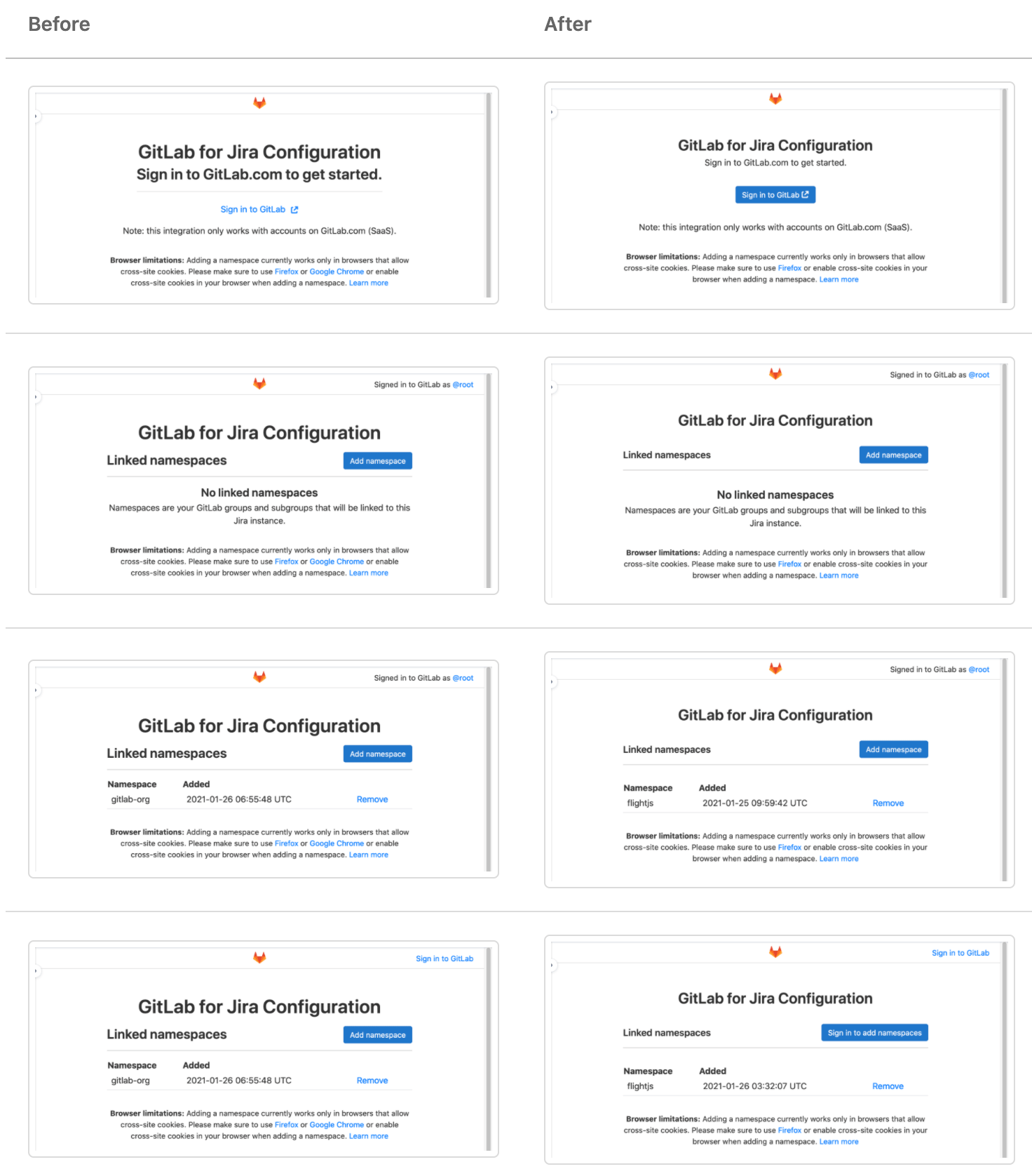
Polishing the Jira Connect app
Our Jira Connect app helps customers use GitLab in coordination with Jira for a more seamless developer experience. Libor Vanc (Senior Product Designer) and Justin Ho (Senior Frontend Engineer) on our Ecosystem team made some light changes to the app's type scale and CTAs that make the app much simpler to visually parse. What a nice change!
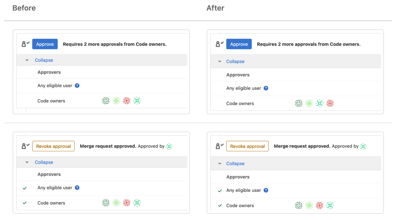
Addressing alignment problems in the merge request widget
Merge requests are central to our user experience, and we're working hard to make the experience exceptional. When Staff Product Designer, Pedro Moreira da Silva, noticed alignment problems in the MR widget, he worked with Senior Frontend Engineer, Jacques Erasmus, to address them. It was a very subtle change that will impact millions of users.
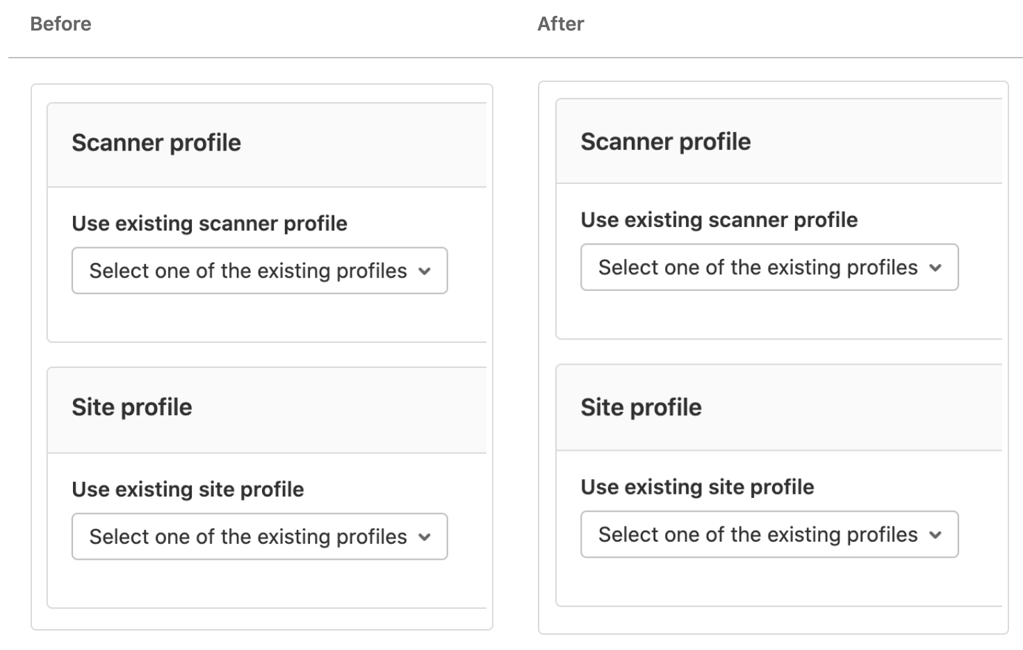
Fixing the vertical alignment in card headers
This change is so subtle that it's hard to even notice, but the vertical alignment in the card header of our on-demand security scans was off by mere pixels. Product Designer, Annabel Dunstone Gray, noticed the problem during an MR review, and Frontend Engineer, Paul Gascou Vaillancourt, jumped in to fix it in the same release.
More to come!
We make visual refinements all of the time, so this is just a start to what you'll see in the GitLab UI Polish Gallery. I'll personally be checking in from time to time to remind myself of the little things that make a big difference.