
Organizing your projects into groups within GitLab should be a simple matter for new users. We conducted a Category Maturity Scorecard validation to see how we were correct to assume that it was easy to model your organization in GitLab so that teams could have clear boundaries between other groups. What we found during our initial testing, however, was far off from this assumption.
Problem
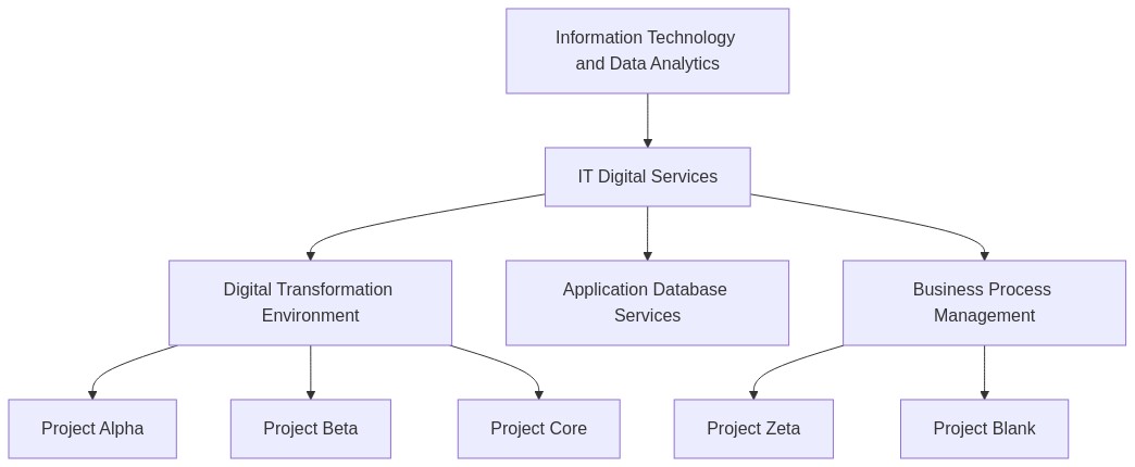
Looking at this organization chart, we assumed our test participants would have no trouble creating this structure in a test environment.
Sadly, this was not the case:
- Five test participants could not complete the task in 30 minutes.
- One confused the difference between Groups versus Projects but could (inaccurately) recreate the structure in GitLab in approximately 3 minutes.
- Only one person was able to complete the task accurately in around 3 minutes.
Observations
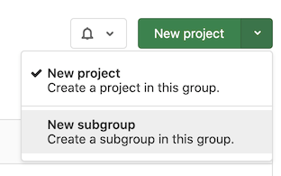
The primary problem we found was that our participants could not find a way to create a subgroup. Success depended on creating subgroups, but the button to create a new subgroup was not easily discoverable. The participant would have to go into exploratory mode and click to see what was in the 'New project' dropdown to find it. This problem with button dropdowns and primary action discovery also occurred within the Comment button in Merge Requests.
The second observation was that the user experience and logic of building an organizational system are not intuitive for new users.
Participants expected:
- A more graphical user experience with interactive boxes and lines
- A way to perform the task through the command line
- A way to import the org structure from another system
Participants could not determine the difference between a group or a project or how they were related. There was no visual indicator of what the difference was or what features related to Groups or Projects.
Solution proposals
For an initial recommendation to address the confusion, we wanted to separate the primary dropdown button.
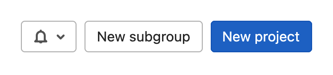
Hiding features under dropdowns assumes the users understand they can access additional actions if they click the button's dropdown area. As well, two disparate interface actions shouldn't juxtapose if they have no direct relationship.
We assumed that we could split up this button into two for an MVC and have better results. After another round of testing, we were able to achieve far better results. Our test participants completed the task of creating the group and project structure quickly and found the task easy to complete.
This one simple trick
By breaking apart the 'New project' and 'New group' buttons, we could make the 'New group' action discoverable. After we made this change, participants had no trouble interpreting the scenario and executing the task within 5 minutes.
Next steps
Currently, we are looking at how we can improve sharing groups and features. We want to remove the barrier between groups and projects. We believe that this will help with some of the problems users have with sharing across groups, and they will be able to take advantage of features that provide them with a more connected set of groups. This change will also improve our information architecture by reducing the confusion around how objects are connected, making navigation and cross-team sharing easier in the future.