
Have you ever pressed the close door button on the elevator, in the hope that you'll save a few precious seconds? Or got frustrated at the person stood next to you at the cross-walk, neglecting to press the button? Well, maybe they know something you don't, or perhaps you know this already. Many buttons in our society lie to us. David McRaney dubbed these, "Placebo buttons" and they're everywhere. Those elevator doors won't close any faster and the cross-walk button has no effect on the lights. The only lights they control are the lights on the buttons themselves. They give you the feedback you crave, but that's all they're doing.
These placebos aren't constrained to the physical world, they're prevalent in UI design too. From literal placebo buttons like YouTube's downvote, to more subtle effects like Instagram always pretending to work, or progress bars that have a fixed animation. They're everywhere if you know where to look.
At GitLab, we created a placebo of our own in one of our core features; the pipeline graph.
Those of you who have used our pipeline graph, will be familiar with its appearance. There's a series of jobs, grouped by stages, connected by a series of lines depicting the relationships between the jobs. But these lines might be lying to you. These lines are indiscriminately drawn between each job in a stage, regardless of their relationship. These lines are placebos.
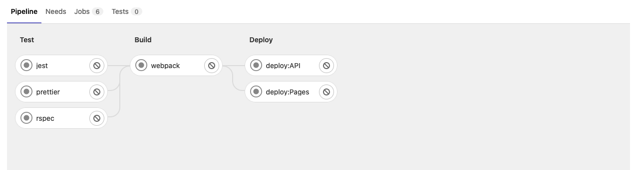
This wasn't a problem to begin with. A basic pipeline has several jobs across a handful of stages. Jobs in each stage would run parallel to each other, but each stage would run sequentially. In the image shown above, all the jobs in the test stage would trigger at the same time. Once those jobs had finished, all the jobs in the build stage would trigger. We used rudimentary CSS to draw lines connecting each job in one stage to each job in the next. These lines weren't calculated based on their connections, but still reflected the story they were telling.
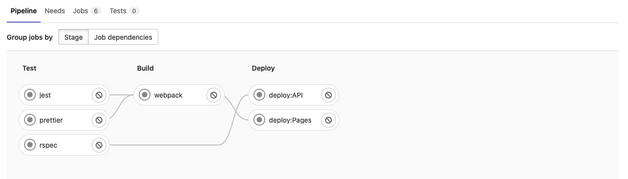
Since the introduction of needs relationships in v12.2, pipelines got a bit more complicated.
Now you could configure a job in a later stage to trigger as soon as a job in an earlier stage completed.
Looking at our old example, we could set the API deployment to run as soon as our spec tests passed.
This skips the remaining tests and the entire build stage, turning our lines into pretty little liars.
We had many internal discussions about these lines, and how to show the relationships between jobs.
There's the needs visualization, which does an excellent job of displaying these relationships, but the main pipeline graph was still inaccurate.
For the past few months, we've been refactoring the pipeline graph, giving it a new lease of life and fixing some of its issues along the way.
One of those issues were the faked lines.
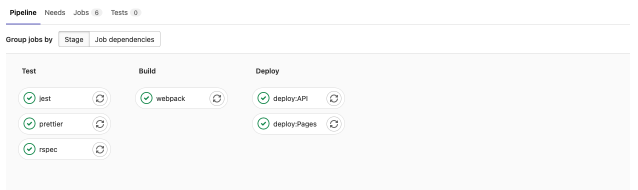
In the new version, we can accurately draw lines between jobs.
Lines that actually depict the relationships jobs have with each other.
Now the lines no-longer lie!
The above image shows an unreleased version of the pipeline graph.
You can see the lines drawn between the jobs to show that the deploy:API job can start as soon as the rspec job is successful.
Something the old lines (shown earlier in this post) would have been unable to depict.
One unfortunate downside of this is that these lines can be quite expensive to calculate. They're actual DOM nodes, drawn deliberately and placed precisely. On smaller graphs this isn't a problem, but some of our initial tests have found pipelines with a potential 8000+ job connections. That kind of calculation would grind the browser to a halt, and nobody wants that.
At GitLab, we believe in boring solutions. We make the simple change that sets us on the path towards where we want to be. Ship it, get feedback, and iterate. So that's what we did. In the first phase of this rollout, we shipped the new pipeline graph with no lines connecting the jobs. We don't have to worry about the expensive calculations, and we still get to roll out the refactored pipeline graph.
We know some of you will miss them, but fear not. Boring solutions are just technical debt if you don't iterate on them. So the improved lines are coming in a future release, along with several other improvements to the pipeline graph. We're already starting to roll out the new Job Dependencies view which shows the jobs in a (much closer to) execution order. Stay tuned for more updates, and watch Sarah Groff Hennigh Palermo's talk for the technical side of this effort and a deeper dive into some of the decisions we made.