
Deciding on the look and feel of a new home is already challenging. The level of complexity grows even more when ideas involve altering the underlying structure itself. Every decision you make affects the feasibility of future changes. Choosing what is best can be subjective, even when rooted in the realities of physics and mathematics. Now imagine millions of people using this house, each with unique requirements. That gives you an idea of how it feels to update the navigation experience of GitLab. Picking a fork in the road means it won't be perfect for every user, but it needs to work well for the vast majority.
We'll share how our design process ideated through each solution to make a vision into reality.
Dreaming of a new home
You might dream of an extra bedroom, an open kitchen, or more efficient use of space. Regardless, it all starts with a vision of what comes next. In our release post, we shared how our North Star vision drove our direction. We used these themes to focus on the meaningful foundational elements as we explored new concepts. We built our design assumptions around these themes before filling out user interface elements.
Theme 1: Minimize the feeling of being overwhelmed
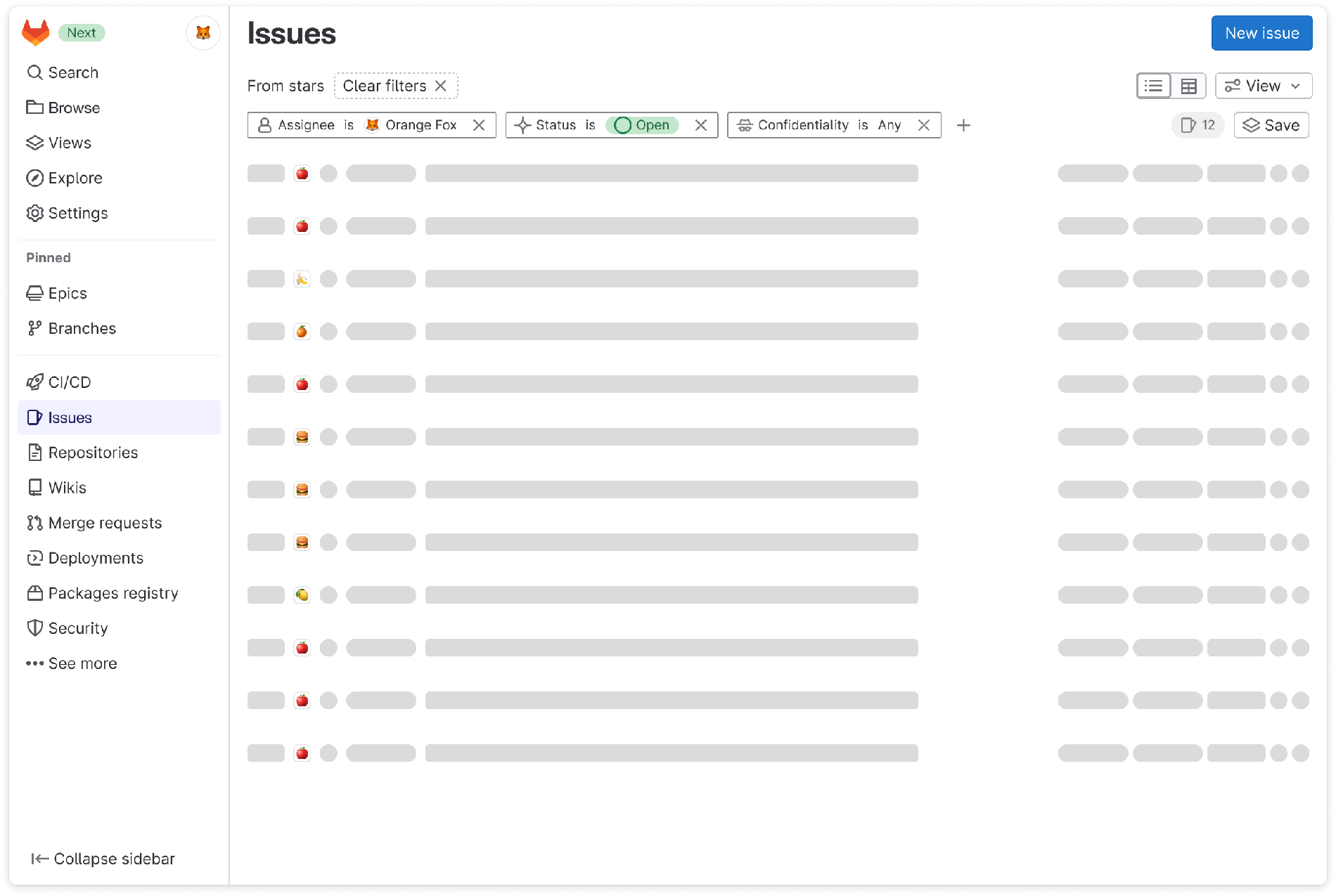
The project and group left sidebars have been growing. Features were in different places and often required users to search for the page they needed. We started addressing these issues in the following ways:
- Reorganize page elements into consistent collections across groups and projects to reduce confusion.
- Start everyone with sensible defaults for a baseline that accommodates most user needs.
- Provide customizable options in the left sidebar which could reduce discovery time in the future.
- Give back screen real estate so the focus remains on the page content and task.
Theme 2: Orient users across the platform
It could be difficult for a user to know where they were inside GitLab. Landmark clues like sidebars, breadcrumbs, and page titles weren't consistent and occasionally were missing. Without these wayfinding cues, jumping from one task to the next was challenging if the next thing wasn't directly in front of the user. To give a sense of place, we:
- Show the pages specific to a given context by displaying all available options in the left sidebar.
- Fix breadcrumbs at the top of the window to help users retain their context even when scrolling.
Theme 3: Allow users to pick up where they left off easily
There can be a lot going on at one time in GitLab, so it can be hard to know what to do next. It should feel natural to transition into GitLab and get started. Helping users transition means we must:
- Make it clear that the homepage of GitLab can redirect anyone to their next task.
- Keep things familiar so that anyone will feel right at home.
- Reduce the number of page visits required to jump between tasks.
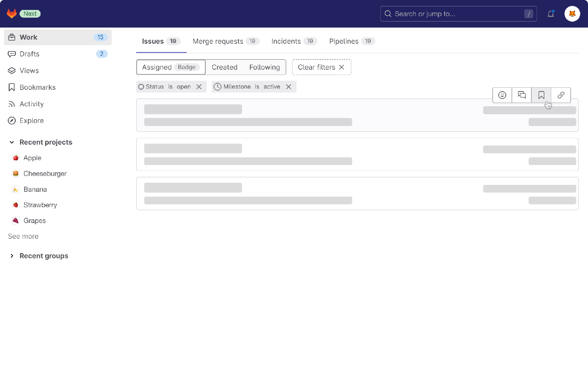
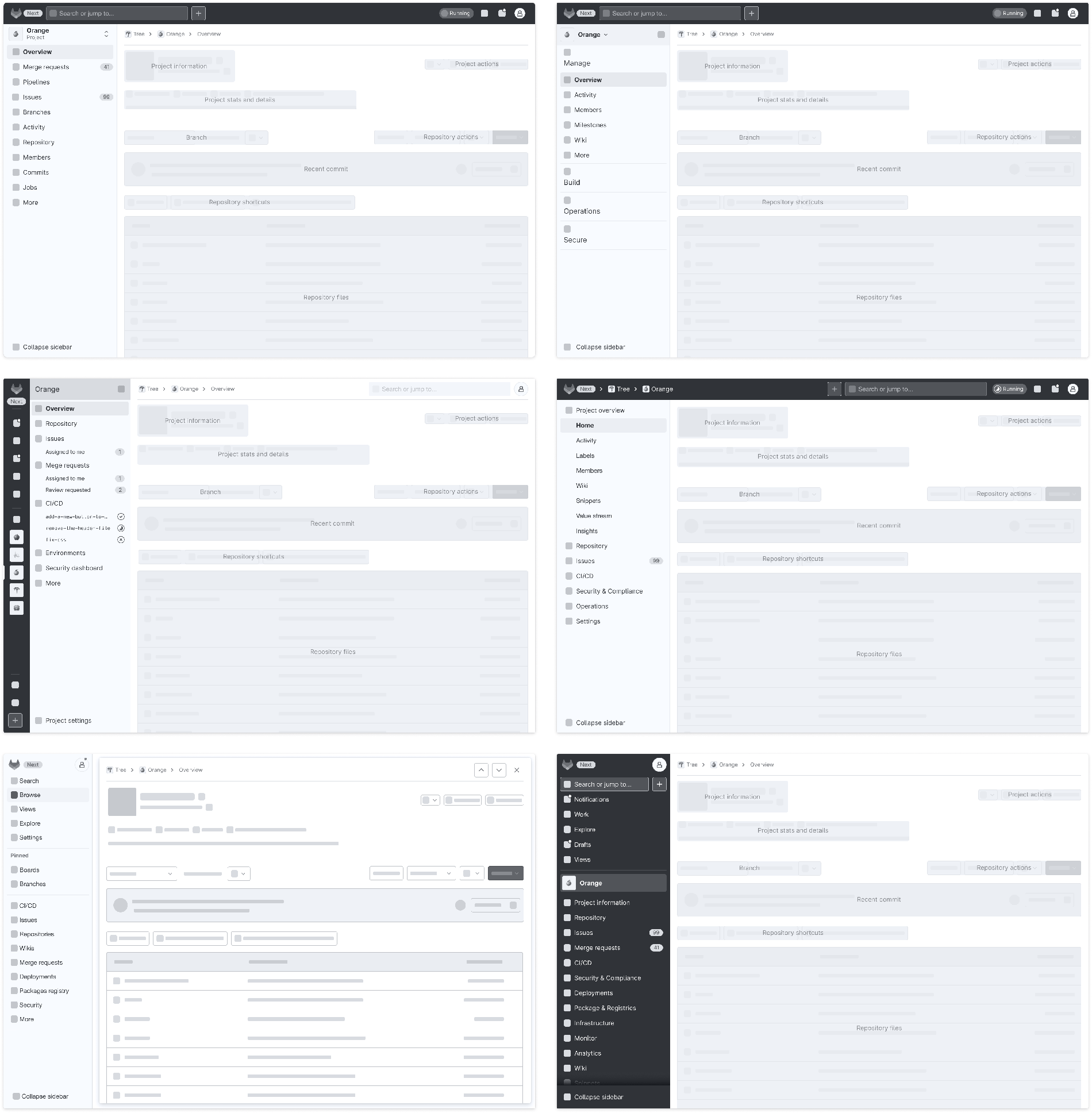
Visualizing the navigation layout
It's helpful to envision how you would use each room in a house before pulling it all together. We started by visualizing five different concepts, and each idea explores a unique design choice to address our assumptions.
| Idea 1: Minimal features on display |
|---|
| There are so many features that could appear in the sidebar. How might it feel to only show a select number of them? |
 |
| Idea 2: Fewer collections to choose from |
|---|
| Organizing features into distinct collections mitigates growth but impacts discovery time. Would it be simpler to search through only a few options? |
 |
| Idea 3: Sidebar broken into multiple layers |
|---|
| GitLab can feel relatively flat in its structure, but it is far more complex than that. How might we use distinct layers in the sidebar to aid navigation around the platform? |
 |
| Idea 4: Breadcrumb navigation |
|---|
| Breadcrumbs are a familiar pattern for distinguishing locations. If the breadcrumb were more prominent, how would it impact awareness? |
 |
| Idea 5: Static navigation elements |
|---|
| The sidebar has always been specific to the context. How would making the sidebar consistent across all screens impact user mental models? |
 |
Exploring multiple ideas let us evaluate different design decisions before settling on a final plan. We created a baseline across all the concepts, exposed them to others for feedback, and tested them against a set of standardized tasks:
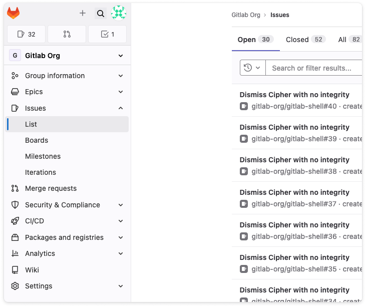
- Task 1: Where would you go to see all issues for a project?
- Task 2: How would you create an epic in a group?
- Task 3: Imagine you started writing a comment and had to navigate away to address something else. Where would you go to find that comment?
Two of the concepts felt easier to use and didn't require relearning. Both of these concepts build on familiar user flows. The other four proposals were overwhelming. The breadcrumb, collapse sidebar button, search bar, and pinned section were elements universally appreciated.
Making tough choices
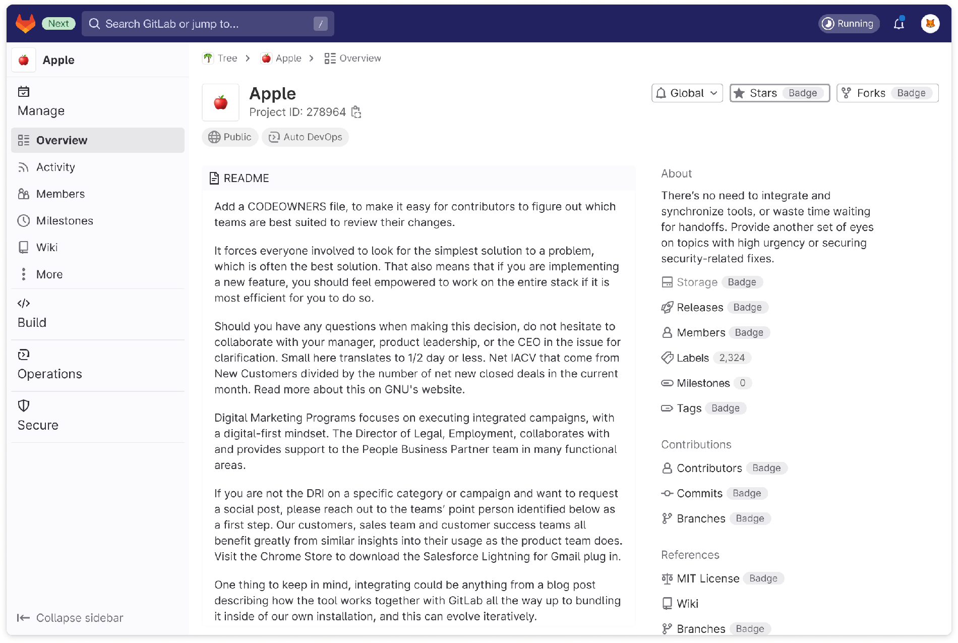
These insights left us with one lingering question. Should we split the navigation across a top and left bar or move it all into one sidebar? We were down to two unique layouts but torn on which worked best. We had similar concepts with a few visual differences, but the key differentiator was the layout. So we devised a research plan with tasks specific to each user persona to observe how these participants adapted to these new concepts.
| Codename: Element Reswizzle | Codename: Super Sidebar |
|---|---|
 |
 |
 |
 |
We learned from our testing that the Super Sidebar was preferred as it allowed for more intuitive navigation between projects without losing context. Super Sidebar supported mature and new GitLab users better in their most common workflows. In comparison, only mature GitLab users found the Element Reswizzle easier. However, the Element Reswizzle offered elements, like icons and tool tips, that users would like to see included in Super Sidebar.
We chose to iterate and use the layout of the Super Sidebar while including aspects that were useful from Element Reswizzle.
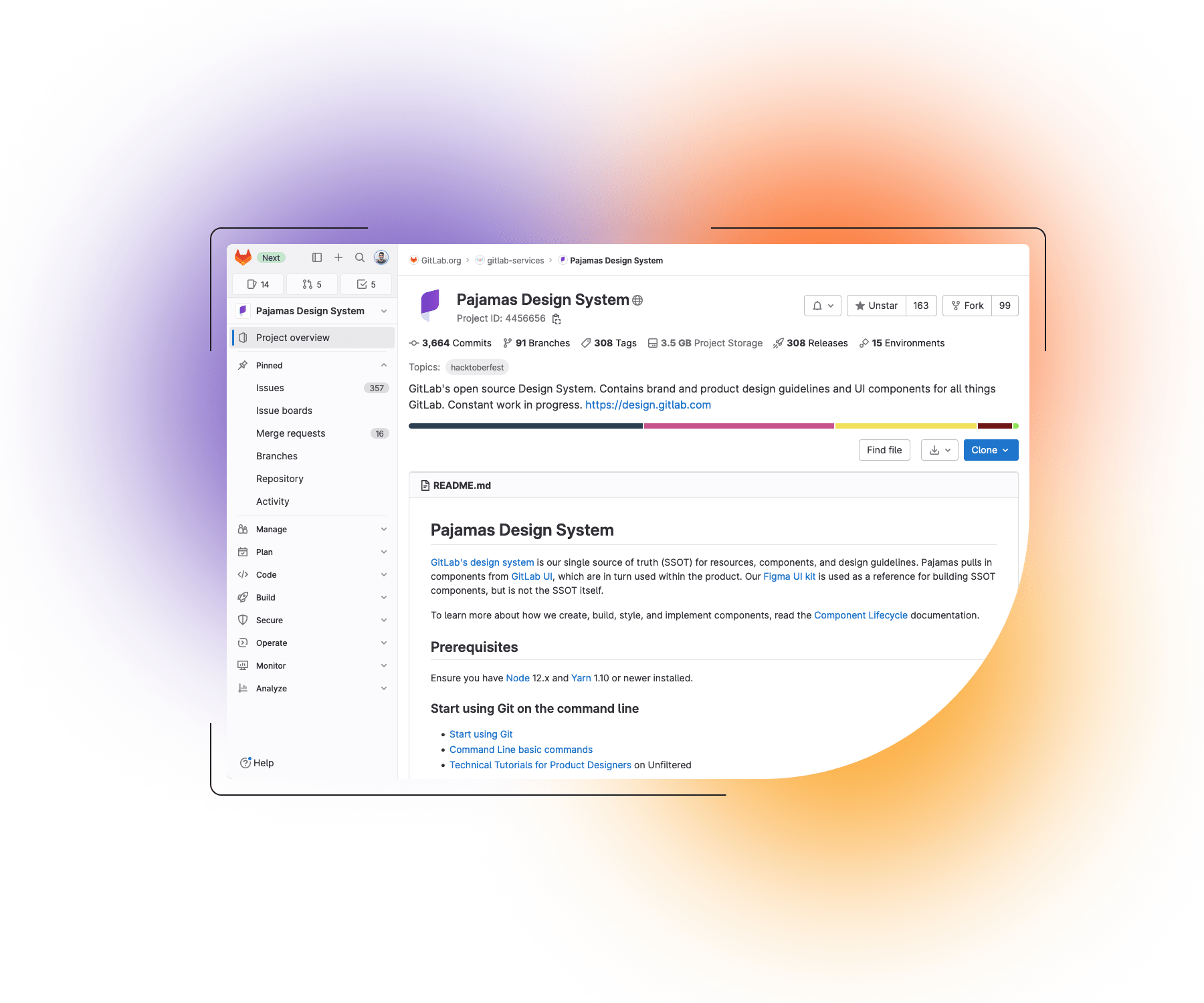
Planning the big move
We had tackled the big questions around the scaffolding but hadn't solidified the specifics. We also needed to define color choices, font size and weight, spacing, alignment, icon options, organization of items, and placement of features. The finer details must work seamlessly and feel right, or the scaffolding around the product will fail to demonstrate its value due to a mediocre user experience. We created an epic to house all the work we'd try to accomplish before overhauling the core navigation experience.
Pouring the foundation
Each milestone brought new design challenges and trade-off decision-making. We knew the direction, but it was impossible to change everything in a single milestone. We wanted to ensure the navigation was functional first because the structure is what we were most concerned about getting right.
We first added critical contexts like your work, groups, and projects while unpacking the rest of the feature set. Focusing on the foundation first allowed us to get a sense of the flow of our new house before settling in.
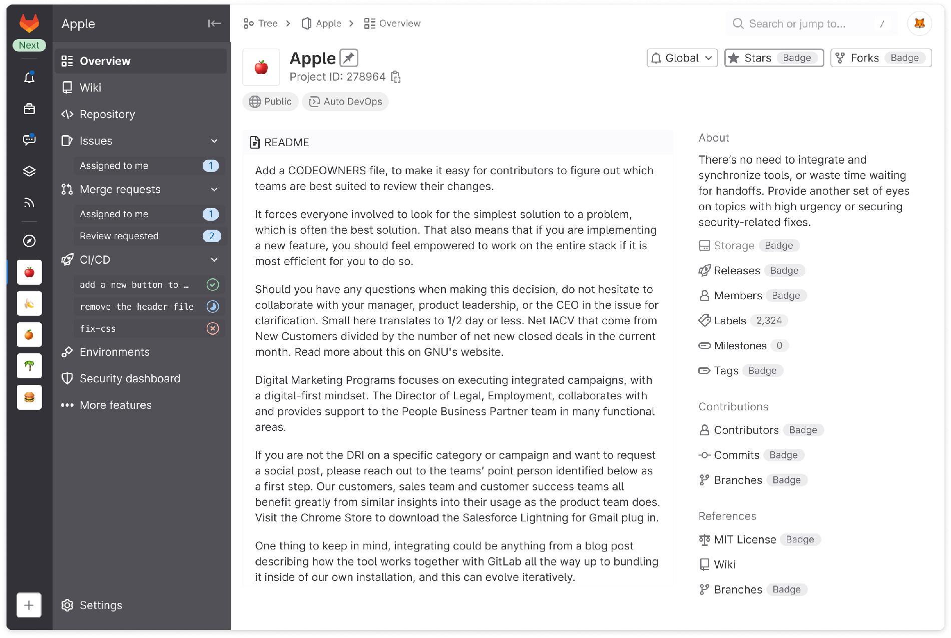
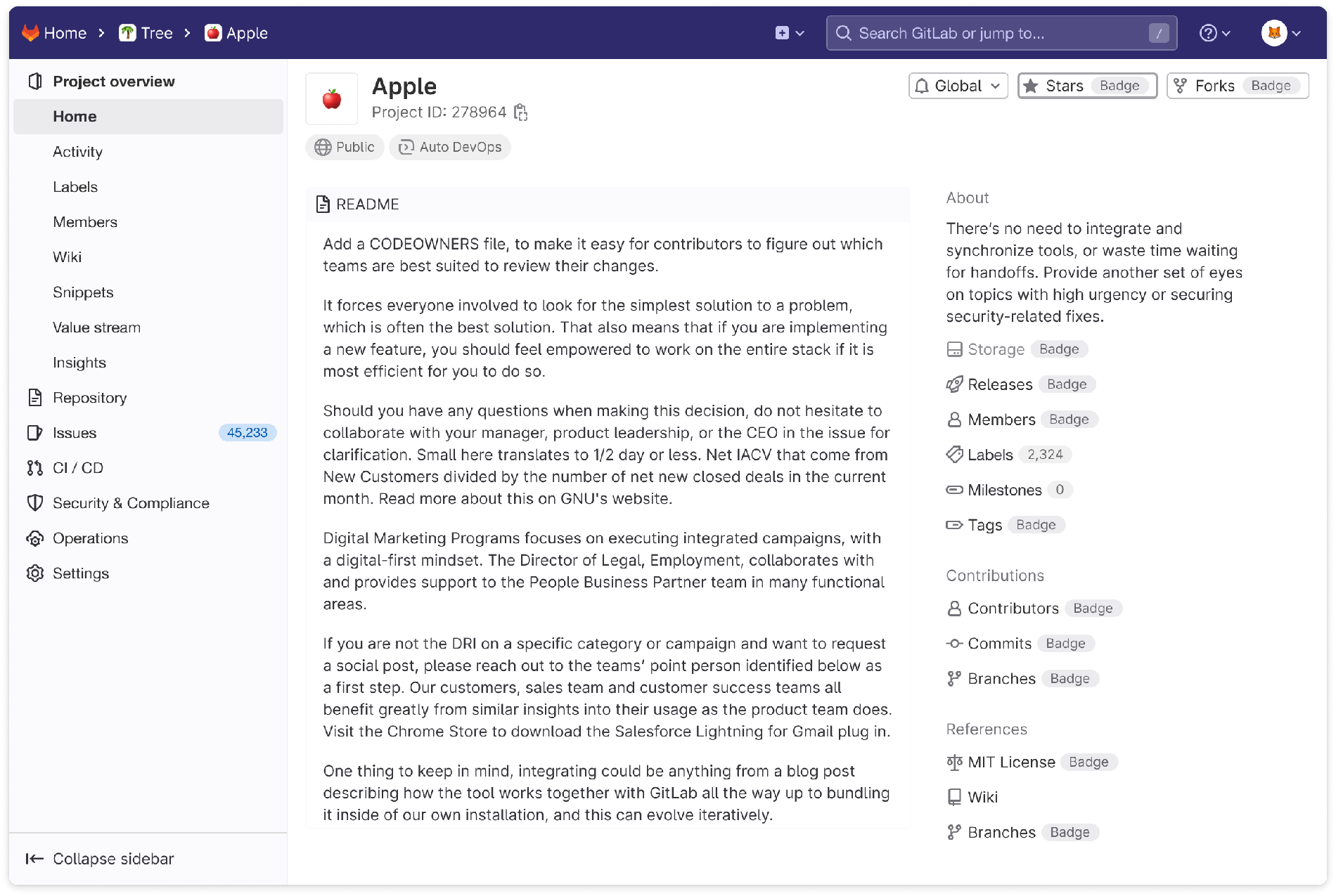
We had team members start trying out an alpha experience early on. Some things might seem right in a design but feel off once in production. An example of this is how users switch contexts. Initially, we created a method built into the navigation sidebar but discovered it was confusing.
"I wouldn't expect the rest of the nav to disappear when I uncollapse the project view. I would expect it to push the other content down rather than taking over all content in the panel." - comment from our feedback issue
| Before | After |
|---|---|
 |
 |
We pivoted by adding more layering with dropdown disclosure to give a sense of movement. It's not the perfect solution, but it's a good iteration that holds us over until we can design a better experience.
Getting ready to show
Honing the navigation will take numerous rounds of feedback, several more iterations, and plenty of patience. A home is never quite finished neither is the navigation of a platform like GitLab. Before the 16.0 release, we focused on squeezing in as many UX improvements and bug fixes as possible to improve upon our prior iterations. This has brought us to a navigation experience that works beautifully. We are excited to share it with everyone. We are confident that GitLab will become more usable and beloved with each new milestone. Try out the overhauled navigation experience today, and share your thoughts with us in our feedback issue.


