Soon, we’ll be launching an entirely redesigned navigation in the GitLab product that is based on feedback from users. We’re both excited and a little nervous because navigation is so critical to every user’s workflow. That’s why we made a thoughtful shift in our iteration strategy, taking extra time and intention to develop a new and refined vision. We'd like to share a peek into how we ended up where we did and why we are so excited for our new design!
We had to invest in the right user experience
Because it has such an obvious impact on user experience, a navigation overhaul is no small feat. That’s why we fully funded a team to work exclusively on navigation, and provided the time and space to create the best experience possible. During the past year, we put a big focus on design ideation and UX research. It was a lot of work, but we believe this level of user focus has really paid off.
Backed by our amazing design and product leadership team, we put much of our focus on the new navigation for more than nine months while we designed and tested it with end users.
In this blog post, we’ll share insights on our process, what we learned, and our vision for the future.
Predicting what users will need
When we first started to think about how to redesign our navigation, the challenge seemed overwhelming. How do we know how to make the best decisions for our navigation? How can anyone know which design or solution is right?
We did not want to make users unhappy for even a short period of time. At GitLab, we have 15 user personas, incredibly savvy users, and so many different workflows. We had to consider opinions that were not present in our backlog. For example, our power users can be very verbose in issues, but new users are not.
It is a huge undertaking to get to this kind of understanding and know what is right. Time pressure and needing to ship quickly could have made this type of work impossible at this scale.
Thankfully, our team dedicated to navigation was amazing. They invested time to reveal our users' key pain points with navigation, which set the litmus test by which we could evaluate every mockup and solution.
Establishing a north star
Before we wrote a line of code or started planning, we did a crucial piece of alignment to know our goals. Our design team led us in a north star exercise where we examined every piece of System Usability Score (SUS) feedback we had received on navigation.
We coded this feedback and three themes emerged. We needed to:
- minimize feelings of being overwhelmed
- orient users across the platform
- allow users to pick up where they left off easily
This north star was amazing for understanding the problem and how to proceed. We learned a lot about what our users’ pain points are and what our users struggle with daily.
Thankfully, this also helped us remove the dread of trying to ship something with the impossible goal of being all things to all people as we could now test these three themes with any persona.
We applied the themes to every design validation effort that we conducted with users moving forward. Our UX Research team also conducted interviews to understand how users felt about these specific themes. It felt incredible to have these insights available right from the start. It was also empowering to let some of the noise go to focus more clearly on what matters and what would move us forward.
Shifting our perspective on iteration for the right user experience
GitLab is amazing at iteration, and lately, we’ve been raising the bar on the quality of our MVCs and definition of done with the goal of not degrading the current user experience. For navigation, we took this extra seriously, with the intention of protecting every part of the navigation experience.
As we reviewed the history of many iterative navigation updates over the past five years, we could see that there was very little overall consistency in the code and in the intention of the updates. This is what happens at fast-moving startups, and it can be ok for a period of time, but at some point, it's necessary to take a pause to strip things back for a meaningful change. The small iterations over time gave us an indication of pain points overall, and we needed a thoughtful plan to proceed.
We decided that anything we change in this new navigation should not degrade a user’s core workflow. We would first hit a baseline for what currently exists in navigation and then make meaningful updates. We agreed that anything we ship after our Alpha had to be fully usable by our own team. We didn’t want users to feel like we’d moved backward or that they had lost functionality in this next phase.
So, while we have some exciting features planned for the future, we won’t take action on them until we fully refine the core features and address user feedback.
Iterations now and vision for the next year
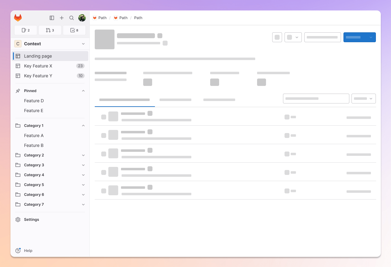
While holding the baseline promise of no degradation in the new navigation, we did find opportunities to ship small iterations to our current navigation since January. First, we shipped a new navigation called “Your Work” and second, we shipped a new “Explore” menu to all users. Those menus are central to our new navigation vision, but they improved the legacy navigation, too.
After launch, we can’t wait to improve even further with more customizable navigation experiences like allowing pins on Your Work and seamless integration with search, command line, and keyboard use. We also have ideas on how to add better landing pages that make life more custom in GitLab, and we couldn’t do that without this new navigation.
No one likes a navigation re-design
All that said, we know that no one actually likes a navigation redesign, even if it is best in the long run. Core workflows are ingrained muscle memory that no one wants to mess with if possible.
That’s why we are releasing our new navigation with a built-in on/off switch. With this approach, you can gradually move to the new navigation by switching back and forth for a little while, as needed.
Our hope is that you’ll take a similar approach and share your feedback along the way, too. We want to hear about your experiences, so please be honest and your feedback will help us iterate.
What to expect for rollout
We are proud of our vision for a new navigation! Over the next few months, our new navigation will be available via an opt-in process in the user profile menu, and we'd love your feedback. Watch our Twitter, upcoming release posts, and our direction page for more information!