Anyone who uses GitLab knows how extensively we use icons in our product. Because information density is high and screen real estate is at a premium, we use them for everything from indicating status and critical actions to navigation and label clarity. In short, icons have a comparatively large impact for such a visually small UI element.
In traditional product development, it’s common to incrementally update features and functionality, and then save visual updates for major version bumps or larger brand updates. But we already had a collection of issues (the medium for collaborating on ideas and planning work in GitLab) telling us change was needed, so we wanted to address that without the dependency of a new version or brand update spurring us on.
True to GitLab fashion, this meant we could exercise our efficiency value with a minimum viable change (MVC) approach – iteratively making visual updates while providing continuous improvement.
Minimum viable change
At GitLab, we’re comfortable iterating and releasing designs similar to how our development counterparts iterate on functionality. We still research and test our solutions, but we have the freedom to quickly learn and iterate because of our constant exposure to real use. Our end goal is always to have a beautiful, guiding, and functional interface.
At the time of this writing, we have 277 custom SVG icons in our library. There are also more than 800 instances of FontAwesome icons in the product. We reference icons in HAML, HTML, JavaScript, Ruby, and Vue. A wholesale change to use a new set of custom icons across the entire product would be a massive undertaking. Incremental changes are a must.
As it turns out, one of our weaknesses is also a strength. With our UI already mixing icons from two different sources and two different styles, we can concern ourselves less with near-term differences and instead focus on making the right changes moving forward.
 A row in the Pipelines section that contains SVG and FontAwesome icons.
Laying the foundation
One of our values is to create a distinct GitLab personality that is strong and consistent. Iconography offers a powerful visual cue to users and should reflect our particular sense of style. (This is the opening statement in our new iconography documentation.)
We decided that the MVC with the greatest initial impact was updating the icon documentation itself. To reflect the promise of a strong and consistent presence within the product, we had to offer docs that would help fix problems in meaningful and sustainable ways.
To be sure we were iterating in the right direction, we established guidelines that considered the entire icon ecosystem, but still allowed us to make quick changes. At the same time, we also overhauled our iconography documentation to make icon updates and creation as self-help as possible.
Guidelines
- Each icon must have a clear meaning or metaphor in context.
- SVGs are optimized for performance and accessibility.
- Visual changes are minor first, only updating to align with new documentation.
- A change in metaphor requires validation and/or usability testing.
- Icons are categorized in Sketch for easier use.
- Unused icons are deprecated.
- Icons are added only when existing ones can’t be used.
One of our values is to create a distinct GitLab personality that is strong and consistent. Iconography is a powerful visual cue to the user and should reflect our particular sense of style.
With directional guidelines and documentation in place, we turned to specific constraints that we could leverage in practice.
Embracing constraints
Who doesn’t love a good set of constraints? We definitely have some.
Perhaps the largest (pun intended), was the small 16×16 pixel grid used for each icon. We wanted to use a fairly common 24×24 pixel grid with strokes set to 2 pixels, so that we could include more fidelity in each icon, scale more freely, and stay within our base-8 pixel grid. When scaled down to our most common size (16 pixels), the strokes would effectively be 1.5 pixels, which looks great on a HiDPI screen. It's just enough weight to stand out and not feel too bold, although they’re blurry on standard definition due to the half pixels.
 Examples of visual guidelines from the icon documentation
Our analytics show that many users are still on non-HiDPI screens, and while we wanted to push for a new standard, we weren’t ready to make the leap until a majority of users could experience crisp icons in the UI. So, the best choice was to keep the 16 pixel grid and have crisp icons for all.
Another key constraint was stroke weight. Within an even-pixel grid, a 1 pixel stroke can never be centered and aligned to the pixel grid, so we chose to stick with a 2 pixel stroke weight rather than offset some icons. This meant less room for fidelity in the small space, and as a result we aimed for the least amount of detail that provided the most concept clarity.
By nature, other constraints exist in the documentation that deal primarily with stylistic elements.
The process
Work at GitLab starts with an issue or merge request, so we can tackle things in an efficient, async way. Since there were already many icon issues in existence, we created an epic to collect them and added new issues to it. As common themes emerged, we knew that updating documentation would be the place to start, as it gave us something to point back to for current issues and something to stand on for new work.
Updating nearly 300 icons takes time, so we divided them into separate batches where related groups, like everything associated with documents, were updated at the same time. Even though, at this step, style might differ between groups, we were still consistent within the group itself.
Every batch of icons went through an async group review, where we offered feedback and made adjustments over the course of several days. At the close of the review period, we created a merge request to bring the updates into the SVG library. Then, we could test and evaluate the new icons one last time through a review app before releasing them into production.
In each batch, we added a few new icons and deprecated others. We also released updated versions of our Sketch UI Kit concurrently with the product changes.
Not all icons followed this exact process. For example, concepts like epics and issues are fairly abstract, and we really want to ensure their visual representation is both meaningful and proprietary. There’s an entire subgroup that is just for the status of these, so getting them right is crucial. These icons are currently undergoing three rounds of usability testing, and testing will continue to be an important step in our process.
Early results and next steps
After working through hundreds of icons, five batches of updates, and several rounds of usability testing, reactions thus far have been positive and productive. Here are a few worth noting:
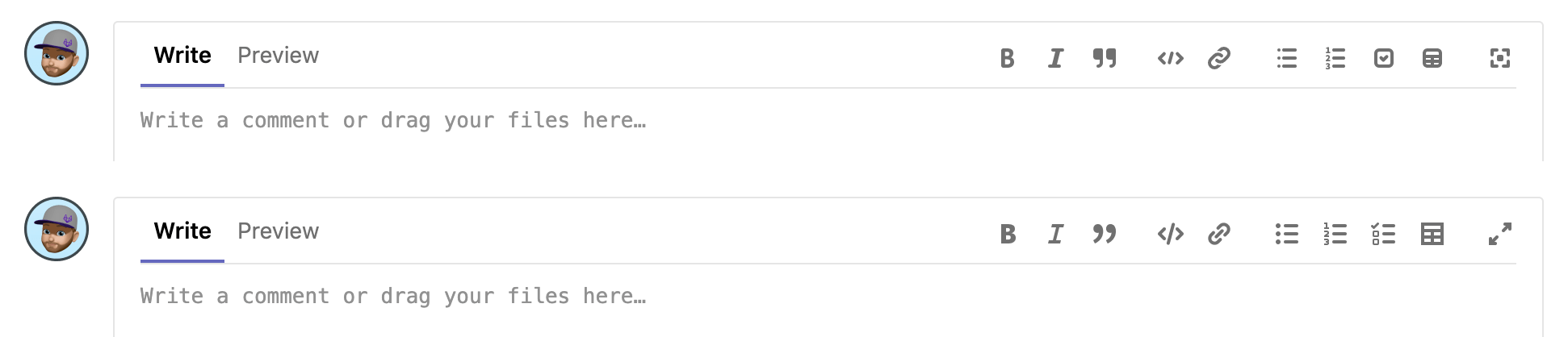
- Several users thought we added a new feature that adds a pre-formatted markdown table in our text editor. The feature has been there for some time, but the previous icon didn’t look enough like a table. If you’ve ever had to manually create a table in markdown, then you know how helpful this feature is. Imagine all the time saved!
- One of our developers created a tool to audit all instances of FontAwesome icons in the product, so that we can better audit changes and replace instances with our SVGs. He also added the ability in our SVG Previewer to view icons in different color schemes, so that we could identify issues (like style or color artifacts) in the SVG code and explore theming.
- Many “is this known” questions are being asked about icons in our Slack channels. This is useful, because they point out where incorrect icons have previously been used and where style differences are too glaring between our SVGs and FontAwesome. That's exciting, because visual updates are helping us prioritize friction in the product caused by icons.
 Before (top) and after of text editor icons
Because this was an MVC, the work isn’t done yet. Here are some things to watch for in the coming months:
- Fewer FontAwesome icons in use, with the end goal of only using our own SVG library.
- Additional grids for specific contexts where scaling icons isn’t ideal.
- Assessing the effectiveness of documentation and adjusting accordingly.
- Evaluating instances where the same icon is used for different actions by considering context and performing usability testing where needed.
- Creating a better and more consistent naming system for icons in Sketch and the SVG library.
- Conducting more usability testing to ensure metaphors bridge cultural or experiential gaps.
Lastly, you can contribute too! If you have anything you’d like us to consider with regard to icons, create a new issue and tag the GitLab UX Department (@gitlab-com/gitlab-ux). Also, if you’d like to be a part of our testing efforts at any level, be sure to sign up for our GitLab First Look program.