
Our policy at GitLab is to dogfood everything – meaning we aren't going to introduce a new product or feature to our DevOps platform before our engineering team tests it out. Sometimes though, the development process happens in reverse: The product and engineering teams need a specific tool or functionality to help us run GitLab better and discover a tool that has the capacity to solve many different customer use cases.
Insights, which is available to GitLab Ultimate users, is an example of such a tool. Insights is a flexible feature of GitLab that allows our users to visualize different trends in workflows, bugs, merge request (MR) throughput, and issue activity that is based upon the underlying labeling system of a group. In this blog post, we'll go in-depth on how and why we built this tool, how we use the tool at GitLab, and explain how to configure Insights for your own projects.
- Why we built Insights
- Labels powers Insights
- How to configure Insights
- How GitLab uses Insights
- Implementing Insights in your instance
Kyle Wiebers, quality engineering manager on Engineering Productivity, gives an overview of how we use Insights at GitLab in the GitLab Unfiltered video embedded below. Watch the video and read the rest of the post to learn all about this exciting new tool we're dogfooding at GitLab.
Why we built Insights
The Engineering Productivity team at GitLab first built Insights to provide an overview of trends in the issue tracker, but soon realized that this technology can be applied in different ways that were beneficial to our needs, and the needs of our users.
"The initial thing was we were interested in when the bugs were being raised: Were they being raised around release time or were they being raised the middle of a phase?" says Mark Fletcher, backend engineer on Engineering Productivity. "Because we did have bugs being created just after release, which led to regressions, which led to patch fixes. So we were just interested in exploring those kinds of trends."
To capture this trend data the Quality Engineering team created the quality dashboard, which was essentially the first iteration of Insights for GitLab. While the quality dashboard showed trends in bugs being raised per release cycle, it also showed how much work was being accomplished over the same period.
"And that's where the scope really changed from looking at issues that are bugs to merge requests and being able to have generic rules based on labels that we can use to align with our workflow," says Kyle.
Why label hygiene matters
The Engineering Productivity team soon realized that a lot of the different trends they were aiming to capture with Insights were powered by labels. Labels allow a GitLab user to categorize epics, issues, and merge requests with descriptive titles such as "bug" or "feature request" and quickly filter based upon category. The label filtering system works inside the issue tracker, and all throughout GitLab, and is a core part of the underlying configuration of Insights.
A good example of an Insights dashboard that is configured by labels and the metadata that underlies issues and merge requests (such as creation date) is the MR throughputs dashboard.
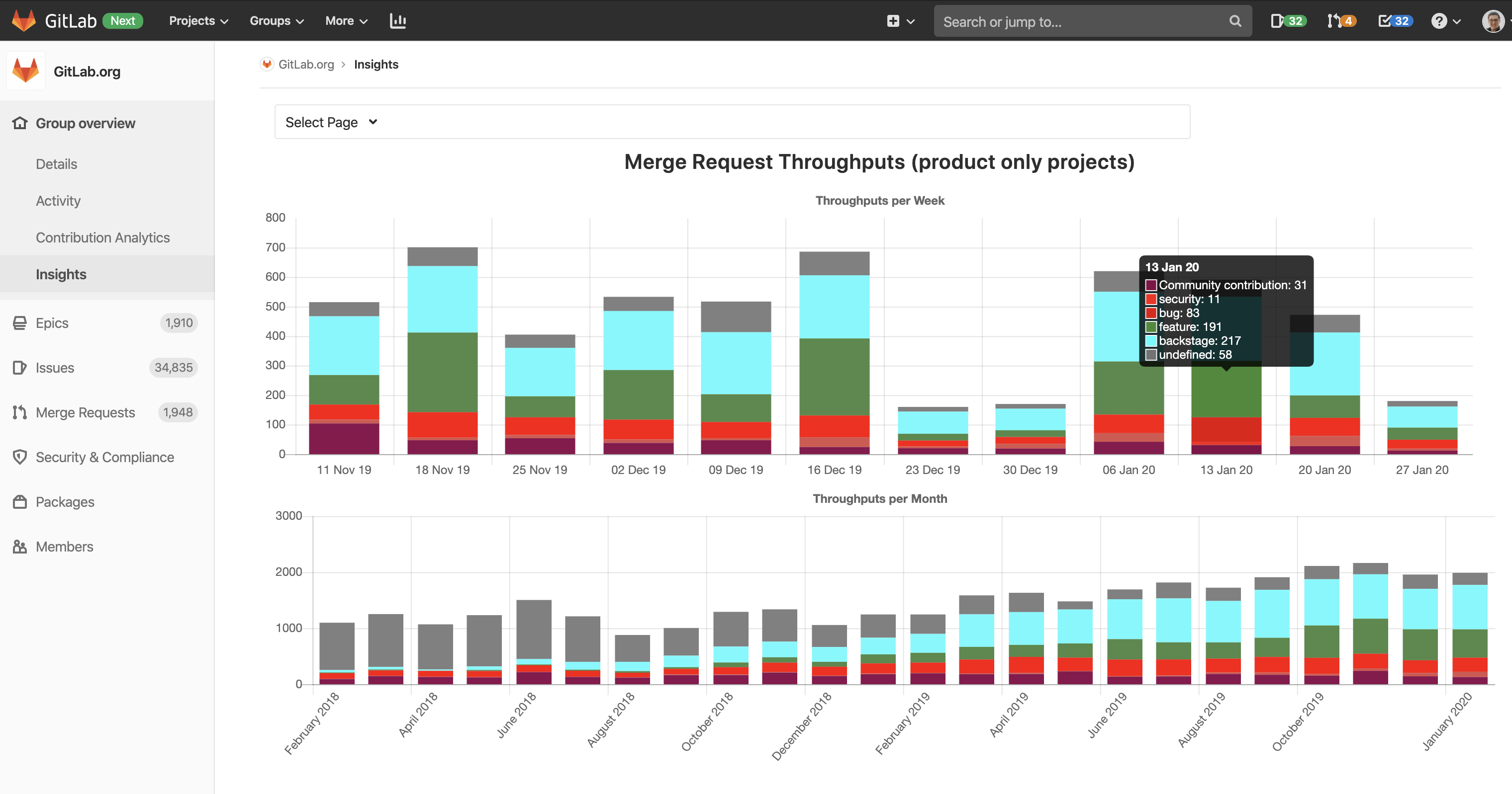 A screenshot of the chart for merge request throughouts at the group level.
The MR throughputs dashboard captures how many MRs are completed during a given week or month to measure our organization's overall performance. It is part of our workflow to assign labels to MRs that help distinguish the type of MR being worked on: feature, bug, community contribution, security, or backstage. This dashboard is configured as a stacked bar chart, which makes it easy to visualize MR throughput by type so we can see the type of work being created over a fixed period of time. The chart is also divided into weekly or monthly views, which helps us see both short- and long-term trends.
"So, we can look at short-term trends and longer-term trends to see: Are we delivering more work? Are we hitting a bottleneck? Are we plateauing? And that allows us to dive a little bit deeper and take corrective action," says Kyle.
Labels help simplify the configuration of dashboards
If you look to the lefthand sidebar of the MR throughputs dashboard, you'll notice that the dashboard is configured at the Gitlab-org group level. The group level of GitLab-org contains all of the projects within GitLab-org and therefore captures all of the MR throughput data across all projects.
The project level is a level below the group level and looks at a specific project contained within a larger group, such as the GitLab project in the GitLab-org group.
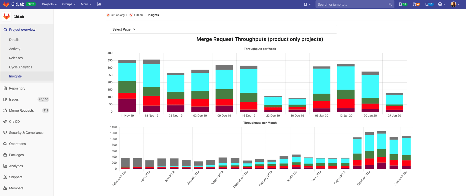 A screenshot of the chart for merge request throughoutputs at the project level.
Any Insights dashboard, including the MR throughputs dashboard, can be filtered at the group level or the project level, but the configuration remains the same regardless of how the dashboard is filtered.
"So everything that's contained within a group, and in our case, it would be the GitLab-org group, you can also have this on a project level," says Kyle. "So if you want to look at Insights on a project, you can configure the same thing on a project. Just for our use case, it made sense to look at MR throughputs across multiple projects versus one specific project."
But in the end, it all comes back to labels. We don't have to configure the Insights dashboard differently for groups and projects because all of our labels at GitLab are set up at the group level and then propagate down to the project level.
One of the characteristics of Insights that makes it such a valuable feature is that the configuration is so flexible. While most customers will use the same labeling system across groups and projects as GitLab does, it is possible to configure the charts separately at the project and group level.
"The scope [of Insights] changed from looking at issues that are bugs to merge requests and being able to have generic rules based on labels that we can use to align with our workflow," says Kyle. "Then that flexibility allows any customers to leverage the same feature based on their own specific workflow or labeling practices."
A user can use Insights on a group or project regardless of the underlying labeling system. They just need to configure the dashboard according to their workflow.
Configuring your Insights dashboard
There are numerous Insights dashboards that are available out of the box or that can be easily configured based on a user's labeling workflow.
All of the Insights dashboards within GitLab are driven by a YAML file. The configuration for each chart includes configuration parameters: title, type, and query.
The query section defines the type of issues and/or merge requests from the issue tracker that will be included in the chart. The parameters for which labels are contained in the chart fall under the query section as well.
"The Insights configuration is actually stored in [one of your project's repositories]. So, it can be changed just like you do any of your code. It can be version-controlled so you can see changes over time. That gives you a lot of value to just ensure that there's very clear traceability into why was this dashboard changed, and when was it changed," says Kyle.
Here is the configuration that underlies the MR throughputs dashboard we looked at extensively in the section above.
throughputs:
  title: Merge Request Throughputs (product only projects)
  charts:
    - title: Throughputs per Week
      type: stacked-bar
      query:
        issuable_type: merge_request
        issuable_state: merged
        collection_labels:
          - Community contribution
          - security
          - bug
          - feature
          - backstage
        group_by: week
        period_limit: 12
    - title: Throughputs per Month
      type: stacked-bar
      query:
        issuable_type: merge_request
        issuable_state: merged
        collection_labels:
          - Community contribution
          - security
          - bug
          - feature
          - backstage
        group_by: month
        period_limit: 24
Explore the Insights YAML file for GitLab to see how we set up some of our other charts.
How we are dogfooding Insights
Insights is most effective at monitoring high-level trends, as well as measuring performance against a specific measurable objective with the aim of taking corrective action. At GitLab, we've been using our Insights technology in different ways to visualize our overall performance or to answer specific questions.
Our Support and Quality Engineering teams at GitLab currently use Insights, but in different ways. By dogfooding the technology here at GitLab, we've found numerous use cases for Insights that could be valuable to our customers.
How our Support team uses Insights
The Support team uses Insights both as an out of the box issue tracking dashboard and as a customized dashboard made possible using automation.
Bugs SLO chart
The Bugs SLO dashboard was created so the Support department and engineering leaders can identify bugs overdue from SLO.
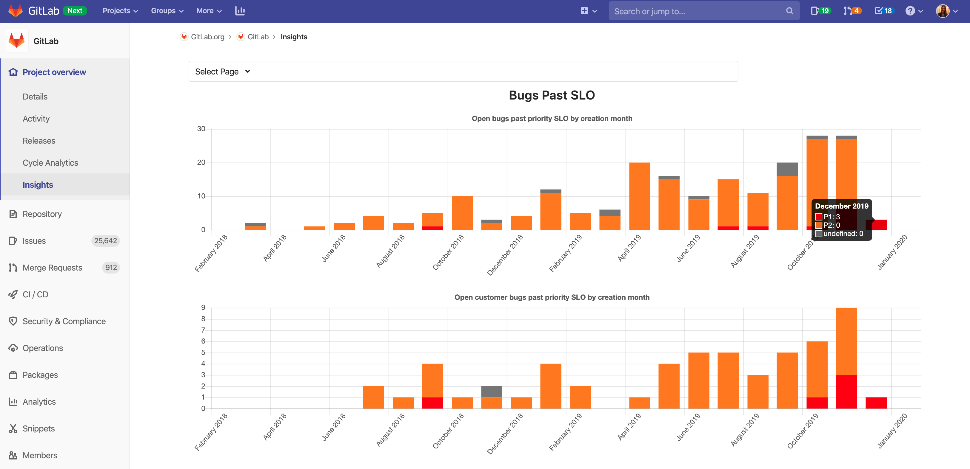 A chart specially configured for the Support team to show how many bugs missed the SLO each month.
The Bugs SLO chart is configured in the GitLab-org group but lives in the GitLab project. The chart pulls open issues pertaining to bugs and customer bugs, that are labeled missed-SLO and groups them by month. We also have a labeling system for categorizing based on priority – P1 bugs are top priority, P2 bugs are second priority.
"This really allows us to, again, look at the trends: Are we improving? Are we getting worse? Do we need to look a little bit deeper here and do a corrective action to help address any problems that we see within the trends that Insights provides?" says Kyle.
Configuration of SLO chart
Here is a peek at what happens inside the YAML file to configure the bugs SLO chart.
bugsPastSLO:
  title: Bugs Past SLO
  charts:
    - title: Open bugs past priority SLO by creation month
      type: stacked-bar
      query:
        issuable_type: issue
        issuable_state: opened
        filter_labels:
          - bug
          - missed-SLO
        collection_labels:
          - P1
          - P2
        group_by: month
        period_limit: 24
    - title: Open customer bugs past priority SLO by creation month
      type: stacked-bar
      query:
        issuable_type: issue
        issuable_state: opened
        filter_labels:
          - bug
          - missed-SLO
          - customer
        collection_labels:
          - P1
          - P2
        group_by: month
        period_limit: 24
Triage helps ensure good label hygiene
For the Bugs SLO chart, we use the GitLab triage project to automatically apply the missed-SLO label to open issues with priority labels that miss the SLO target. We use automation here because the GitLab project is so massive, it would not be feasible to manually apply this label based upon the missed SLO target rules. Insights is flexible enough that either manual labeling or automation can be used on any dashboard.
Support issue tracker
The Support team used one of our out of the box dashboards to see how many Support issues are open and closed per month with the GitLab.com Support Tracker project, which looks at support issues raised by GitLab.com users that don't go through the Support team.
![]() The Support team also uses one of our out of the box dashboards that tracks the number of issues open and closed each month.
The Support team also uses one of our out of the box dashboards that tracks the number of issues open and closed each month.
"This shows that [the dashboard] is quite useful out of the box to just see some visualizations without doing any configuration," says Mark. "These were the charts that we thought would give the most value to a team or to a project without doing any config whatsoever."
How our Quality Engineering team uses Insights
The Quality Engineering team uses Insights to look at opportunities to remedy gaps in a specific project in our EE, as well as to visualize flaky tests on GitLab based on reported issues.
Enterprise Edition testcases chart
One of our more specific use cases is the Enterprise testcases chart. The Quality Engineering department is working to close the gap in testcases in the GitLab Enterprise. The team configured a chart within the testcases project to help visualize how many open and closed test gaps there are, separated by GitLab product area, and GitLab product tier.
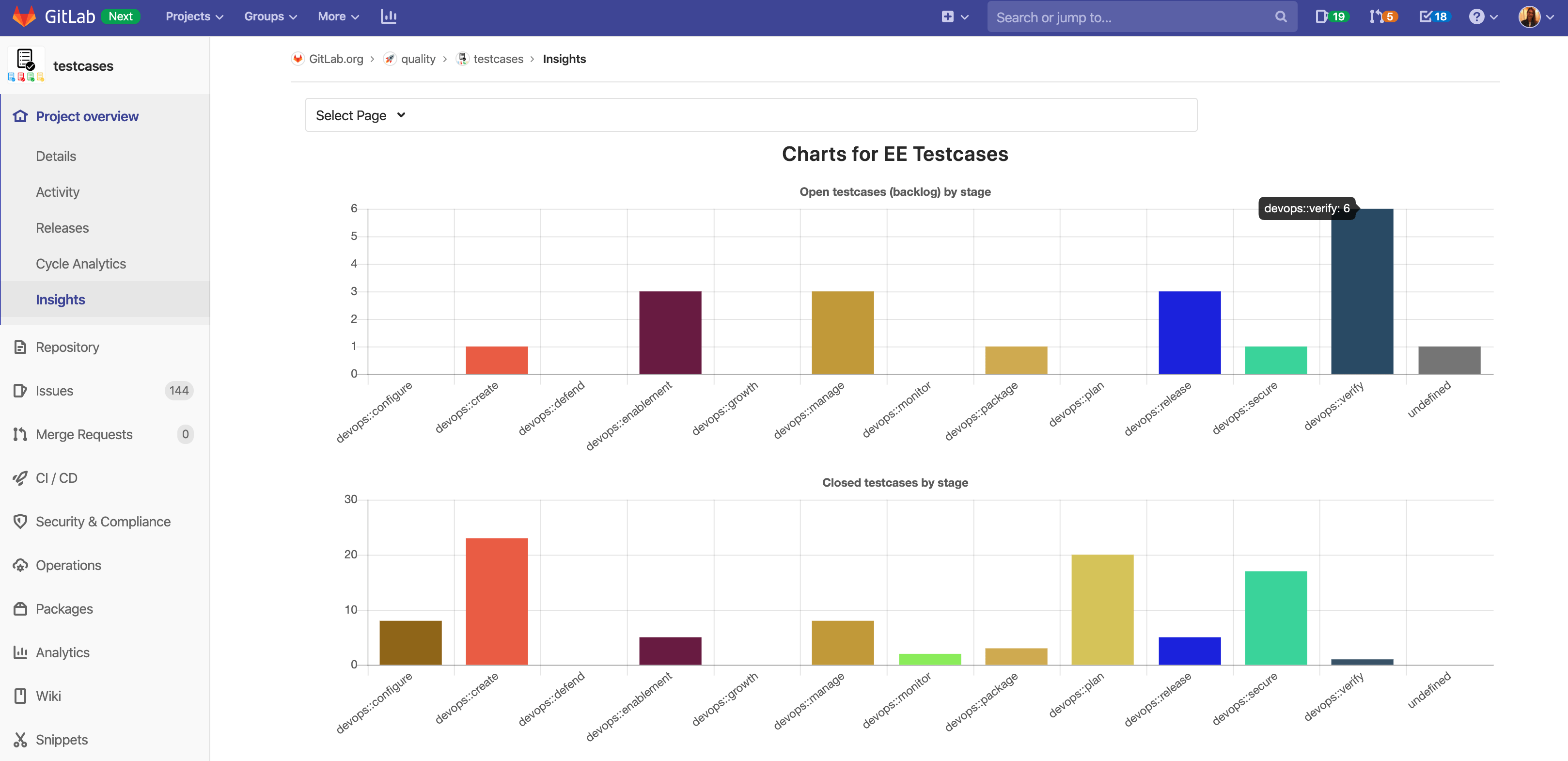 Quality Engineering configured this chart to visualize gaps in testcases on GitLab Enterprise.
"Looking at this chart, we may say, ‘Maybe we should have a few people focus on the gaps in verify because it has the most open testcases at the current point'," says Kyle.
Configuration of EE testcases chart
The EE testcases chart is not something that is available out of the box, but the configuration for the chart is pretty simple nonetheless.
eeTestcasesCharts:
  title: 'Charts for EE Testcases'
  charts:
    - title: Open testcases (backlog) by stage
      type: bar
      query:
        issuable_type: issue
        issuable_state: opened
        filter_labels:
          - "Quality:EE test gaps"
        collection_labels:
          - "devops::configure"
          - "devops::create"
          - "devops::protect"
          - "devops::enablement"
          - "devops::growth"
          - "devops::manage"
          - "devops::monitor"
          - "devops::package"
          - "devops::plan"
          - "devops::release"
          - "devops::secure"
          - "devops::verify"
The configuration shows that this is a bar chart that is looking at open issues with the filter Quality:EE test gaps. The collection labels are what broke the bars out into different columns. While it is possible to illustrate the data in very intricate ways, the underlying schema to configure the chart is actually quite simple, mirroring the process of searching the issue tracker by filtering based on labels.
![]() The issues represented in the EE testcases chart can be searched for by label using the issue tracker in the testcases project.
The issues represented in the EE testcases chart can be searched for by label using the issue tracker in the testcases project.
Opening the issue tracker for the testcases project, you can search by Quality:EE test gaps label, select open issues, to see the actual issues represented by the Insights chart.
The key takeaway: If your team has good label hygiene and a logical workflow, building charts based on Insights should not be particularly challenging.
End-to-end transient failures
The Quality Engineering team monitors how often we have reports of flaky tests in our pipeline by looking at the number of issues created that fit the label schema.
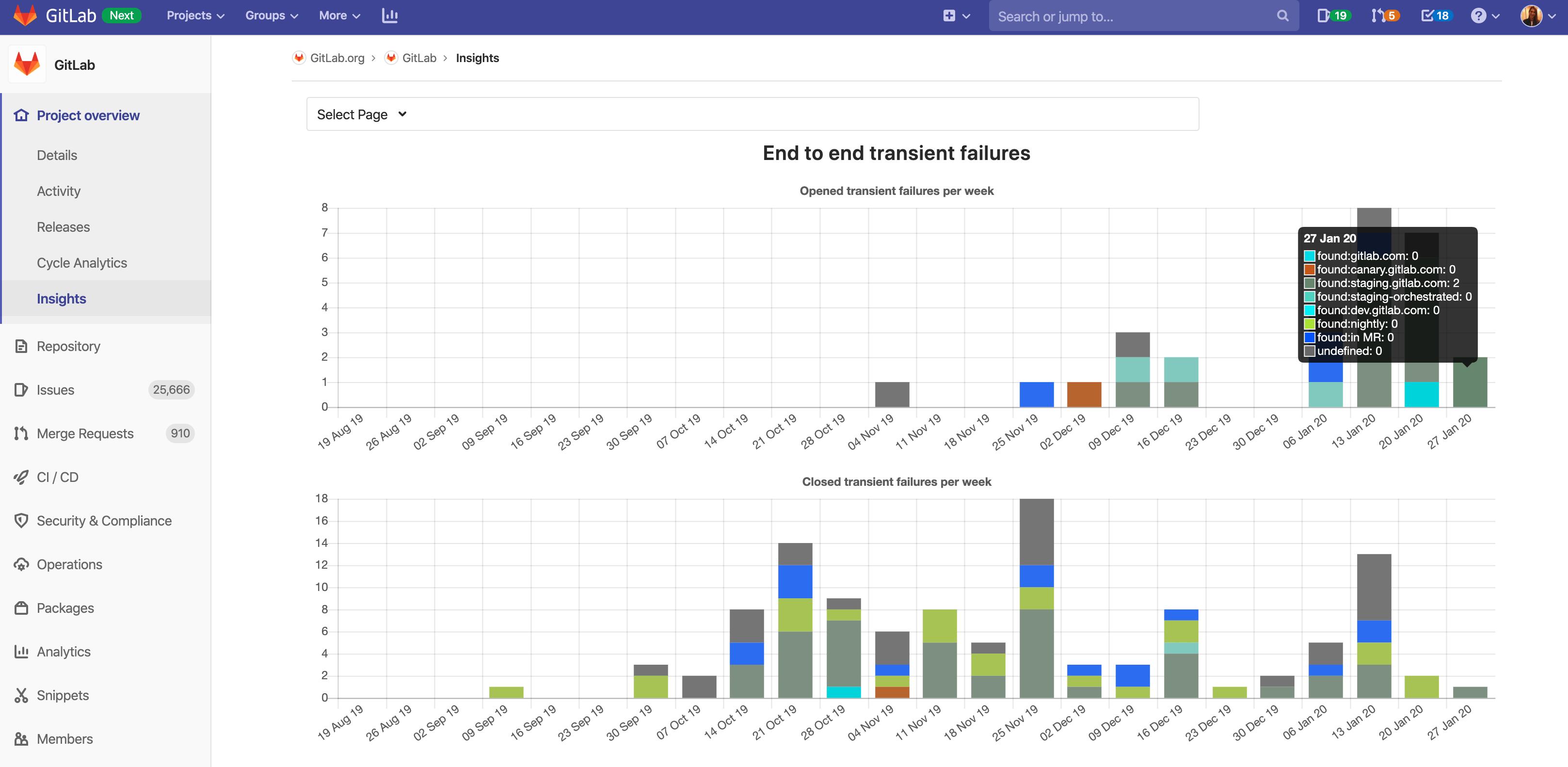 A second chart configured for Quality Engineering is the end-to-end transient failure chart, which looks at flaky tests.
Similar to many of our other charts, this is a stacked bar graph that looks at both open and closed issues on a weekly basis, and the underlying configuration is as you might expect.
transientFailures:
  title: End to end transient failures
  charts:
    - title: Opened transient failures per week
      type: stacked-bar
      query:
        issuable_type: issue
        issuable_state: opened
        filter_labels:
          - "Quality"
          - "QA"
          - "bug"
        collection_labels:
          - "found:gitlab.com"
          - "found:canary.gitlab.com"
          - "found:staging.gitlab.com"
          - "found:staging-orchestrated"
          - "found:dev.gitlab.com"
          - "found:nightly"
          - "found:in MR"
        group_by: week
        period_limit: 24
    - title: Closed transient failures per week
      type: stacked-bar
      query:
        issuable_type: issue
        issuable_state: closed
        filter_labels:
          - "Quality"
          - "QA"
          - "bug"
        collection_labels:
          - "found:gitlab.com"
          - "found:canary.gitlab.com"
          - "found:staging.gitlab.com"
          - "found:staging-orchestrated"
          - "found:dev.gitlab.com"
          - "found:nightly"
          - "found:in MR"
        group_by: week
        period_limit: 24
Implementing Insights for your team
If your team is often pulling data from GitLab through an API or CSV export, and then building charts based on issues and merge request data, then Insights will make your life a lot easier!
Some questions to think about before implementing Insights include: How would you want to categorize the work being done and the issues that are being created? How do you want to monitor the open/close rates on your issues? Also, how do you plan on using labels?
Insights users really need to define their workflows and have a clear idea about how they're using labels. We recommend having some sort of automated mechanism to ensure good label hygiene. GitLab Triage is our open source project that automates labeling of issues on our giant GitLab project and is a good candidate for any organization that has a large backlog of issues.
We recommend users read up more on the issues workflow to learn more about how to use labels and the issue tracker, which is valuable background knowledge to improve your use of Insights.
We've been dogfooding Insights for a time to help iron out any wrinkles in the implementation or application of this technology, but we also want to hear your ideas of how we can make improvements to Insights. Create an issue in the GitLab project issue tracker with the Insights label to share your feedback with us!
Cover photo by Aaron Burden on Unsplash.


