Our new improved free trial signup flow launched in October 2019 and it reduced the number of interactions a user needed to do to complete the process from around 35 to 15. We reduced the time required to sign up and start a trial from more than five minutes to around 2.5 minutes – less than half of the original. Not surprisingly, our free trial signups soon went from around 400 per week to more than 800. This is the journey of three designers battling the complexity that comes with user experiences that weren’t designed holistically but instead grew “organically.”
Discovering the problems
I started working on designing a new user onboarding experience sometime in the second quarter of 2019. The first step I took was to map the existing user journey from when users sign up for GitLab to the end of the existing onboarding. I wanted insight into the mindset of users at the moment they finished signing up for a free trial. We wanted our users to be excited and eager about the onboarding experience. I never expected to find what I did by mapping the current user journey.
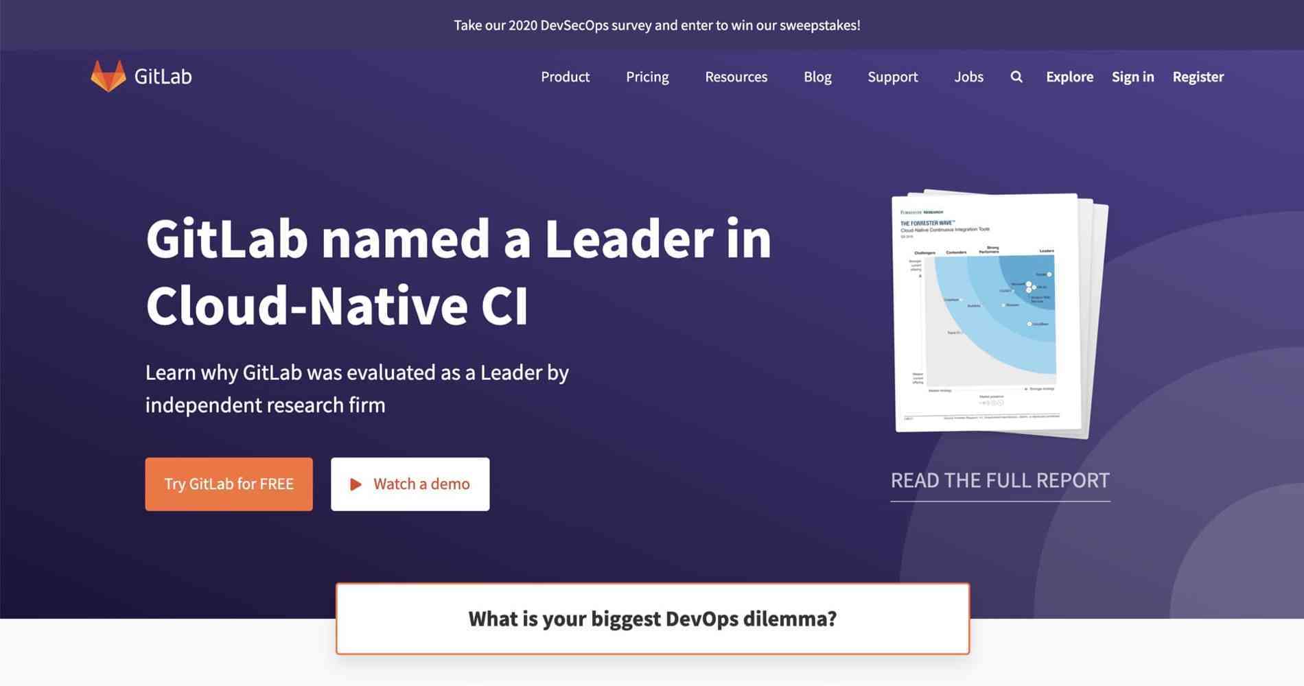
I started to map the journey on the homepage of our marketing website and clicked on the big orange “Try GitLab for FREE” button. That took me to our free trial landing page where a user can choose between trialing GitLab as a SaaS (GitLab.com, hosted by GitLab) or self-managed (GitLab Self-Managed) solution. And this is where the problems started to appear.
Symptoms of a broken user experience
The two options for trialing GitLab (SaaS or Self-Managed) were presented by two tabs, one of which (Self-Managed) was active by default. To start a Self-Managed trial, the user had to fill in a large form right away. The SaaS option, on the other hand, only required a click on a button. My assumption here was that setting up a Self-Managed GitLab trial takes much longer so I concluded that someone who just stumbled upon GitLab is more likely to try it out as a SaaS. But on this page, few users actually noticed that option.
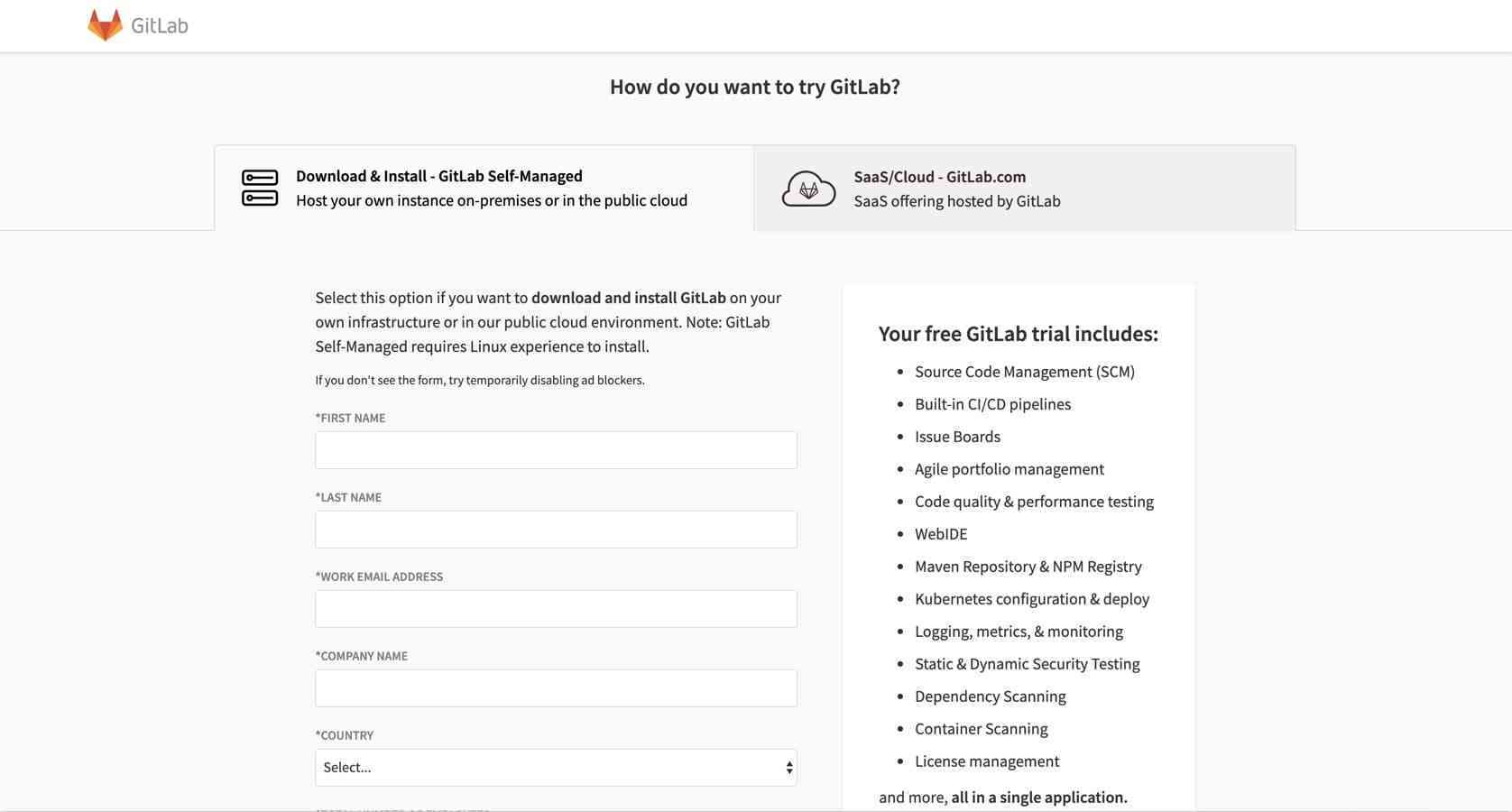
Problems identified:
- Self-Managed is the prioritized option but users need to fill in a large form to get started. Huge drop-off is expected even before the signup flow started.
- Affordance issues: the second option (the non-active one) was barely discoverable because of the way it was presented. The contrast was too low and most users missed it.
- Even the simpler option for starting a SaaS trial had instructions that needed to be followed. Most users missed these instructions and simply clicked on the big orange button labeled “Start Your Trial.”
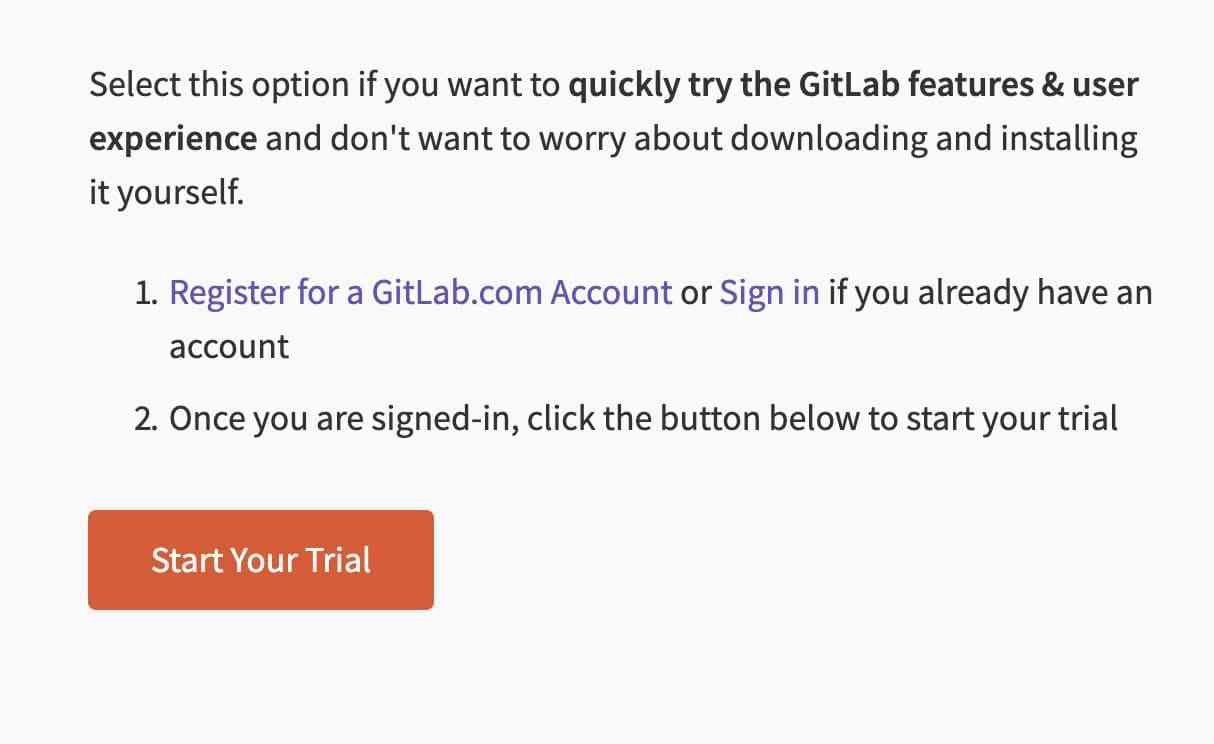
Signing up for a SaaS GitLab trial required users to complete two separate steps in the correct order. If step 1 wasn't completed, clicking on the “Start Your Trial” button led to a free trial signup flow that couldn’t be completed.
So a user would either have to fill in a large form and install their own instance of GitLab or follow these instructions to start a trial on GitLab.com. This reminds me of a design joke I heard ages ago but it stuck with me because it’s so true:
Design is like a joke: if it needs an explanation, it’s not a good joke.
I didn’t know this at the time but these instructions where there for a reason. Users needed to complete two separate steps in two different applications to successfully sign up for a free trial – GitLab.com and a tool we call Subscription Manager. That’s why we had these instructions written on this page and that’s why the experience was completely broken if they weren’t followed. The following is the user journey map that I created:

Altogether, it took users more than five minutes and almost 40 interactions to complete the process. When I say “interactions” I mean things like clicking a button, landing on a page, filling in a form field and similar. A user who just completed the process of signing up for a free trial of a tool should feel excited, but in our cause they most probably felt exhausted. You can watch my video walkthrough of the experience as it was at the time. Here are the key points of the experience:
Users had to sign up for a GitLab.com account first. After this step, they were shown an “Almost finished” message as they had to confirm their email by clicking on a link in an email message that was automatically sent.
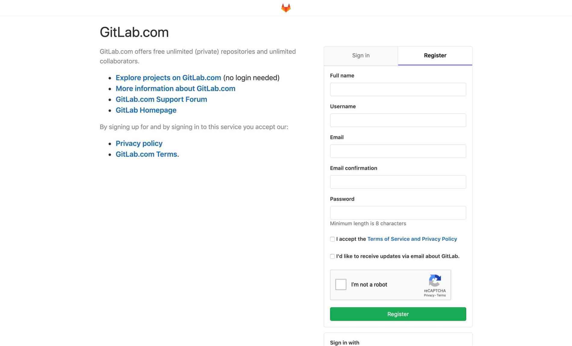
Problems discovered:
- We asked for a lot of information, probably too much for simply signing up.
- We sent the newly signed-up users to their inbox – a huge source of distractions.
After they successfully confirmed their email, we showed them the following screen – the beginning of the Free Trial signup:
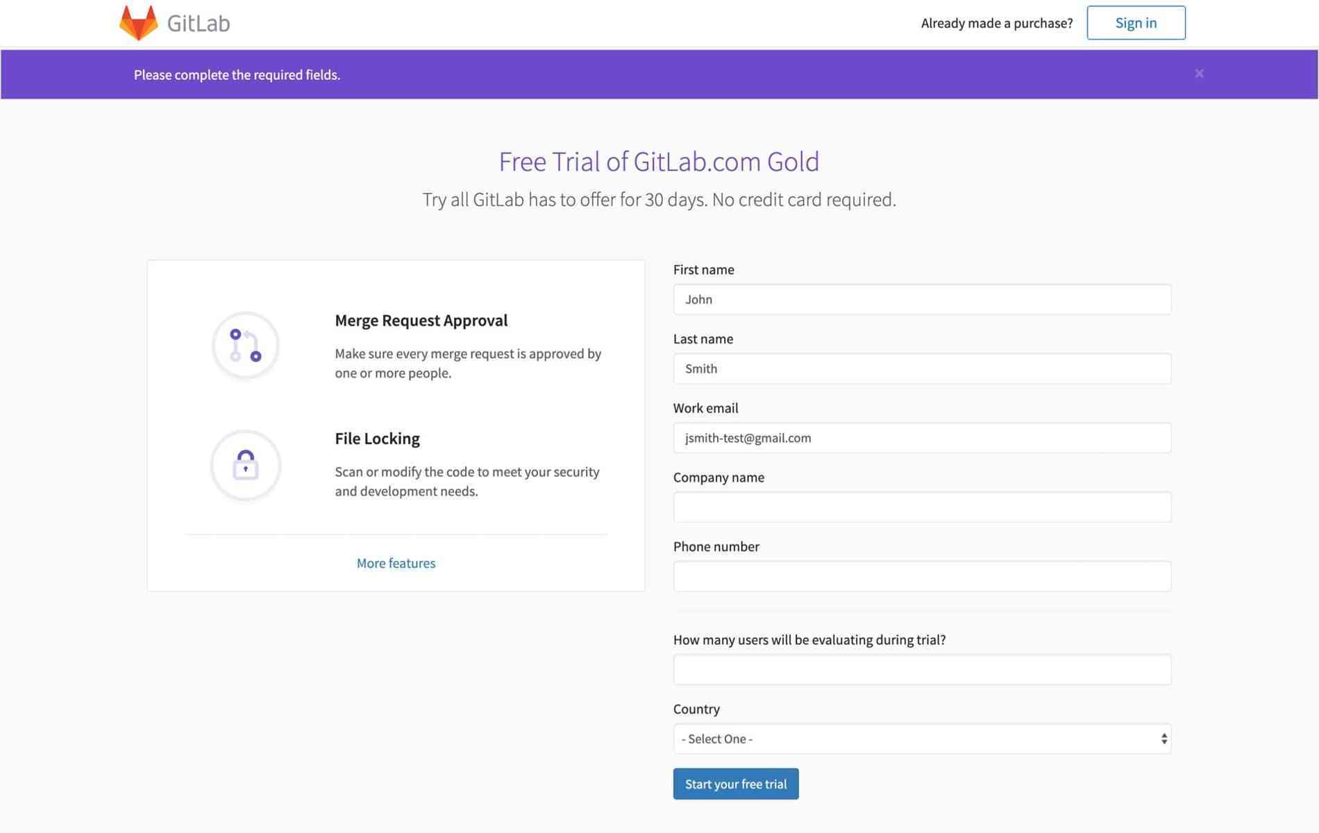
Problems identified:
- Visual style was different.
- We asked for a lot of information again. A lot of this we already had from their GitLab.com signup but we didn’t use any of it to pre-fill the form.
After they filled in and submitted the Free Trial signup form, they were shown the following from the Subscription Manager app. This is when the users started to interact with the second app.
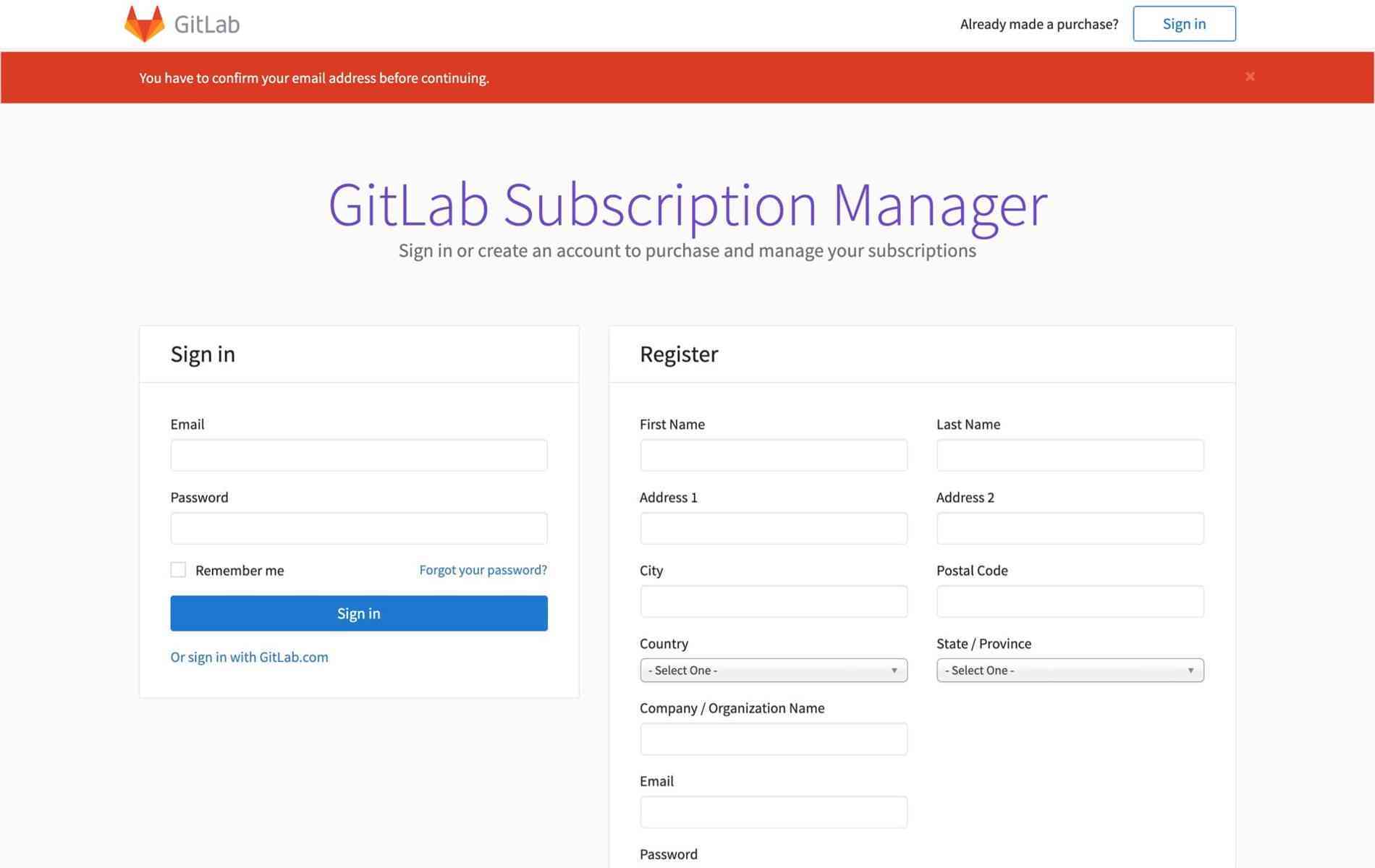
Problems identified:
- We told the users to confirm their email address again. It’s a different app for us, but for them it’s all GitLab.
- The most obvious next step – confirming the email address – actually led to a broken flow that couldn’t be completed.
- This screen created a lot of confusion and users didn’t know what they had to do. Sign in, register, or sign in with GitLab.com?
In the end, signing in with GitLab.com was the only way to successfully complete the process. It took the users to the next screen – activating their free trial.
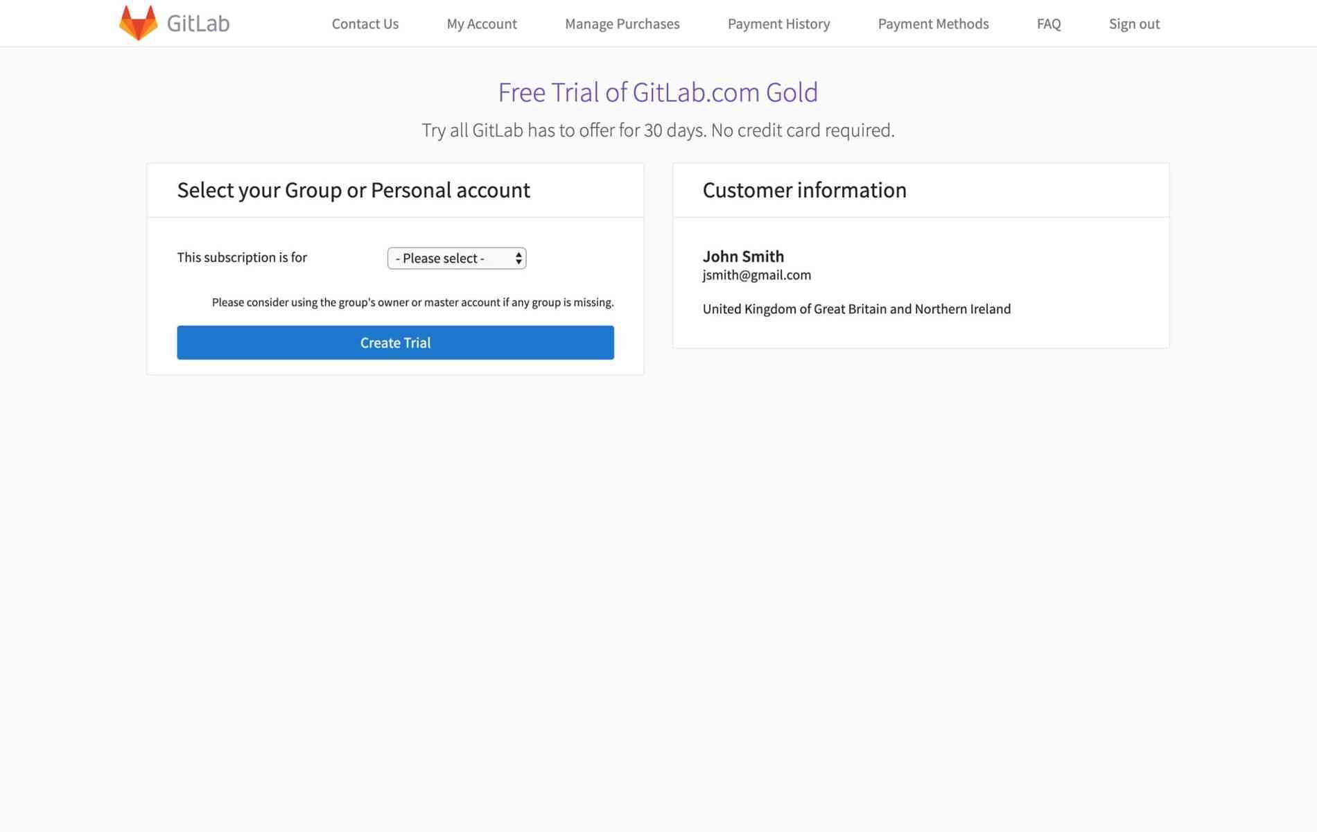
Problems identified:
- We asked the users to choose which group their free trial is for. We asked this even if the user had no groups created at all. In that case, the users could only apply the trial to their namespace so the dropdown only had one option. As this was commonly the case, this step was unneeded manual work.
To add to the confusion, we sent users to the final screen in the flow: the billing overview. The fact that we sent them to this screen wasn’t the problem, it was the information we showed.

Problems identified:
- We told the users they’re on the Gold Plan but we also showed the purchase options right below. Some users were confused about whether their trial was actually activated or not.
With all this done we could summarize what the main problems that needed to be solved were:
- Two separate apps with different visual styles
- The two apps didn’t work well with each other
- We repeatedly asked for information users already provided
- Poor flow of screens and unclear information architecture led to confusion. Users didn't know where they were and what they were required to do.
Fixing a broken flow
Ok, so at this point I learned that the flow for signing up for a free trial was disjointed and sometimes even broken. I recognized what the main reason for that was – separate applications not communicating with each other through some form of automation – as well as other UI and UX issues of course. To tackle the main problem, I came up with a vision: about one minute and no more than 15 interactions required to complete the free trial signup flow. The main outcome I wanted to achieve with this work was to improve the state of mind a user is in after successfully signing up for a free trial – excited instead of exhausted.

But how do we get there? Well, first of all, we need to move away from forcing users to interact with two separate applications. We do that by moving the second part of the process into the first application (GitLab.com) and making it communicate with the other application in the background. I proposed a unified signup flow that happens in one application but is adapted based on the user’s intent. Is the person an existing GitLab.com user trying to sign up for a free trial? Or are they a new user and they need to sign up for both GitLab.com and Subscription Manager accounts?
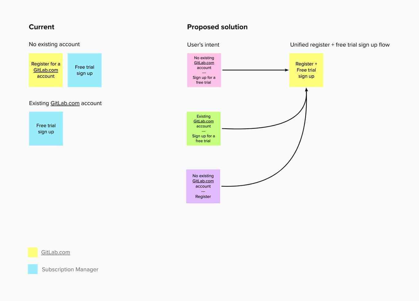
My colleague Timothy Noah took over from here as he was the designer working with the team that owned this part of the product. He completed a UX scorecard and video-documented the flow again. The result of his work was a well structured approach to breaking things down into smaller steps but with a holistic overview. Based on all this work, he then created a proposal of what the user journey should be like.
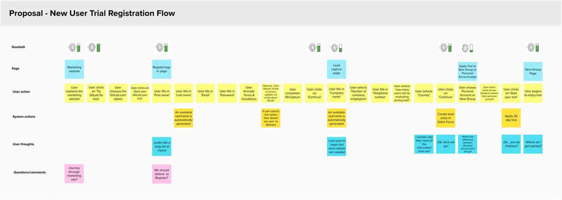
And translated it into actual UI, pages and their flow:
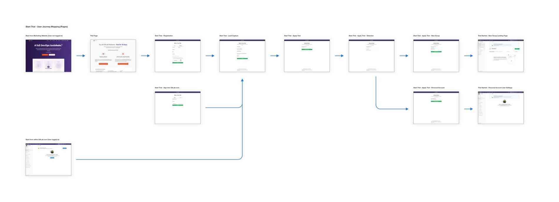
This clickable prototype illustrates perfectly how the new free trial signup flow should behave. It’s immediately clear that it’s much simpler and more cohesive than the original.
With that we could also improve the Free Trial landing page by removing the instructions (as we didn’t need them anymore) and balancing the two options for starting a free trial:

The new free trial signup flow launches
After a lot of hard but well coordinated work, the new free trial signup flow launched on October 29, 2019. The results were clear in less than one week. The week before the launch, we had 466 free trial signups. In the week of the launch the number rose to 628, then to 842 in the week after. They remained well above 800 throughout November. We then saw a small dip during December (but it never fell below 600) and the climb resumed in January. We’re now getting more than 900 free trial signups per week.
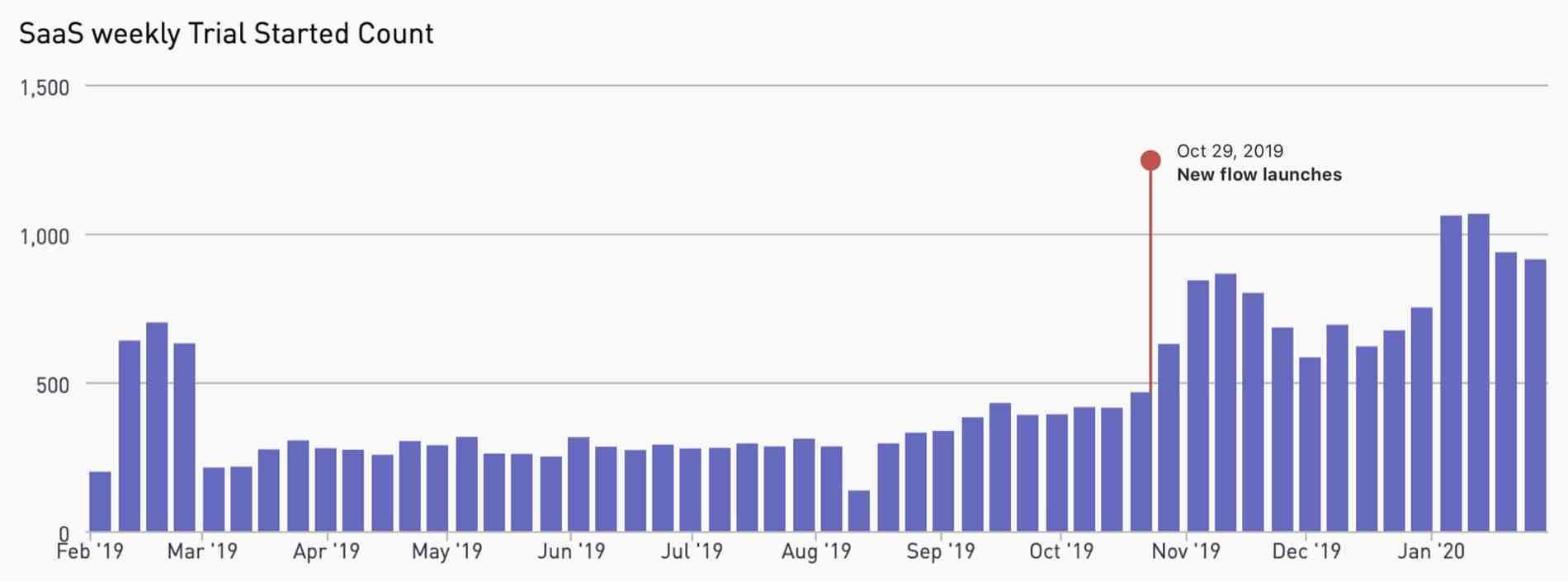
I quickly crunched the numbers and came to the following conclusion:
Average signups per week before launch: 330
Average signups per week after launch: 794
Which results in an improvement of 141%
So we more than doubled the amount of free trial signups, but what exactly led to these results? Another colleague, Kevin Comoli, recently did a follow-up UX scorecard to rescore the experience. His findings? It now takes around 17 interactions (instead of the original 37) and around 2.5 minutes to complete the process. So we reduced both by more than half and that’s why we’re seeing such an increase in completed signups. Take a look at the latest version of the user journey mapped by Kevin.
Organically grown versus holistically designed experiences
Experiences are either intentionally and holistically designed by someone or they get designed by what I call “organically grown” smaller parts of the experience. It’s like cultivating a garden: we start off by planting a few flowers and bushes but leave some empty space around them. Eventually, if we don’t do anything, this empty space will get overgrown with weeds. Our flowers and bushes will also grow in an uncontrolled way. So until a gardener comes around and tidies everything up, our garden will be a mess. It’s the same with our digital products – if a designer with a holistic overview isn’t involved, different parts of our products grow into a mess that doesn’t work as a whole. The holistic overview is the key here. It’s not enough to have designers involved if all they do is design separate screens instead of complete experiences. We need to look at how things work as a whole. That’s when designers, and the teams they work with, are most successful.
Where do we go from here?
We’re thrilled about the improvements we have already achieved but we also feel there’s a lot more we can do. I personally would still like to see the time required to complete the process be reduced to around a minute. As part of his UX scorecard, Kevin also came up with additional recommendations for improvements. There, he talks about trimming down the information shown in the process, improving the entry points to the flow and tailoring its steps based on the user type. We’re all looking forward to these improvements being implemented.


