This blog post was originally published on the GitLab Unfiltered blog. It was reviewed and republished on 2021-03-03.
For a product like GitLab, great documentation isn’t just nice to have – it’s a must.
As a complete DevOps platform, GitLab brings a sprawling tooling ecosystem into a single experience so that teams can build software faster and with greater confidence. Part of our responsibility is to help users quickly understand how to complete standard tasks, while giving them insight into the larger possibilities of the product and which features they might take advantage of next.
Over the past year, we’ve worked really hard to understand our docs experience. We started by assessing the sheer amount of content that’s available on docs.gitlab.com (equal to two copies of "War and Peace"!) and then we began user research to discover how well that content meets our users’ needs.
Wow, did we learn a lot! While 96% of participants thought our content was useful, research confirmed what we suspected: we have some problems with site usability and information discoverability. That was good news, because these things are fixable. In this blog post, you’ll learn more about what’s in process, what we’ve already addressed, and what we plan to do next.
What we’re working on now
Let’s start by covering what we’re working on now, since these are nice refinements that we’re really excited about.
It’s always about the homepage
A website’s homepage is where users first orient themselves and look for important information. And, frankly, our homepage just isn’t doing that job well. While we’ve made iterative improvements over the past year (we'll talk about those in a minute), we know it’s time for a major overhaul. That's why we’re so excited to see the improvements we’ve made in collaboration with senior product designer, Jeremy Elder, come to fruition.
Here's our current home page.
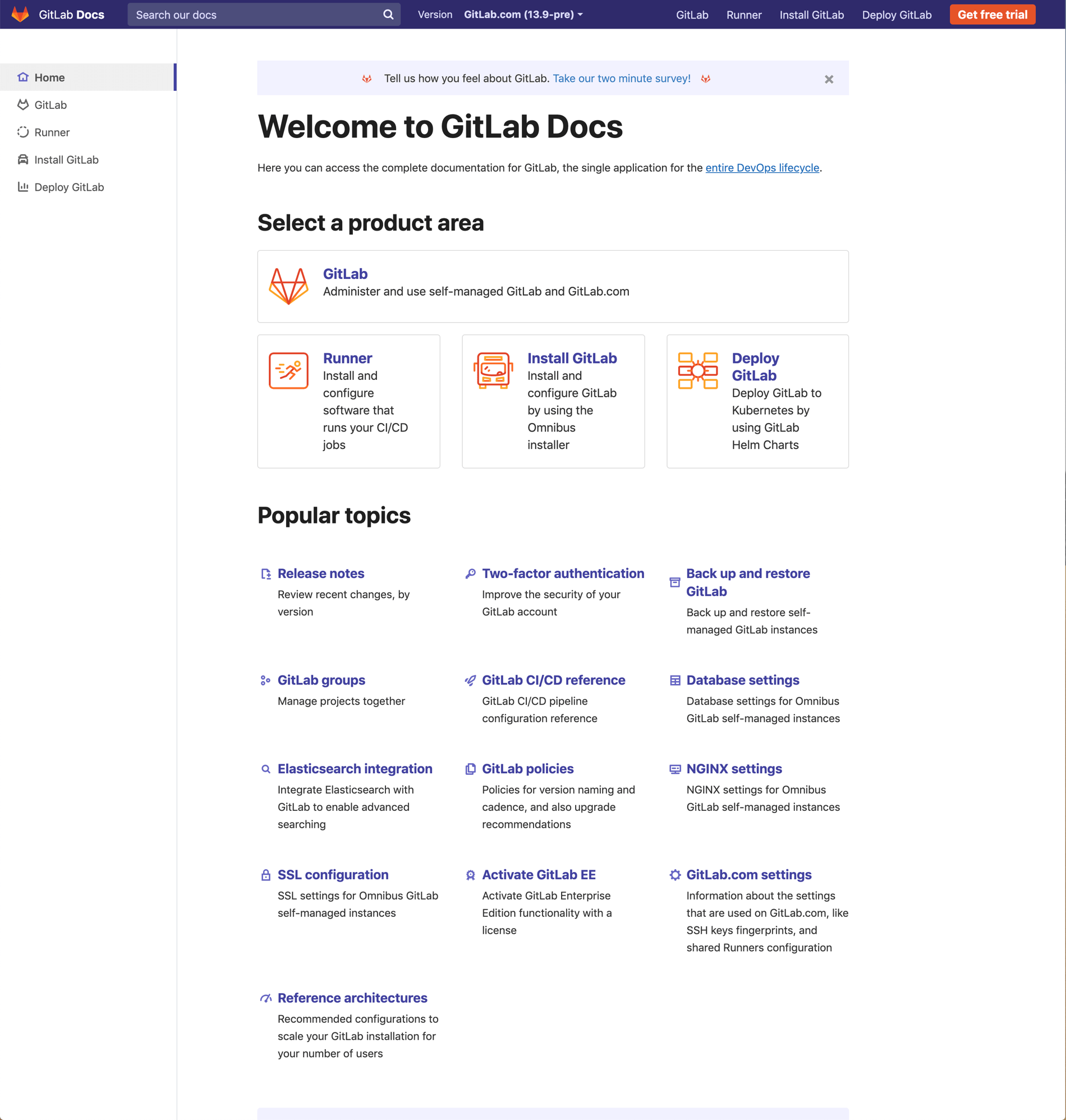 Current homepage
Our homepage redesign focuses on:
- Helping users find what they need more quickly by elevating search and removing extraneous content to simplify the design
- Highlighting key areas that users typically want to get started
- Making installation instructions easy to find
- Aligning the top navigation with accessibility guidelines
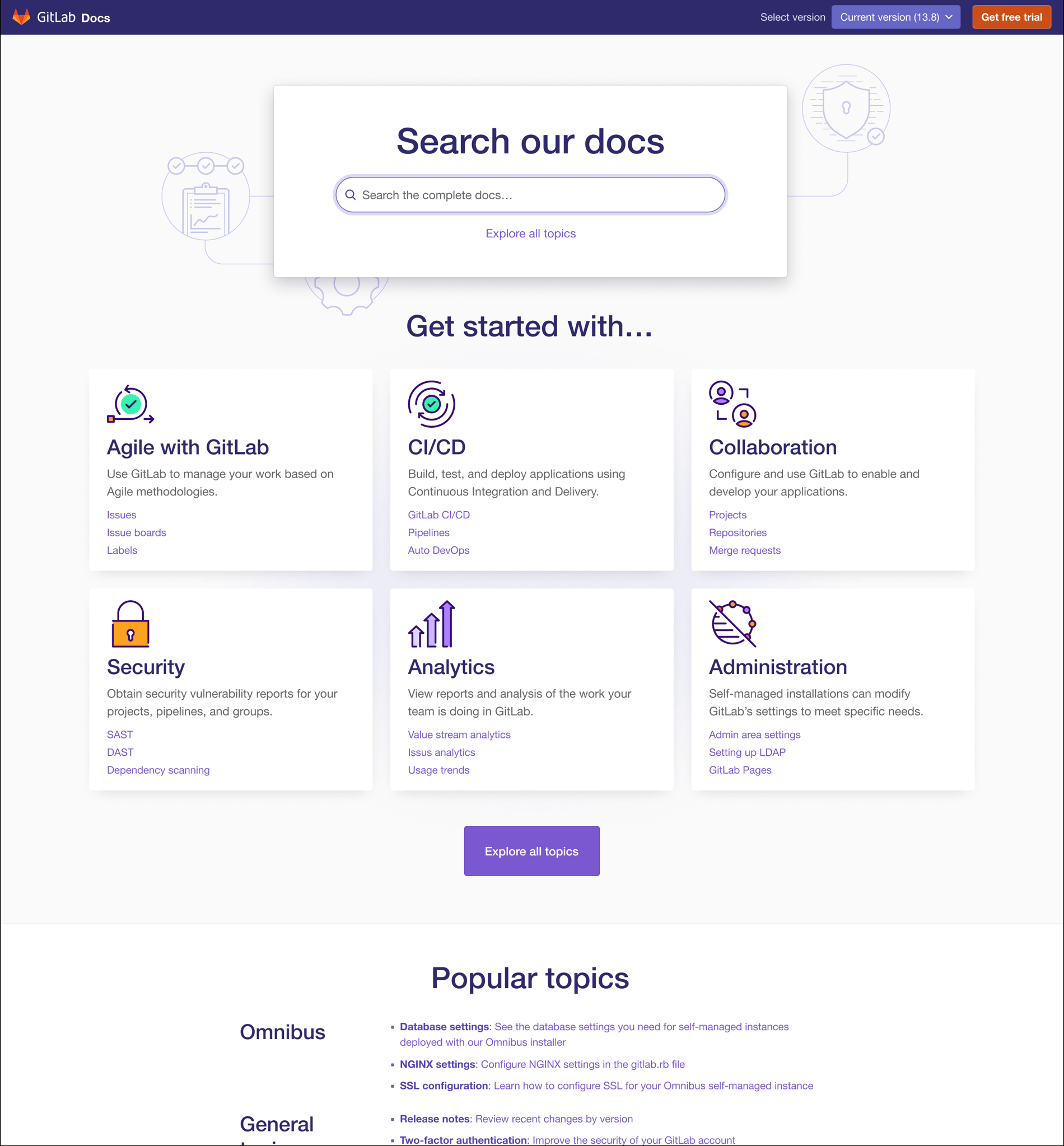 In progress (better usability and visual appeal)
Type scales matter
"Sometimes I get emotional over fonts." - Kanye West
It’s OK, Kanye – we understand. Fonts make us emotional sometimes, too. Unfortunately, our current type scale makes us feel sad. :(
Here's what it looks like now:
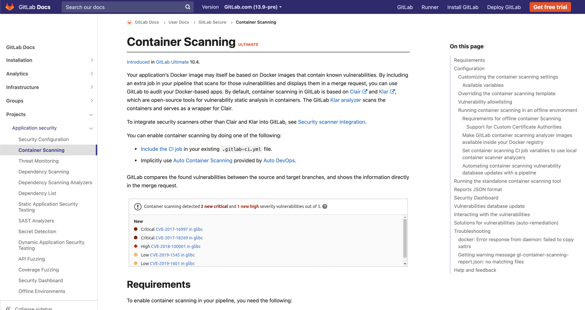 Current type scale
Here's a peek at how we’re updating it to be more modern, easier to scan, and better themed.
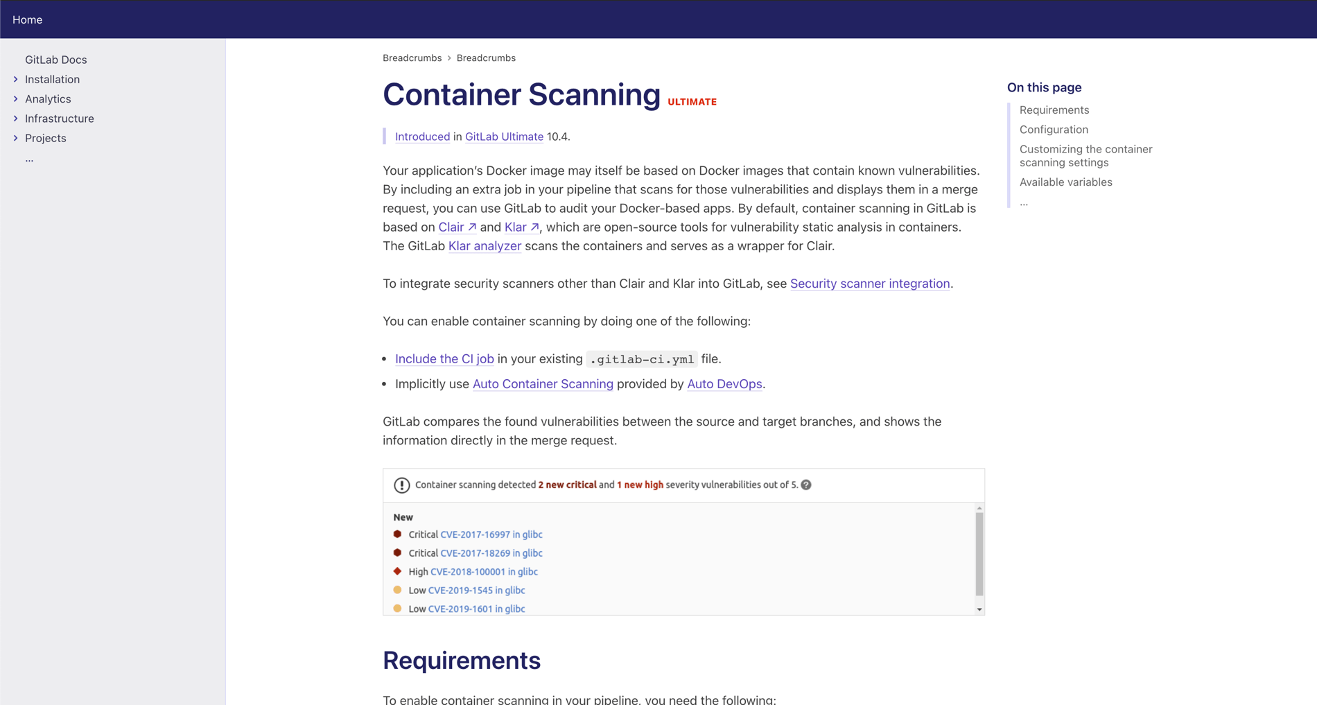 Coming soon!
What we’ve already done
As mentioned before, we didn’t just start this refinement process – we’ve been making iterative changes for a while. Those changes aren’t as impactful as what we’re working on now, but they’re still worth mentioning.
Fixed our alert box madness
Alert boxes, including notes, tips, and warnings, provide important information that we want you to know. That doesn’t mean they should be visually overwhelming. And when you overuse them, making it seem like everything is important, then nothing is. (Confession time: One of our pages included 40 notes.)
So, we reduced the number of “Notes” in our documentation by 25%, and we toned down the colors of notes, tips, and warnings to be less “in your face.”
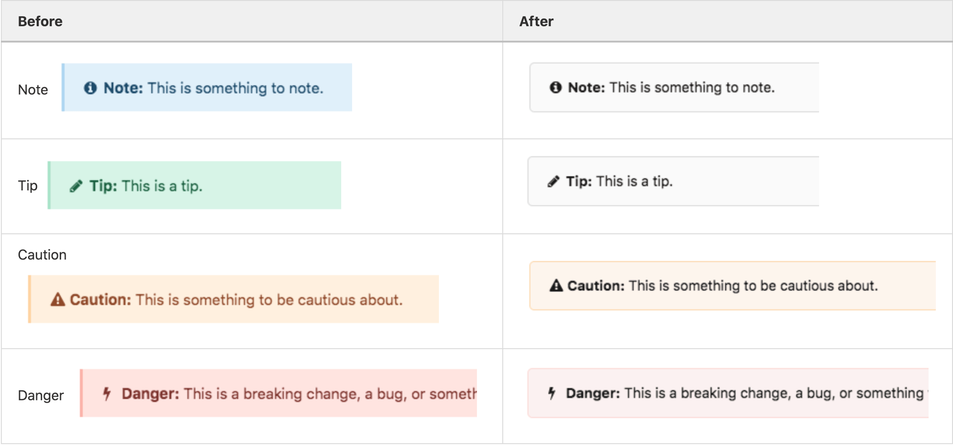 Alert box refinement
Improved topic scanning with better use of fonts and white space
Good use of fonts and white space can provide visual cues that help users more quickly identify related information. This is especially important for scanning large amounts of content.
The most egregious example of elements that needed to change was our headings.
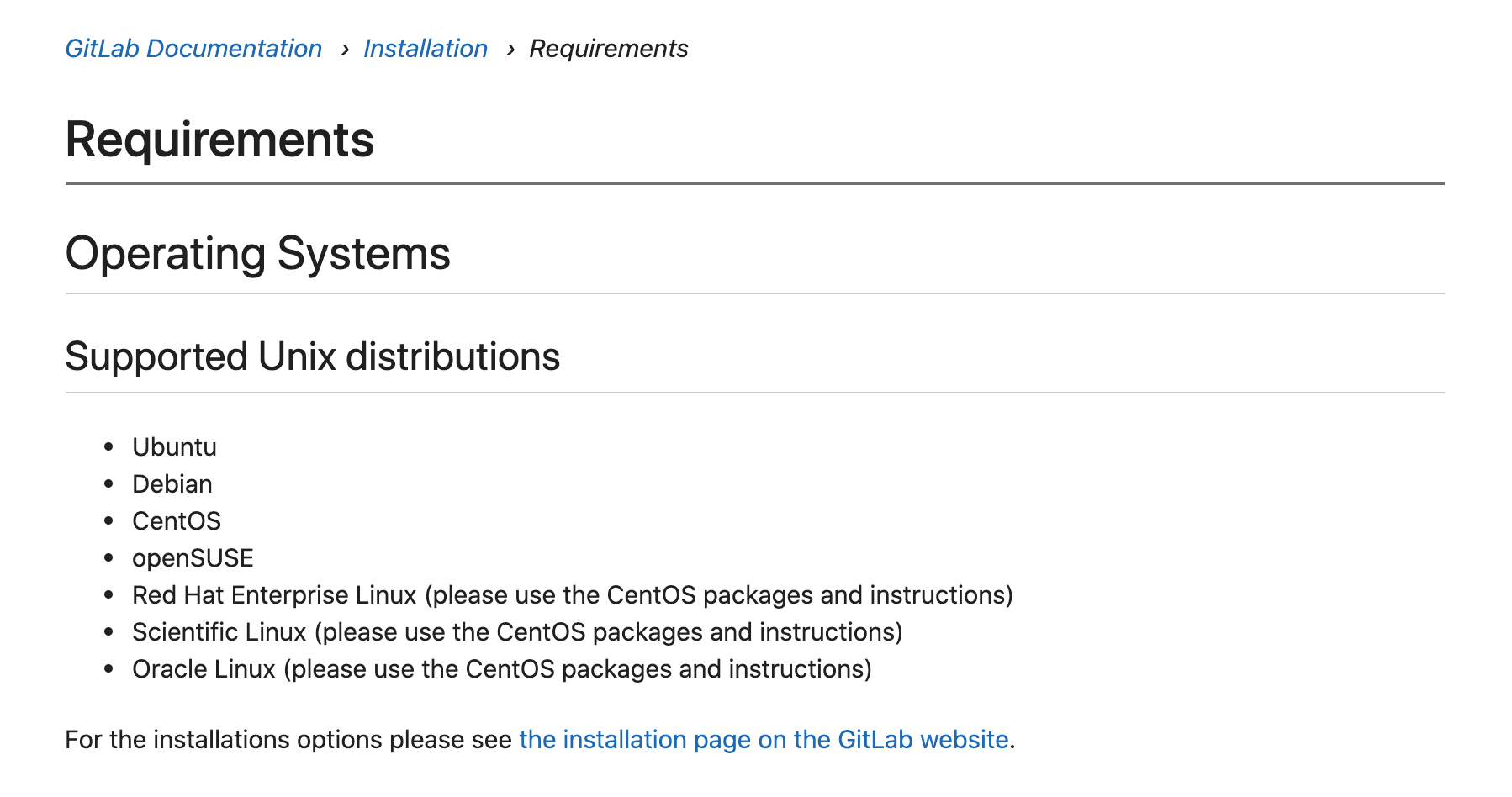 Earlier version of headings
To begin making improvements, we removed the borders from every heading level except H1, refined how we used margins, and made better use of font weight and size to distinguish levels H2 and smaller. Our headings will continue to improve in the type scale work we’re doing now, but in the spirit of early iteration, we didn’t let perfect be the enemy of better.
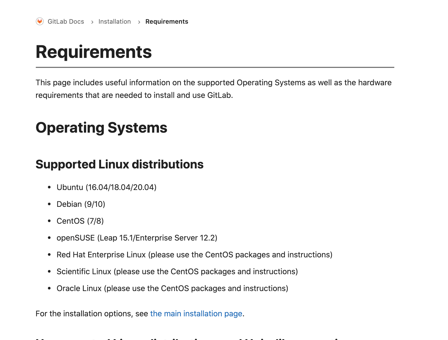 Current version of headings
Also, the leading in our bulleted lists (which appear frequently in technical docs) was… weird. Every line of text had equal spacing, making it difficult to see what information belonged together. There was too much space between the introductory sentence and the bullets that followed.
Not anymore!
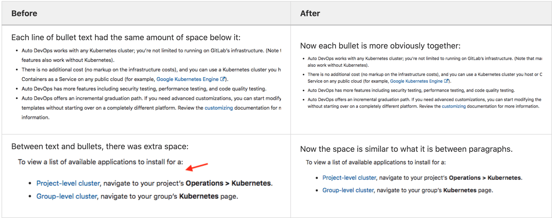 Fixed leading, margin, and enumeration
Toned down visual noise of images
We also realized that our images were too visually pronounced. So, we removed drop shadows and reduced the size of the margins surrounding images.
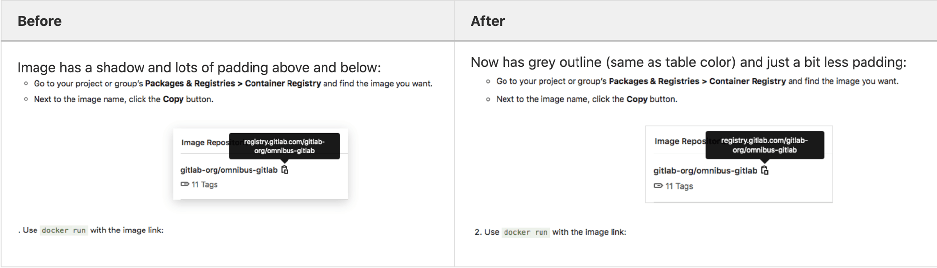 Removed drop shadow and reduced margin
What’s up next
We’re excited about the improvements we’ve already made and what’s in process now, but there’s still more to do. Based on the same user research that guided our visual design enhancements, our Documentation Roadmap includes back- and front-end changes to continue to improve the docs experience for the GitLab community.
As always, we value your feedback, so please continue to let us know how we’re doing!