Around this time a few years ago, I had the opportunity to bring more consistency and rigor to GitLab’s product icons, and ever since then I’ve been working through the next iteration. You can read more about the previous effort in this post, GitLab Iconography: MVC meets visual design. Today, though, the next iteration is here, and I’d like to briefly share a bit of what went into it.
First up, a little housekeeping. Changes to a user interface (UI) can be highly subjective, and while I don’t think preference will or should ever be eliminated, it shouldn’t be the driving factor for change. To that end, we always take a thoughtful approach to any change in the GitLab UI. And in the spirit of iteration, I think my colleague, Tim Noah, put it best when he said that we’re privileged to “work on the ink that never dries.” This isn’t the first iteration, and it certainly won't be the last.
Icons can be better
While there’s more nuance than I can unpack here, at a high level the problem we faced was this: Icons can be better. And better isn’t that subjective after all; it’s measurable.
To name a few things, icons can:
-
Be more balanced with other UI elements.
-
Better align with the brand.
-
Be constructed to be more future-proof and available for further iteration.
-
Work well in both light and dark UI.
-
Better convey abstract concepts and metaphors.
Choosing what to change
Historically, our product icons had most commonly used a 16-pixel grid and 2-pixel stroke. In a condensed UI, space is at a premium, and there’s a careful balance to strike between helpfulness and distraction. This isn’t a site where icons are visual anchors and decoration. This is a complex application where icons perform tasks and indicate status and state. They should be available when you need them, but not in the way when you don’t.
Since each icon concept and metaphor can be evaluated on its own, and the grid size was out of scope, I focused on a single shared attribute that relates to all of the ways we determined icons could be better: the stroke weight. Seriously, though, a seemingly trite attribute can have that much impact. Instead of the previous 2-pixel stroke, the icons now use a 1.5-pixel stroke. It turns out that half of a pixel is a big deal.
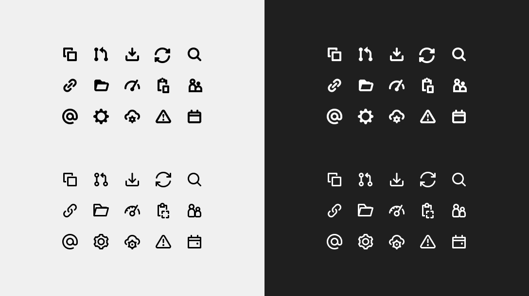 Before (top) and after icon comparison in light and dark UI
Exploring the benefits
Here are some of the benefits we’re starting to experience as a result:
-
Because minor icon differences and details are now more distinguishable, our icons have better fidelity. That makes a big difference when a metaphor may fall short with less detail.
-
GitLab uses system fonts, and the updated icons match the weight of a regular sans-serif font at body size (the most common font in our UI). Icons don’t compete with the text as much, and there’s a better balance of visual weight.
-
For users who experience visual impairments, UI elements can appear blurry. With more negative space in the icons, there’s less opportunity for elements within each icon to blend together and become indistinguishable.
-
In a dark UI, the light emitted from an element tends to bleed into surrounding pixels. This creates a ghosting effect and makes the element feel visually heavier than it is. A lighter stroke weight can help offset this effect and make the dark UI as balanced as its light counterpart.
-
Previously, we went with a 2-pixel stroke weight, because there was still a significant percentage of users with standard resolution monitors. This meant that we weren’t comfortable with making the leap to aesthetics that favored higher-resolution displays, because a 1.5-pixel stroke could have appeared blurry for many users. Based on current analytics, though, we no longer feel constrained by display resolution and have solved our half-pixel alignment concerns.
-
Icons feel more consistent, polished, and on brand than before. They also share more characteristics with the marketing iconography.
-
Getting an icon asset ready for production used to mean that we needed an original layered version and another outlined version to export. We create GitLab product icons in Figma, so we can now leverage their boolean unions to keep all icons in an editable state and export a single pathed SVG from the same layers. This is a huge efficiency gain and also makes it easier to create differently sized icon sets, if we need to. We’re also leveraging reusable icon elements as components to help propagate changes.
-
Lastly, on a more subjective point, the UI in general feels lighter and more modern, both of which are desirable outcomes and something we’ll continually work towards with other parts of the UI.
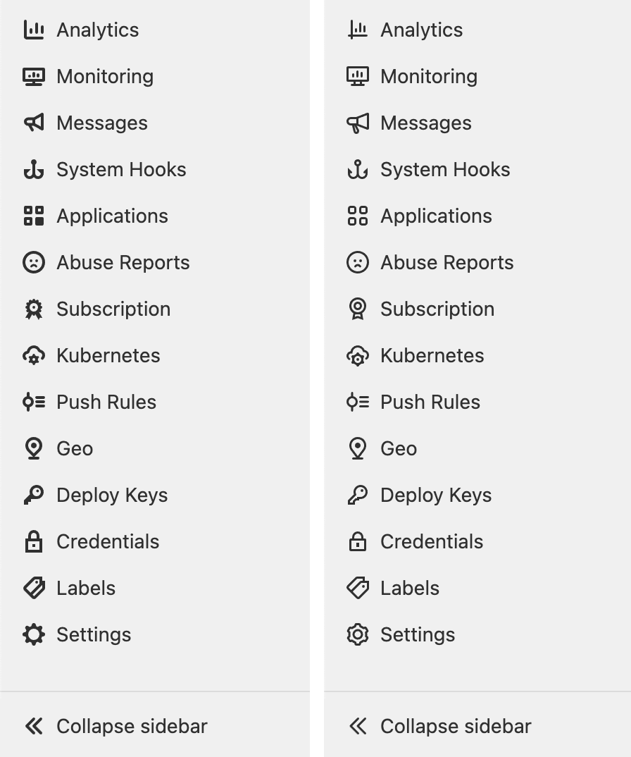 Before (left) and after icon comparison in the navigation
What’s trending
Do a quick search, and you’ll find that this road has been traveled before, with product after product making the shift to lighter icons. At first, it might seem like this is another UI trend to chase, but look a little closer and you’ll find that the real trend is to create a better user experience. And that’s a trend we’re happy to chase all day.