We take the choice of typefaces very seriously around here. And, in the spirit of transparency, a GitLab core value, we like to share our rationale for typeface changes. This blog introduces you to the new default typefaces in GitLab – GitLab Sans (Inter) and JetBrains Mono – and explores in detail why we chose them and how they will improve the user experience.
Introducing GitLab Sans and JetBrains Mono
In the recent GitLab rebrand, Inter was selected as the primary sans-serif typeface and we've adapted it for use in the GitLab user interface (UI) to have more continuity between the brand and product experience. It will be available for users in Release 15.8. Specifically for the UI, we've enabled disambiguation features (increased distinction between some characters) by default. Because of this change, we're including it under the name GitLab Sans in the open source package of GitLab. To complement GitLab Sans with a monospace typeface, we've chosen another open source option: JetBrains Mono.
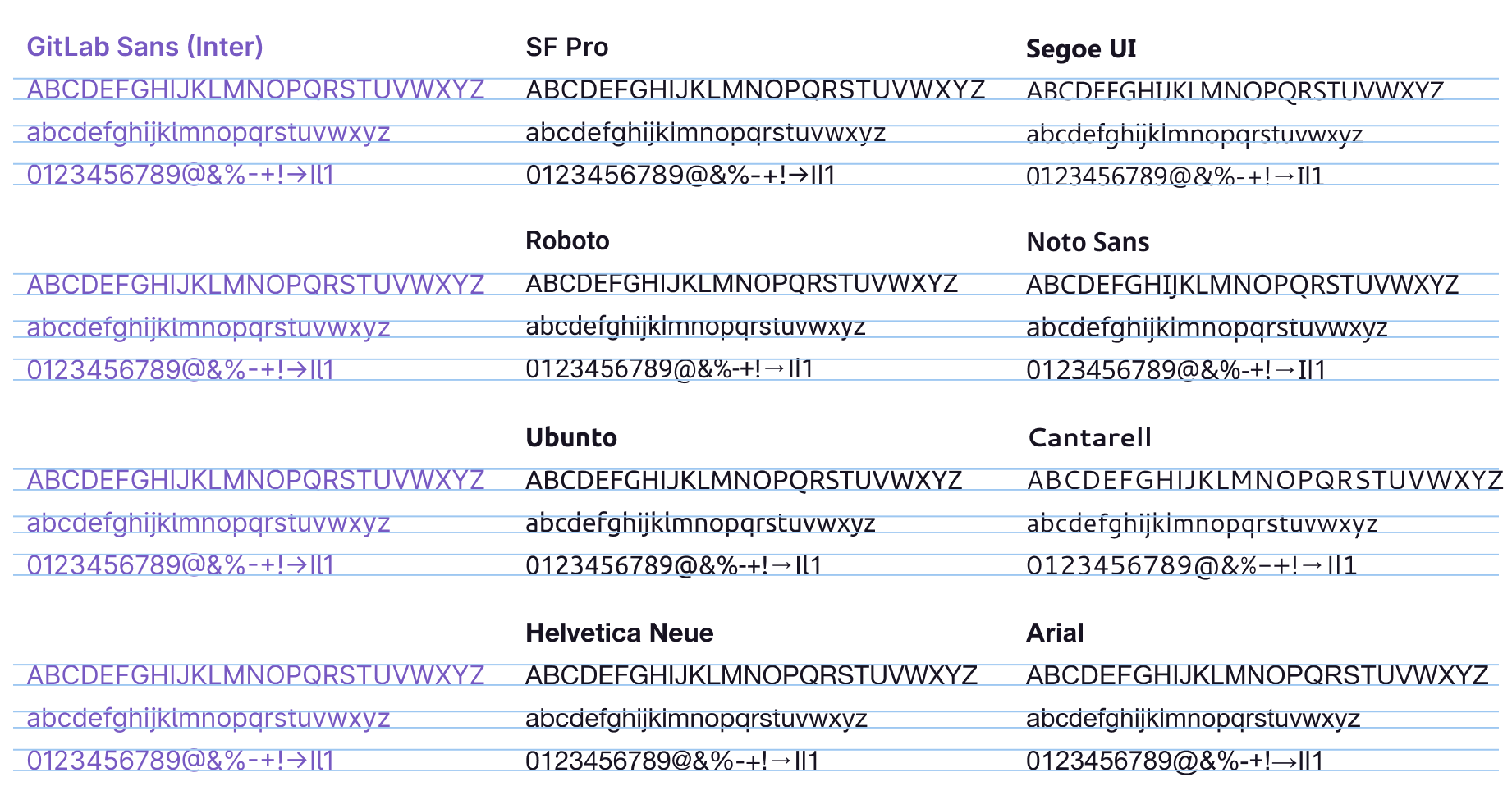
The GitLab UI has historically relied on system fonts, like San Francisco on macOS and Segoe UI on Microsoft Windows. There are, however, limitations to using these that we'll cover in a moment.
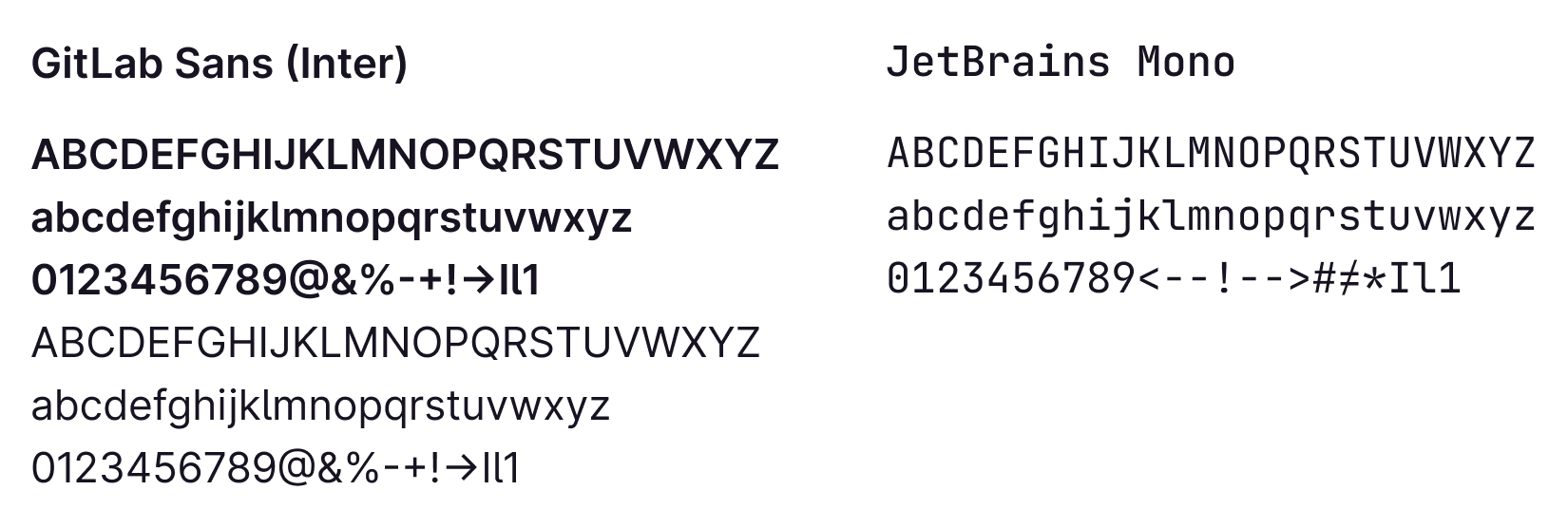 GitLab Sans (Inter) and JetBrains Mono sample
Why the change?
So we've already mentioned brand continuity as a driving reason for the change, but let's step back a bit. During the rebrand process, Inter was one of many typefaces considered because it was open source and designed for UI. Choosing a font primarily designed for digital output might seem like an odd choice for branding and print application, but the primary extension and experience is the product itself. GitLab is digital-first, and the brand reflects it. Inter had all of the qualities and features we knew we could leverage to enhance and realize our vision for the UI.
We realize there's a lot of subjectivity wrapped up in a change like this. Visual updates are, well, highly visible, but we believe they have to be rooted in objective considerations that lead to adding real value, so here are a few other aspects we evaluated and will cover in greater detail:
- Less is more - How can we limit certain choices in ways that enable more meaningful ones?
- Consistency - Can we create more harmony within a single view, streamline the experience across platforms, and reinforce the brand?
- Enhance the content - Can content be more readable, discernable, and generally consumable?
Less is more
Typography is a crucial part of the GitLab UI, if not the most crucial part. As we continue to refine and beautify the experience, it's apparent that more control over the typography would yield a better experience not only for our users, but also the ones creating the experiences — our internal product, design, and development teams. System fonts have led to everything from false positive bug reports to visual regression errors on both sides. More choice — especially when systems are choosing — doesn't always lead to better experiences.
With multiple system fonts in play, we choose compromises, not enhancements. For example, asking what alignment works best for most system fonts in a button instead of what alignment works best for this font. Or, what weight should we use when not all system fonts have the same available options instead of what weight creates the right hierarchy for this content. With fewer typeface options we have more ability to make meaningful decisions about disambiguation, visual weight, language support, hierarchy, type scales, and so much more.
Consistency
An experience has multiple facets: a single view or screen, a flow between multiple views, a transition from reading to editing, or a switch from settings to documentation. Consistency should happen not only within each of these, but also across them. Consistency in a single view means hierarchy, balance, and harmony. In a flow, consistency establishes patterns and understanding. When contexts change, consistency brings familiarity and enhances trust. Typography is an important aspect of all of these.
Inconsistencies add up and lead to design, tech, and experience debt. There are known consistency problems with system fonts, for example, in Firefox on macOS, San Francisco has tighter letter spacing than on Chrome or Safari. This leads to different experiences across browsers, and this is just for one system font.
 Varied x-heights of system fonts
Optically, system fonts are noticeably different in size. However, the difference is more visible when you compare the length of each due to character width, weight, and kerning (the space between characters). This impacts everything from truncation and component width, to wrapping and legibility.
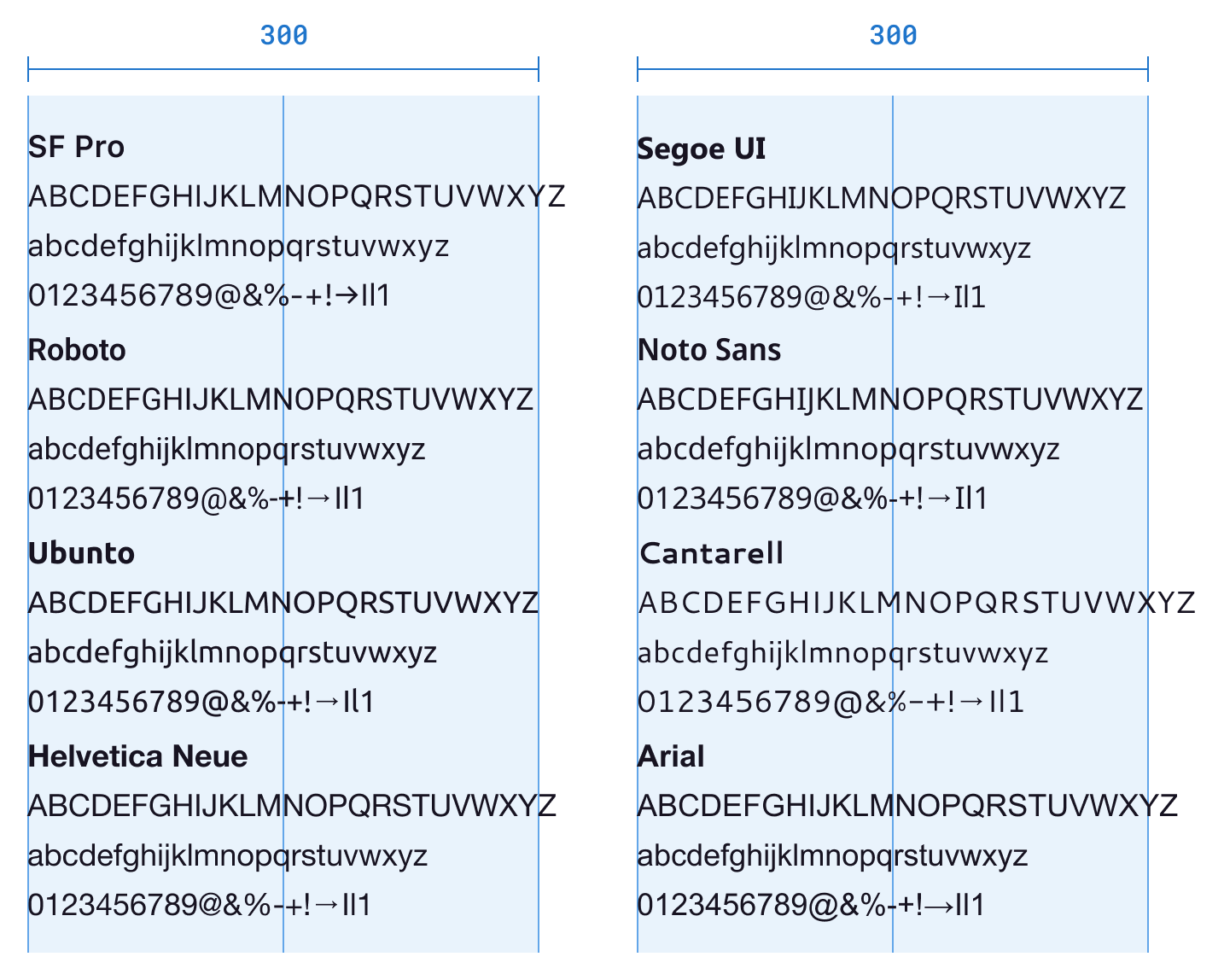 Varied width of system fonts
Menlo has been used as our monospaced typeface. It appears bigger than many sans-serif typefaces when using the same font size. To counter that issue, we had downscaled its size by one pixel to make it appear as the same optical size. This added unnecessary bloat to styles and is also not foolproof since sans-serif system fonts also vary.
Inter and JetBrains Mono have nearly identical x-height, which allows us to remove all of the downscaling overrides and more generally handle text styles consistently. While both typefaces have specific use cases, they’re almost always present next to each other in the UI, making cohesiveness that much more important.
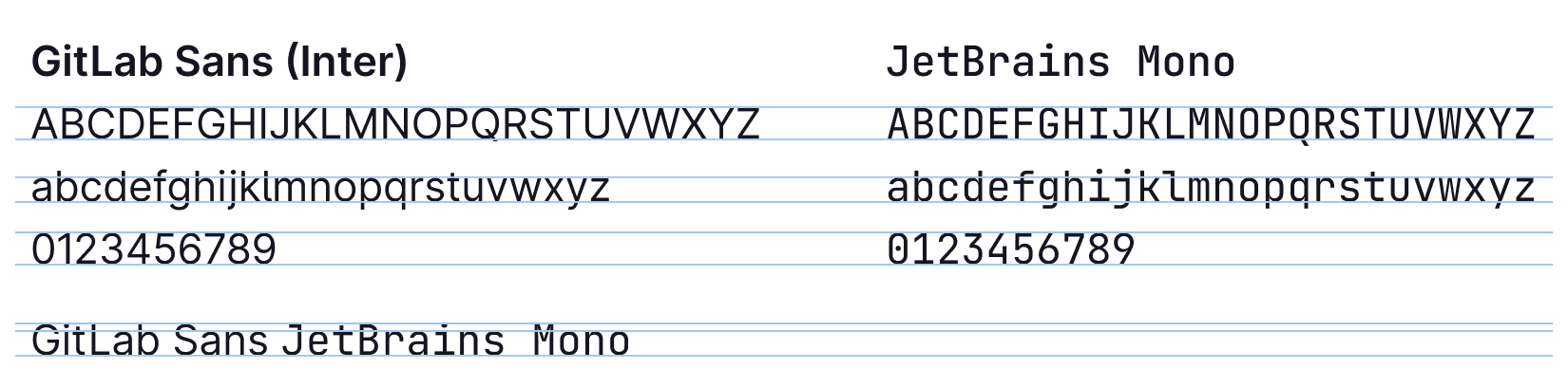 GitLab Sans and JetBrains Mono with similar x-height
By reducing our typeface options, we're working towards consistency in so many ways we haven't before, everything from brand to product, product to documentation, and browser to browser. Consistency is not the same as uniformity though, and nor should it inhibit preference, but by creating a baseline those things can have room for more thoughtful approaches in the future too.
Enhance the content
As mentioned earlier, typography is a crucial part of the UI, and arguably most of the content is in text form. Whether communication or code, status or state, the typeface is the delivery vehicle for the content. GitLab Sans and JetBrains Mono give us better control over readability.
Both typefaces include variable webfont and contextual features, which means that the font weight and other settings can be finely tuned to enhance visual weight, hierarchy, and contextual alternates. For GitLab Sans, we've enabled the disambiguation feature set to ensure readability is a top priority. Disambiguation is used to avoid common character confusion. For example, by using the feature set cv05 (lowercase L with tail for disambiguation), you can easily distinguish between the capital “I” and the lowercase “L” (see image below). We had discussed using either ss04 (disambiguation without slash zero) or cv05 and decided to go with the latter for a simple, modern look.
 Inter disambiguation options from left to right: Default, without slashed zero (ss04), lowercase L with tail (cv05)
GitLab uses a condensed UI, meaning more content in less space and typically at smaller sizes. Inter is popular for a reason, more likely dozens, but the most applicable to GitLab is that it’s designed specifically for UI. On the website it states, “Inter is a typeface carefully crafted & designed for computer screens.” With a tall x-height, contextual alternates, tabular numbers, and more, Inter enables us to actually make more meaningful typography decisions that impact readability.
Similarly, JetBrains Mono has a tall x-height, which increases readability at smaller sizes, and it has a normal character width to keep more characters on a single line which limits wrapping. During our exploration, we found that typefaces like Menlo, Fira Code, Source Code, or Noto Sans Mono either have shorter x-heights or wider characters that lead to size or spacing compromises.
With these typefaces in place we've started a deep dive into our type scales and updating design resources in Figma too. The upcoming work on type scales, in particular, will provide more consistency and refinement.
Other considerations
GitLab is an open core product, which means the core of our product is open source, so selecting typefaces that are also open source was a crucial part of the decision.
Anytime you opt to distribute your own resources versus using what's already available to the system the question of performance comes up. And while it's true that we're increasing the payload by a few kilobytes, we're able to rely on modern CSS and browser handling for delivery and caching. At the same time, we're reducing the CSS by removing styles that have been added to counter aforementioned compromises. This is something we'll continue to evaluate and optimize.
And speaking of distribution, we're packaging the fonts to make it easier for all of our properties to consume. This means we're also able to leverage the same resources in our design tooling.
Lastly, we know that changes like this have the benefit (or downside, depending on how you look at it) of exposing other inconsistencies in the UI that need to be addressed. While it seems counterintuitive to release an update that potentially introduces visual regression, we consider it as the dye in the water to let us know what else we have to fix as we continue to work towards a single source of truth for typography styles.
What's next?
As the typography changes are being rolled out, we’re working through feedback and addressing any potential regressions. Along with type scale updates, we're going to evaluate headings throughout the product to ensure heading levels align with correct Document Object Model (DOM) structure, visual weight, and styles. In short, our typography decisions are interdependent and foundational for the overall experience. By limiting typeface options, we’re removing the limits of how hard we can make typography work so that we can further refine the interface, bring harmony to the UI, and make content more consumable so that using GitLab is more productive and enjoyable.
If you’d like to provide feedback or contribute, please use this feedback issue.