Published on: October 11, 2016
5 min read
To Wrap or Not to Wrap: One of Life's Greatest Questions
Breaking lines: useful or painful?

Whether and how we should be making line breaks is currently a controversial topic amongst the GitLab folks; it's an issue of style as well as ease of use. In this post, we’re presenting the two current views held, and giving you the opportunity to speak your mind (in the comments or on Twitter) about how we should handle this in our style guide. The current policy laid out in the style guide is that you should:
Split up long lines, this makes it much easier to review and edit. Only double line breaks are shown as a full line break in GitLab markdown. 80-100 characters is a good line length.
The understanding is that you if you create a line break after 80 characters, the text becomes easier to review.
However, quite a few people feel that this isn't helpful and creates stylistic and/or visual messiness when, for example, edits are made which cause the line breaks to go amok. Basically, there are two options if your line exceeds 80 characters:
- Wrap the text as the author of the code.
- Rely on the reviewer to wrap the text with their local editor, and insert a new line for every sentence.
DON'T WRAP IT.
Some of us at GitLab are in the don’t-wrap camp, positioning that it’s better to rely on the reviewer. If you modify text, you don’t want to have to realign the rest of the text when edits are made because the line breaks are uneven. Rewrapping requires a feature that some editors (including GitLab) don’t have. Some people might have it but not know they have it, or not know where to find it in their editor. If you do rewrap with your editor, the diff might get messy and make it hard to work out what's visually changed. Plus, that 80- to 100-character limit is more of a guess than an exact limit. It can be different depending on your editor/screen size.
This is how a paragraph looks like after a few reviews when you choose to wrap the text. It's odd, as it has long lines and short lines distributed unevenly:
 {:.shadow}
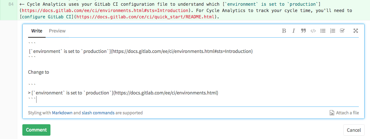
However, when you don't wrap it, a collaborator needs to point to the portion of the text before explaining the change, which can be very time consuming. For example, in the paragraph below, the collaborator needs to identify the link first, and repeat the section with the proposed changes:
 {:.shadow}
DO WRAP IT.
The company's official position is of the do-wrap variety, with the main reason that when people view and edit the text, they can do so without scrolling horizontally ad infinitum, which drives some people nuts. As a result, the comment box sometimes extends beyond the edge of the viewport, making it difficult to use any of the buttons on the right-hand side.
To compare to the last example, the following screenshot of a text already wrapped, it's easy to comment inline directly, without having to identify what you're talking about first and commenting afterwards.
 {:.shadow}
Comparing Similar Views
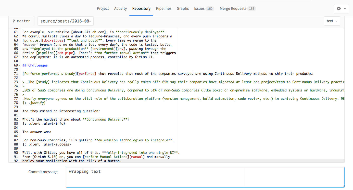
When editing a file in the GitLab UI, this is how wrapped text looks like:
 {:.shadow}
And this is how an unwrapped code looks like:
 {:.shadow}
Even when you're reviewing locally, check how a wrapped text looks like on Sublime:
 {:.shadow}
And how it looks when unwrapped:
 {:.shadow}
Clearly, wrapped text can be considered better for both reading and reviewing through inline comments. But it can also be annoying when writing and editing the file.
Going forward
Particularly, while I'm writing, I don't wrap the text. I'll do that just when it's ready for review. This way, I save myself some time when writing and editing, but I still leave it wrapped for facilitating the reviewers to add inline comments in my merge request.
But yes, there are pros and cons for both cases, of course. The question is, what can we do to make it less painful for everyone?
One of the possible actions we could take going forward is to set a max-width both on the comment box container, and on the editor, so that it remains in a usable state, regardless of code length.
Other ideas? We’re open to them. Let us know what you think, and how you do that with your team.
Note: Currently for blog post technical articles we follow the Style Guide, but the Blog Post Style Guide is an override or addendum to that. The consensus has been that wrapped text facilitates review. We have a lot of guest writers and many reviewers, and this seems to be their preference, so we’ve tried to honor that.
We want to hear from you
Enjoyed reading this blog post or have questions or feedback? Share your thoughts by creating a new topic in the GitLab community forum.
Share your feedback