Published on: October 19, 2016
3 min read
GitLab UX update
Inside GitLab: Sneak peek of what the UX Team is working on

The UX Team at GitLab has been hard at work, and I'm delighted to share a sneak peek of some of their designs. While more details will be shared when the various features ship, hopefully this quick update will help you get excited for what is in the works. The designs below share some of what the UX Team is currently focused on, with a mix of features for both 8.13 and future releases.
What we've been working on:
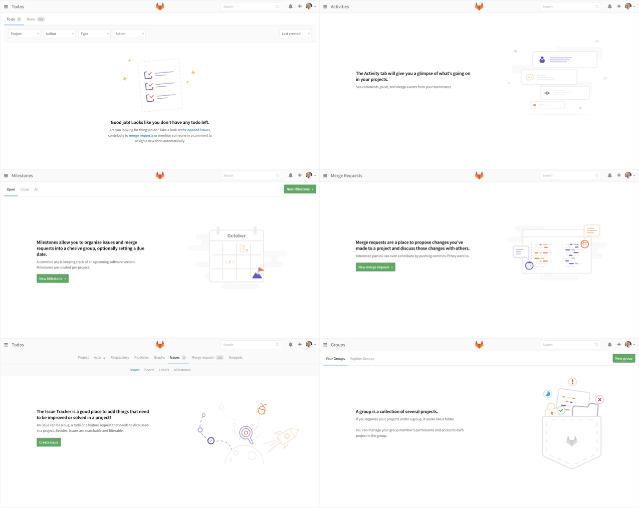
Better Empty States
Empty states are easy to forget about. However, they can be great moments to celebrate an accomplishment (you finished all of your Todos!) or explain a concept (when to use a group).

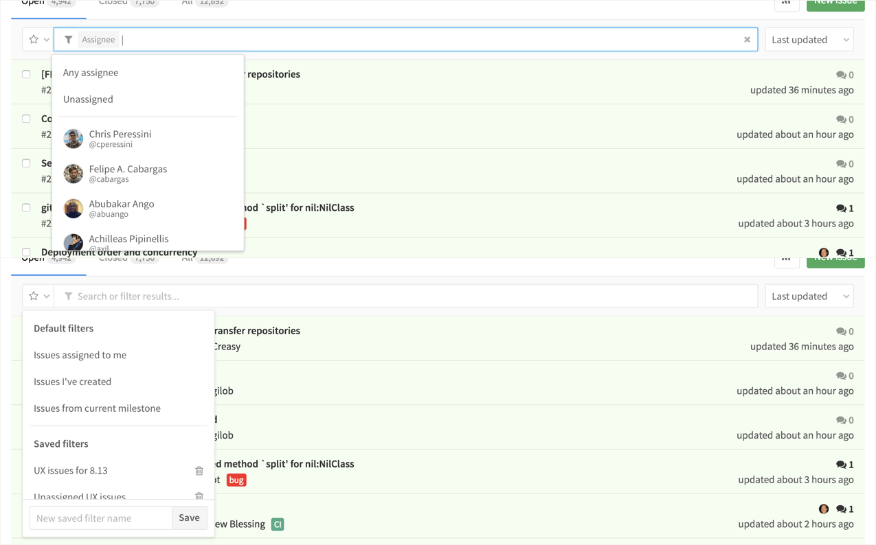
Rethinking Filtering and Searching
Today we have a rich set of filters and search options, allowing you to find exactly what you are looking for. However, you have to jump between many dropdowns, and can't always build the complex query you are looking for. We are actively working on combining the controls into a streamlined, powerful search flow.

Tracking Time
Large companies need to understand the cost of work and use of their resources. One aspect of this is tracking time spent on issues. Using slash commands, you can now easily estimate the time needed for an issue, and keep track of time spent as you work on it.
![]()
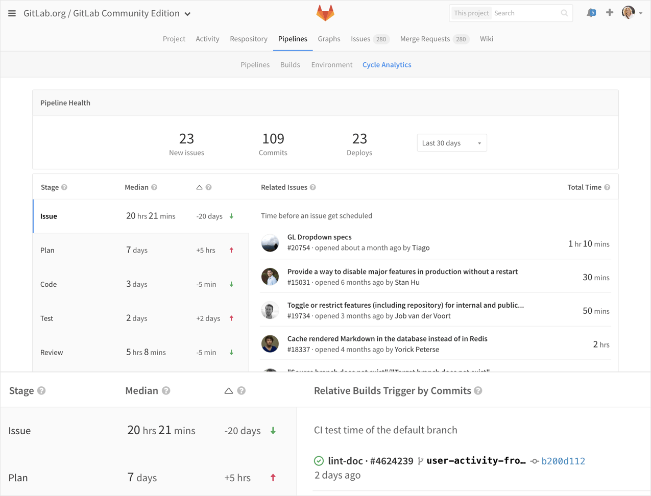
Building upon Cycle Analytics
With the next iteration of Cycle Analytics, we are helping break down each of the stages into events that data was gathered from. It is now much easier to see how the information is being put together, and exactly where your time is going.

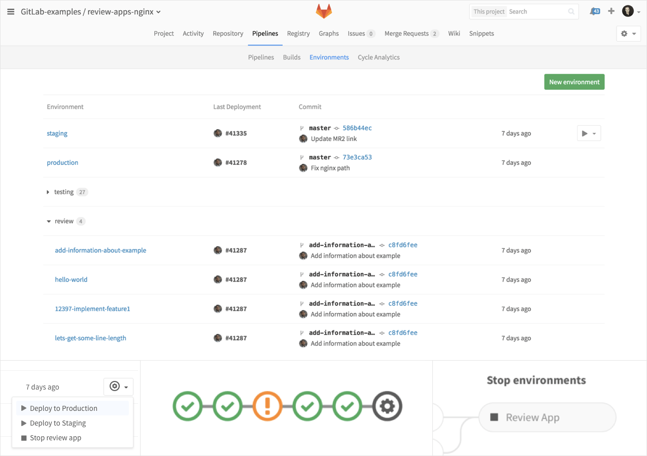
Refining the Review Apps Experience
We are continuing to polish our Review Apps experience, allowing you to stop apps, and group environments.

What's Next?
We are already jumping into more work, from standardizing and cleaning up our many settings pages, to adding such useful visuals as burndown charts. We are also digging into large open question such as refining the personality of GitLab.
We love getting feedback! Please share your thoughts on the designs by commenting below, joining the discussions in any of the issues linked above, or opening a new issue to let us know what else we should consider. Thanks!
Acknowledgments
The design work on this page was created by Hazel Yang, Chris Peressini, Dimitrie Hoekstra, Pedro Moreira da Silva, and Taurie Davis. Thanks for all of your great work!
We want to hear from you
Enjoyed reading this blog post or have questions or feedback? Share your thoughts by creating a new topic in the GitLab community forum.
Share your feedback