Published on: August 20, 2025
4 min read
The GitLab documentation site gets a major design overhaul
Learn about the features of our newly designed product documentation site, which includes an easy way to provide feedback and the much-requested dark mode.


The GitLab documentation site now has a completely updated look-and-feel. What started as a request for targeted design fixes grew into a comprehensive redesign that delivers five major improvements:
Top five new features
Dark mode: The most requested feature is finally here. Toggle between light and dark themes in the upper-right corner for improved readability and reduced eye strain. Brand alignment: Our docs now reflect the modern colors and design language of both the GitLab marketing site and product UI, creating a cohesive experience across all GitLab properties. Simplified feedback: Users can now give thumbs up/down feedback and add comments directly on any documentation page. Redesigned navigation: We've moved primary navigation to the top and restructured our left sidebar to make our 2,300+ pages feel less overwhelming and more discoverable. Addressed technical debt: Dozens of small but impactful fixes to typography, spacing, code blocks, and visual inconsistencies that had accumulated over the years.
Why now? The foundation for change
Earlier this year, led by Sarah German, our documentation engineering team completed a critical replatforming project, migrating from Nanoc to Hugo. While largely invisible to users, this change delivered dramatic performance improvements — 130x faster local builds and 30x faster full builds — and provided the solid technical foundation needed for these improvements. This replatforming was essential groundwork that enabled us to focus on user experience enhancements rather than wrestling with outdated infrastructure. Let's look more closely at the changes.
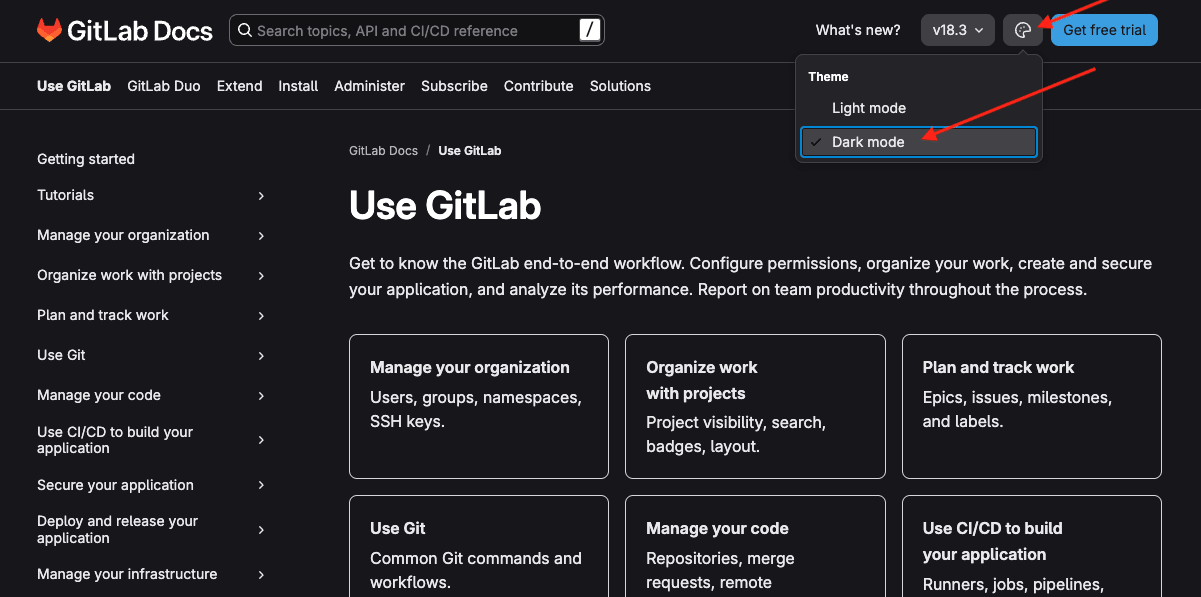
Dark mode
Possibly the biggest news for this release: dark mode is now available across the entire documentation site. Change the setting in the upper-right corner, and the site will remember your preference. For many users, dark mode makes content easier to read and reduces eye strain.
Brand alignment with marketing site
The new design creates visual harmony between our documentation and the broader GitLab experience. We've incorporated GitLab's modern color palette and design elements while maintaining the clean, functional feel users expect from technical documentation.
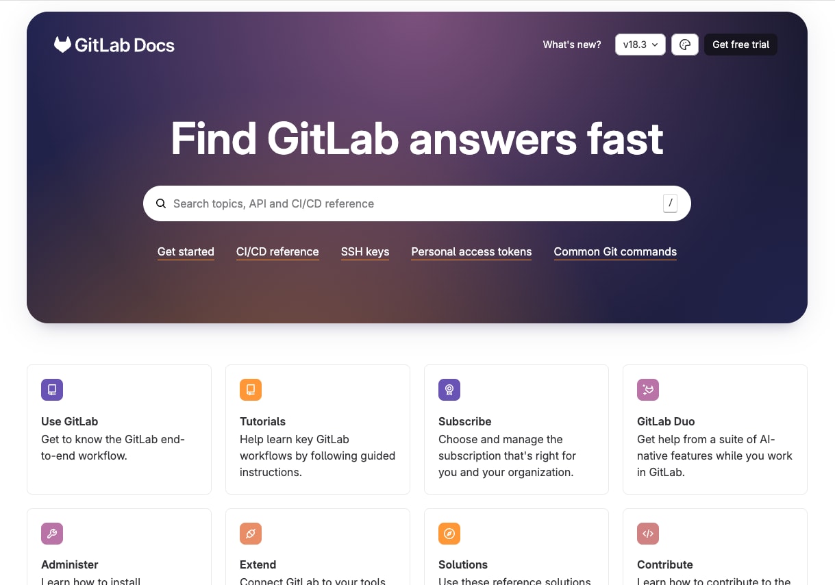 The updated homepage focuses on our primary documentation areas, including tutorials and getting started guides that help new users learn GitLab.
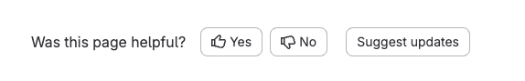
Simplified feedback mechanism
We've eliminated friction in the feedback process. Instead of requiring users to leave the docs site and create GitLab issues, they can now provide immediate feedback with thumbs up/down ratings and comments directly on any page. Scroll down on any documentation page to see this new functionality in action.
Navigation redesign
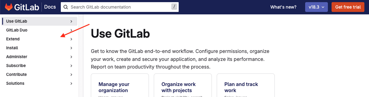
One of our biggest challenges was organizing over 2,300 pages in a way that doesn't overwhelm users. Our previous single left navigation, while comprehensive, created a daunting experience:
 The new approach moves primary navigation to the top, creating shorter, more manageable table of contents sections that feel less overwhelming to traverse:
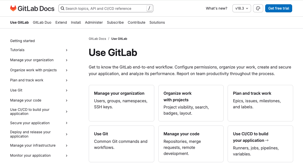 This structure better reflects the relationships between features while making individual sections more digestible.
Style updates and technical debt
Over the years, small style inconsistencies had accumulated — inconsistent padding in lists, extra spacing around alerts, and various typography issues. While these might seem minor, they created a subtly jarring experience for daily users.
Our tabs and code blocks received particular attention, becoming better-defined in the process.
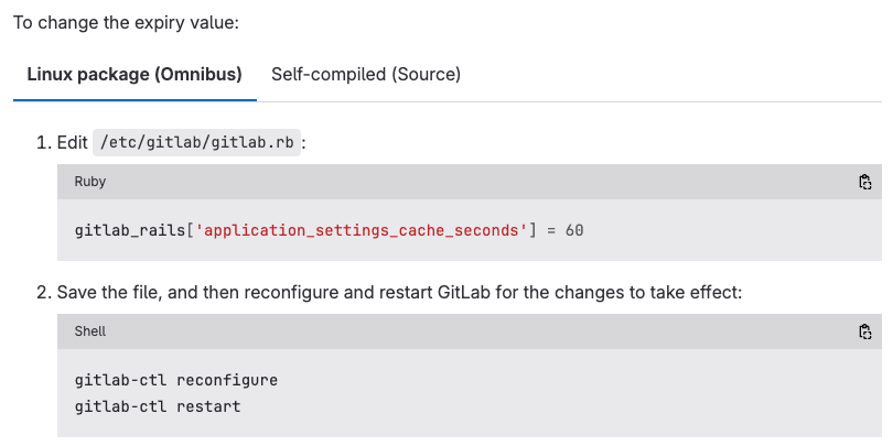
Before, tabs with code looked like this:
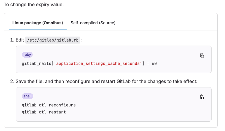
 And now, with a few small tweaks, they look like this:
 These "papercut" fixes may be small individually, but collectively they create a much more polished, professional experience.
What's next?
This redesign represents how we iterate at GitLab — shipping meaningful improvements while building toward an even better future. We expect to continue refining the structure and adding features that help users find what they need more easily. User feedback will drive our next iterations, and with our new simplified feedback mechanism, we're better positioned than ever to hear directly from our documentation users.
The team
This transformation was a true team effort. Kudos to UX Papercuts and Julia Miocene for taking what started as a simple request and turning it into a comprehensive design vision. Thanks to the engineers in Technical Writing: Sarah German, Pearl Latteier, and Hiru Fernando, who brought these designs to life. The new design balances information density with visual clarity, modernizes our site while maintaining usability and accessibility standards, and represents a significant step forward in both user experience and visual design.
We want to hear from you
Enjoyed reading this blog post or have questions or feedback? Share your thoughts by creating a new topic in the GitLab community forum.
Share your feedback