
is now in public beta!
Published on: March 29, 2018
10 min read
Polishing GitLab’s UI: A new color system
Senior UX Designer Pedro Moreira da Silva takes us on a deep dive into how the UX team improved the GitLab UI’s color palette.

We receive a lot of feedback from our users and the broader community. After hearing that there is a perceived lack of consistency and quality in GitLab’s UI, we decided to take a look at our color palette.
Aesthetic aspects like this are a fundamental part of the UI. If we don’t get these right, everything else in the UI won’t feel, look, or behave correctly. Like a house, these aesthetics are the foundation upon which everything else is built.
Our color palette had various issues, so we started by:
- [building a better palette][ce#28614] that aligned with our goals,
- and [defining a color priority system][ce#31094] that helped us move forward.
Why start with colors?
There are many aesthetic aspects to a UI. So why tackle colors first? Well…
- Colors are easy to change: it’s just a matter of changing simple values in
our
variables.scssfile. - Color changes don’t affect layout: we weren’t reinventing the wheel, so these changes wouldn’t influence the layout and spacing between elements like typography can.
And, more subjectively, colors have a huge impact on the perception of a UI. It’s said that 90 percent of information entering the brain is visual and color is an attention-grabbing device.
Issues with the previous color palette
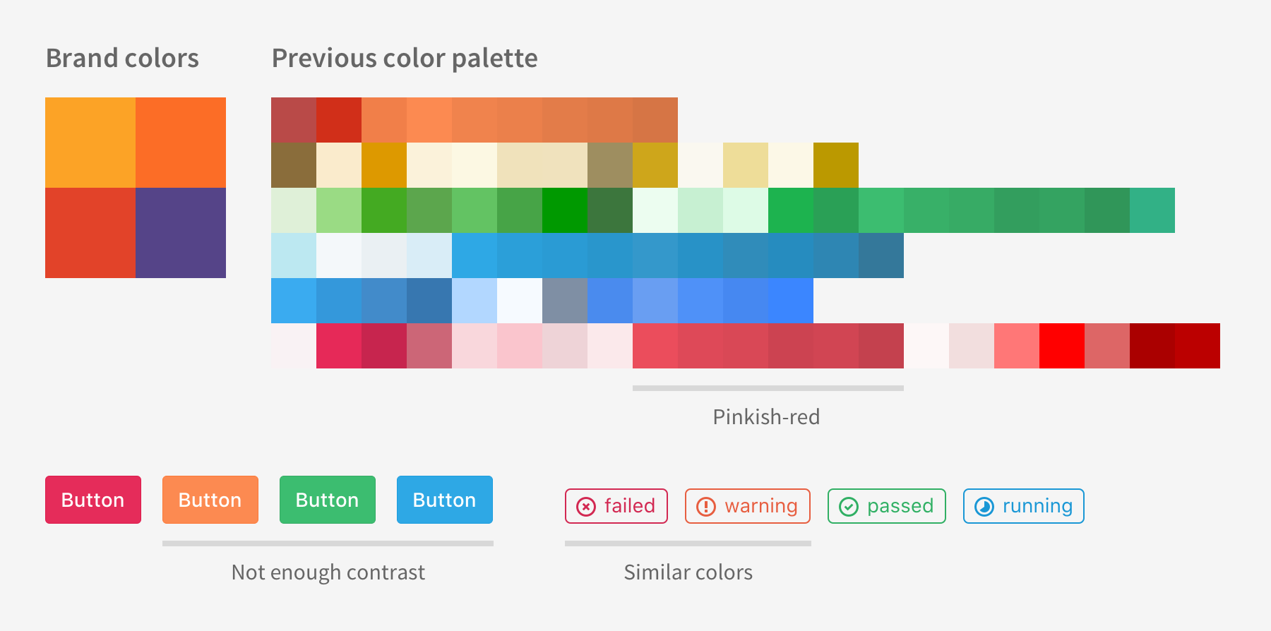
It didn’t extend the brand colors
They weren’t in line with our brand colors, with the most obvious example being the pinkish-red normally associated with negative aspects like errors or irreversible actions. We already have a red from our brand, so why use a different one?
There were too many similar colors
With so many colors, it wasn’t easy to tell them apart. They were so similar that they no longer brought value to the table, just more guesswork and maintenance.
There wasn’t enough contrast
Many of our color combinations did not meet the contrast ratios defined in the [Web Content Accessibility Guidelines (WCAG)][wcag-contrast].
Note that some of these issues were also applicable to grayscale colors (also called “achromatic”).
Building a better palette
At GitLab, we’ve done a lot of things while standing on the shoulders of giants, aligning with our company value of boring solutions. As such, one of our initial thoughts was to use an existing color palette, something that could save us time and maybe serve as the basis for our work.
We soon found Open color, an open source color scheme optimized for UI. It has 13 hues, each with 10 levels of brightness, totaling 130 different colors. All of the values are there, it would be easy for our Frontend team to get started by importing it as a dependency. This was starting to look very promising and we were getting excited about this quick start.
However, the more we thought about our current needs and goals, the more we realized that this approach wasn’t going to work for us. Existing color palettes usually had too many colors for our needs and the ones we did need, would have to be tweaked to align with our brand colors. All of the upsides of using an existing color palette were now irrelevant.
We went back to the drawing board, starting with defining the goals we wanted our new color palette to achieve:
- Align with and extend our brand colors
- Have only the hues that we need, the colors that have meaning in the UI
- Be accessible by passing the WCAG
1. Extending the brand
The first step in creating our new color palette was inspired by “[Add Colors To Your Palette With Color Mixing][viget-article],” where we used ColorSchemer Studio to generate this color wheel from the three brand colors and the primary purple used on this site:
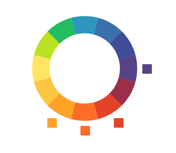
Initial colors were separated by even intervals of hue and manually tweaked. In the image above, the matching brand colors are next to the wheel for reference.
2. Cutting the rainbow
Then, we generated tints and shades for some of the hues in that color wheel: green, blue, purple, red and orange.
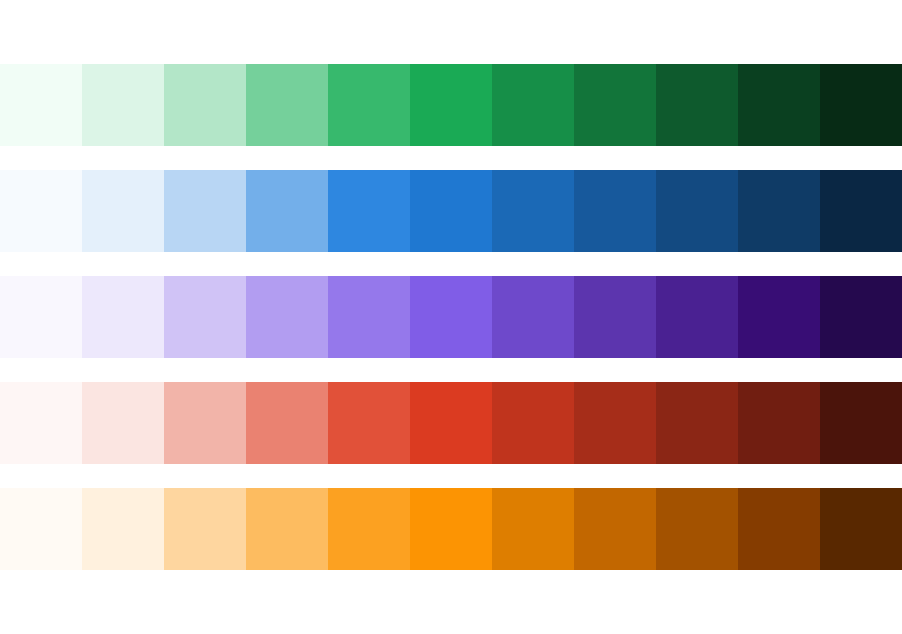
These were first obtained from the Material Design Palette Generator and then tweaked manually using Colorizer and Eric Meyer’s Color Blender. The dark orange colors are a good example of manual tweaking as they initially looked very “muddy.”
It’s important to consider the number of tints and shades that you need, as that affects the flexibility when applying those colors. Our guiding principle here was to provide clear and visible contrast between each step of the scale. If we had steps that were too similar, the difference wouldn’t be noticeable, which meant that there was no value in having those colors.
We didn’t want all of the colors of the rainbow, just the ones that carry meaning effectively. We want to be able to communicate states and actions by applying colors to elements in the UI (e.g. informational elements are associated with blue). If you have too many similar colors in a UI, like green and lime, you’re expecting too much not only of your users but also of your team. On the one hand, most of your users won’t notice the difference between colors when placed in a complex UI, so they also won’t pick up the different meanings. On the other hand, your team will have more work learning, working with, and maintaining unnecessary colors.
Additionally, we shouldn’t rely on color alone to communicate something, so that’s also another point for not having too many similar colors. This is actually one of the success criteria of the WCAG about the use of color:
Color is not used as the only visual means of conveying information, indicating an action, prompting a response, or distinguishing a visual element.
3. Colors for everyone
Using a small set of colors which allows for better memorization and recognition is already a good step towards a more usable product, but it’s not enough.
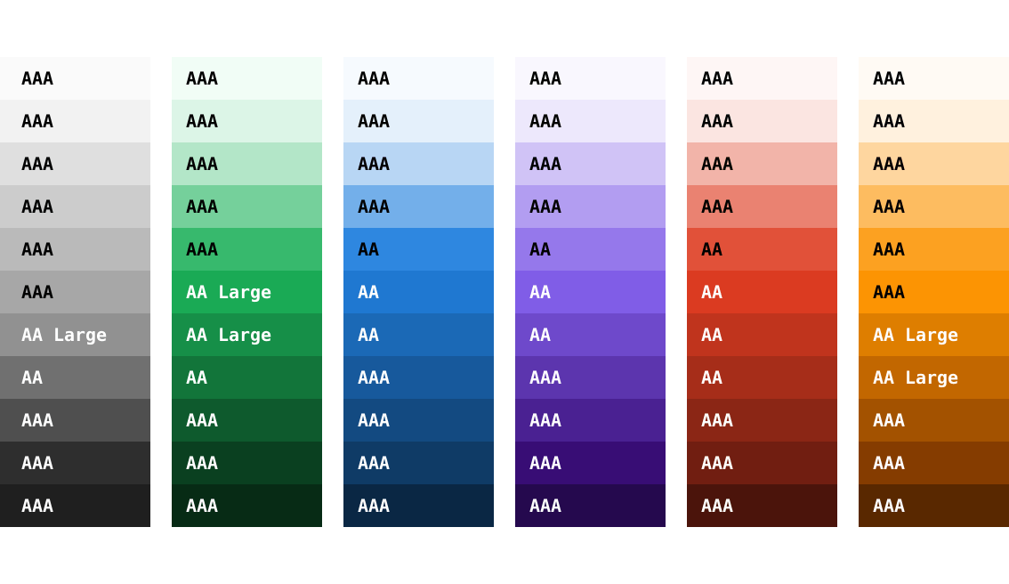
Evaluating, testing, and prioritizing accessibility problems is one of our main initiatives here at GitLab. Establishing contrast between text and background is one of the key aspects of accessibility and, as we saw before, our previous color palette didn’t meet the [WCAG contrast ratios][wcag-contrast]. So, as we were defining our new color palette, we continually tested the colors using the WebAIM Color Contrast Checker.
Along the way, we hit a problem: combinations of white text over green or orange backgrounds did not pass WCAG level AA for small text. This was an issue because we wanted to keep a uniform “vibrancy” and “pop” throughout all colors. While the colors looked uniform to our human eye, the WCAG test didn’t “see” them as we did. Would we be forced to “break” this visual consistency and use darker shades for those colors? Not only that, but this would render them too dark to carry meaning effectively. In the following example, the “success” meaning of green or the “warning” meaning of orange become less immediate as their contrast increases.
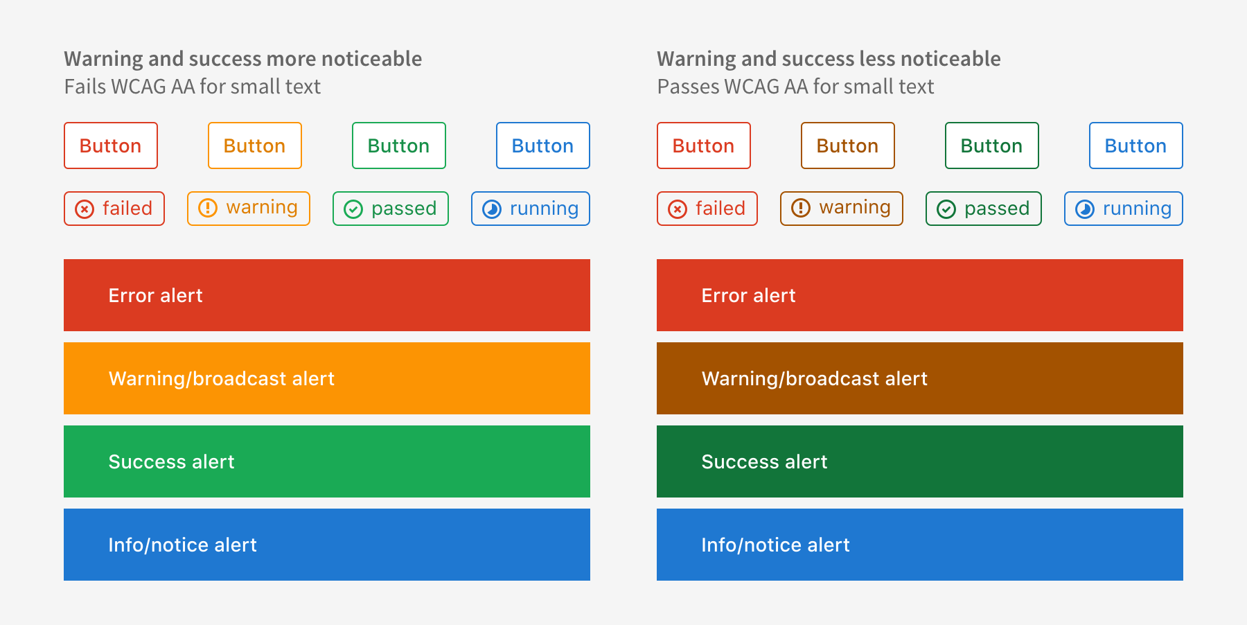
We found an interesting take on this at the Google Design website, which intentionally uses colors that at least pass AA for large text:
Due to this site’s purpose being a source for visual design reference and inspiration, we felt it was acceptable not to target a stronger color contrast level. — Behind the Code — Google Slash Design Accessibility
Considering our audience and user base, should we be rigid and enforce AA level for small text? As a first step towards better color contrasts, we decided to set our minimum at AA for large text, even for small text. For grays, we [tested and tweaked their contrast against light gray backgrounds][ce#36675], as that is a common color used to differentiate regions in the UI.
Color priorities
So, after all this work, we introduced a wide range of color tints and shades with the new color palette. The problem was that there was no guidance for using them. Some color decisions are fairly quick and intuitive, but we wanted to standardize and make the color selection process as objective as possible for everyone, even developers. We want to give people the chance to make a decision without imposing approval or reviews by the UX team. We want to be lean, efficient, and focus on results.
Some questions that we should be able to answer:
- “I need to use one blue, which shade should I pick?”
- “This UI component needs three contrasting shades of green. Can I pick whichever I want?”
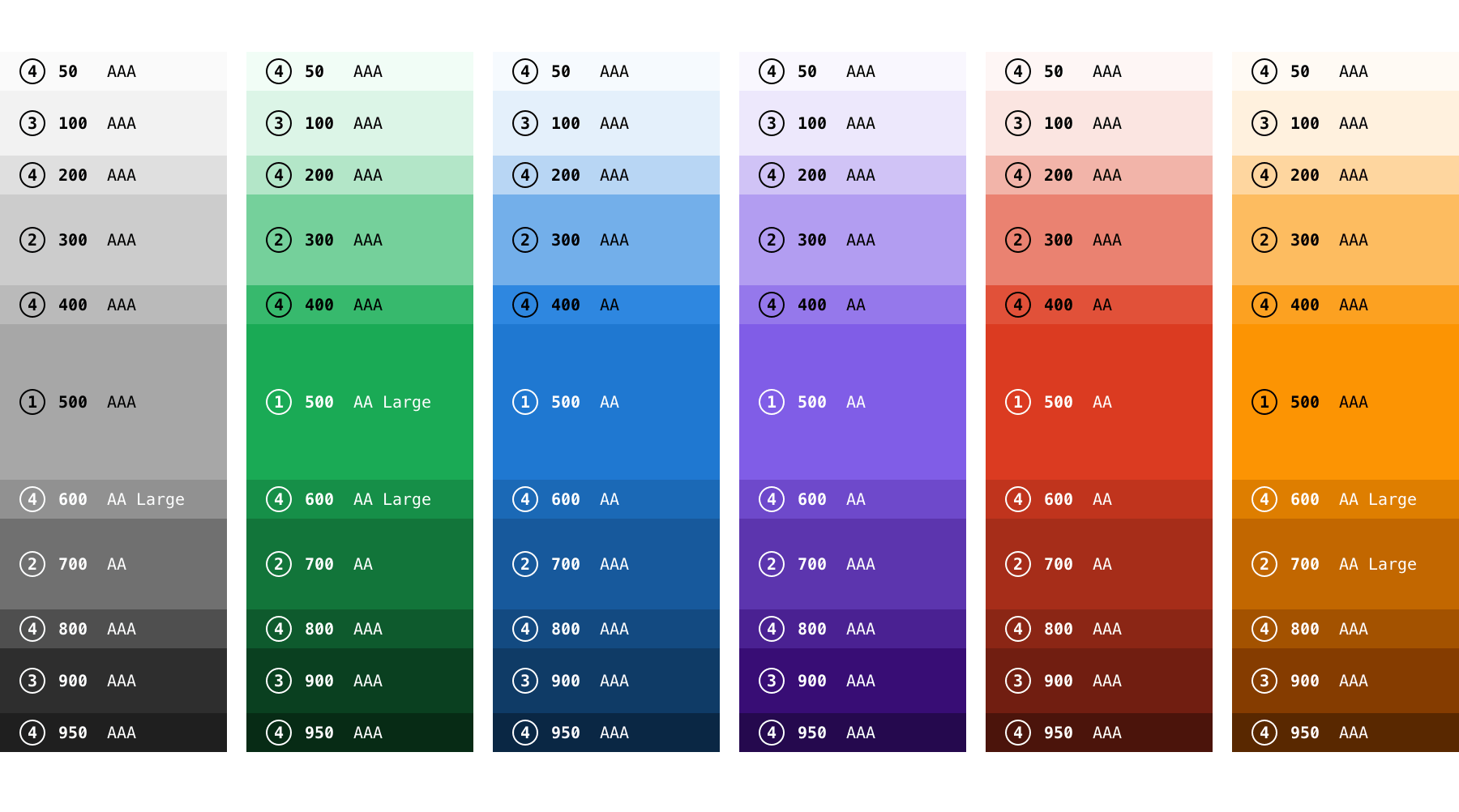
The Material Design colors
have been a great source of inspiration for us. They follow the numeric naming
conventions used by the CSS font-weight property,
where a higher value equals a higher degree of blackness. So, we’ve named our
colors from the lightest (50) to the darkest (950).
On top of this naming scheme, we’ve defined a system of color priorities. This is similar to how different font weights are used to create contrasting typography that communicates hierarchy.
We can apply this same logic to colors, as seen in the image below, by tagging them according to their priority: from 1 to 4. If you need guidance, the priorities can help you make better choices. When choosing how to apply color to a UI component:
- You start at priority 1, which is the medium weight 500. There’s only one shade with priority 1 per color (the “default” shade).
- For more shades of the same color, you could then choose from the next priority level, number 2, which can either be 300 (lighter) or 700 (darker). And so forth for even lighter or darker shades.
What’s next
Along the way, we’ve learned that mixing colors and defining color palettes is not only science, nor only art, it’s a subjective balance on the human mind. Color harmony depends on many factors, like culture, age, social status, or even the designer’s intent.
We’ll have to see how people use the 11 tints and shades and how they’re applied in our [Design System][ds]. This is a constant evolution, and we’re always iterating (as we should be).
Next, we’re going to review our color meaning guidelines and be more active in their usage, not only in the product but also in our [Design System][ds] and pattern library.
A new color palette and a color priority system are seemingly small steps towards a better user experience throughout GitLab, but they do make a big difference, for our users, our team, and every contributor. This is the first initiative to polish our UI styles, next we’re implementing our new type scale – which will deserve a dedicated blog post.
If you have any questions, feel free to post a comment on the community forum, tweet at us, or join the discussion on the following issues:
- [Change chromatic/full colors to a more harmonious palette][ce#28614]
- [Define color priorities][ce#31094]
- [Define a pure gray color scale][ce#36675]
We want to hear from you
Enjoyed reading this blog post or have questions or feedback? Share your thoughts by creating a new topic in the GitLab community forum.
Share your feedback