
Published on: July 26, 2019
7 min read
Quantifying UX: Positioning the clone button
We wanted to move the clone button on the project overview page. Here's how user testing helped us make the right choices.

We recently redesigned GitLab's project overview page in an effort to make it easier to read. We wanted to make it simple for users to understand what the project is about and to get a quick overview of its status and activity. We considered moving the clone button further down the page, but decided to put a smaller version in the header instead. The logic behind this decision:
Things further down the page are harder to find.
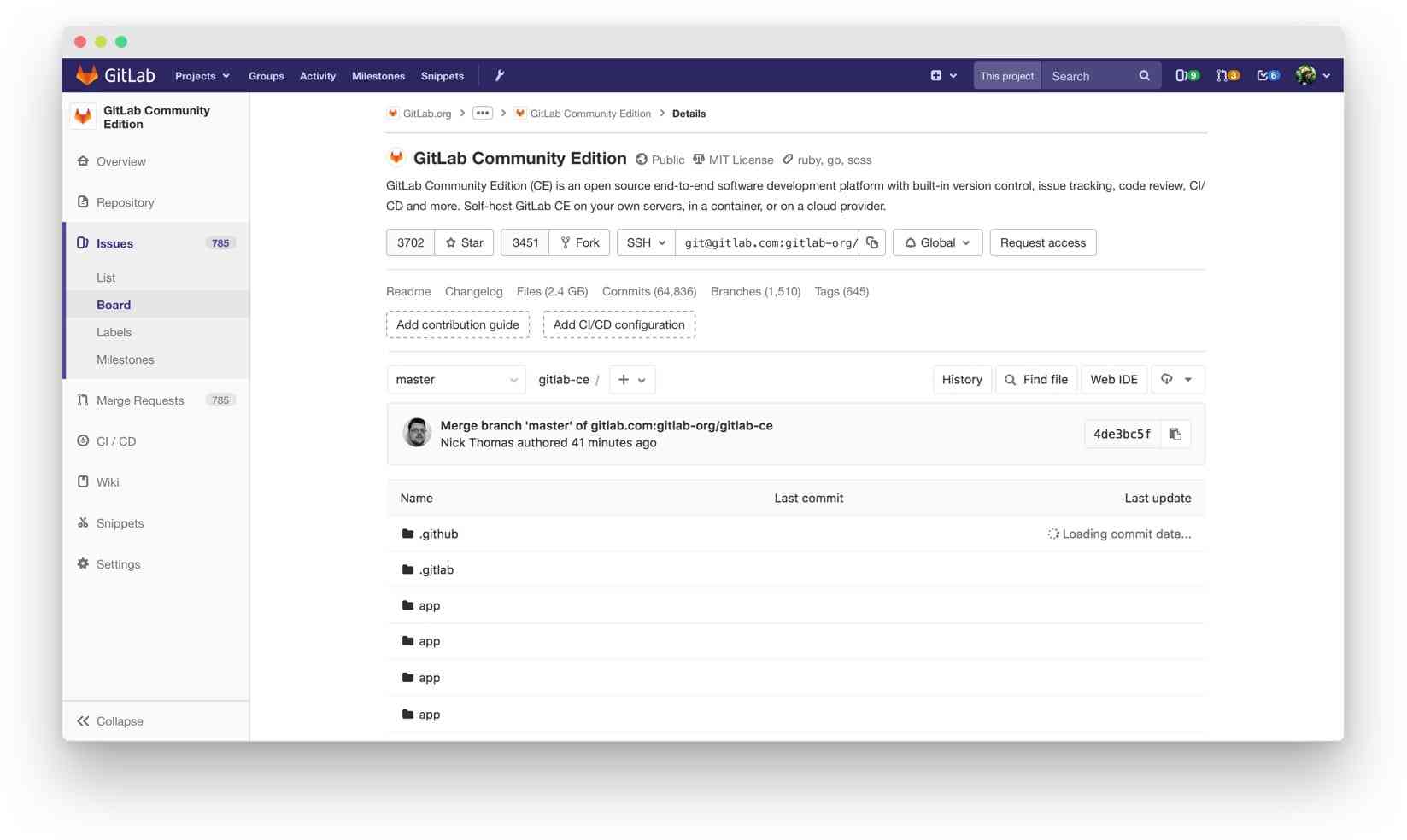 The original project overview page. Lack of structure and an unclear information architecture were two major problems.
We know one of the main things users want to do on the project overview page is clone the project.
We were already changing the UI so we would hide both clone URLs (HTTPS and SSH) behind a dedicated “clone” button, but we were concerned that change would have a negative impact on the discoverability of the cloning options.
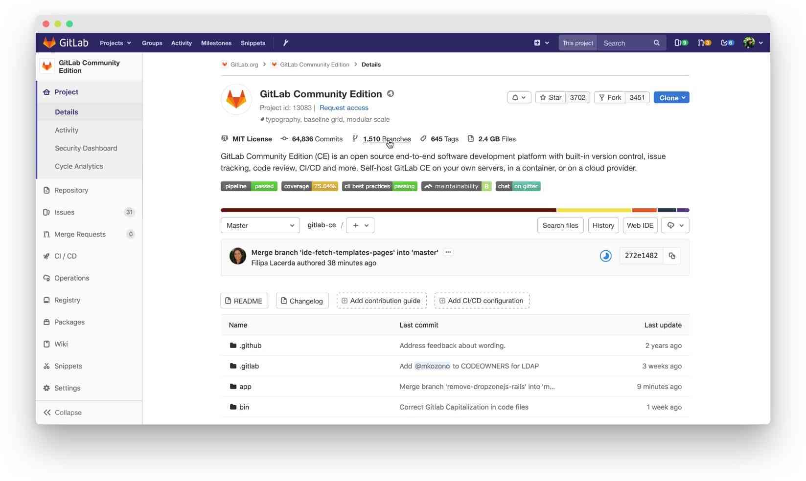 The redesigned project overview page that is currently live.
We received some negative feedback after the change but nothing that was too serious. The feedback was mostly about having to make an additional click to get to what the user wants. We concluded it was a compromise we could live with.
Moving the clone button
But after a while, we started receiving more feedback and suggestions to move the clone button down to the file tree control area.
The initial suggestion was made because the recent redesign of the project overview page made the clone button completely disappear from the repository page. Removing it from the file tree section in one place removed it from all occurrences of this UI pattern.
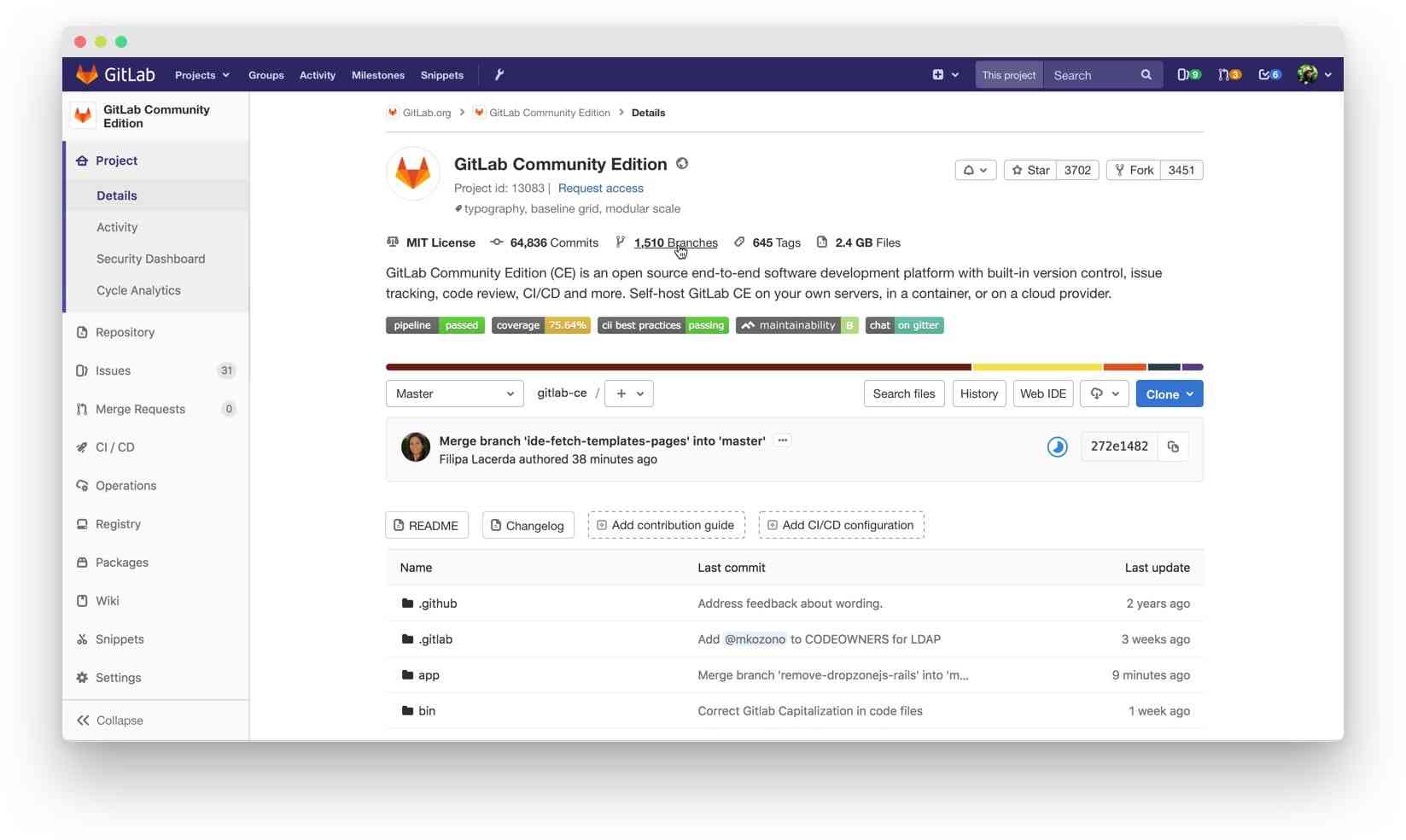 The proposal suggested we move the clone button down to the file tree controls.
I remembered the negative feedback we received for our most recent change so I wanted to make our decision with some research. I quickly created a UsabilityHub click test that would tell us if the discoverability of the button worsened by moving it further down the page. The test was simple: show the new design and ask the participants one question – Where would you click to copy (and sync) this repository to your local machine?
Our UX research team helped me shape the question so that it wasn’t leading (we couldn’t use the word “clone”). We would also run a control test with the live design – the one where the clone button is in the header – so that we could have a baseline for comparison.
 This is what solving a click test looked like.
As I was working on the test, I thought it was going to further validate the recent change where we moved the clone button to the header. It makes sense: If a dark blue button is on the top right on a page, it’s easier to notice than if it’s further down or possibly below the fold.
But then I remembered that other Git platforms (most notably GitHub) have the clone button in the same place we were considering. The test went live and I had no idea what to expect. We soon collected around 40 answers to each of the two variations and we felt that was enough to draw conclusions.
The results were surprising.
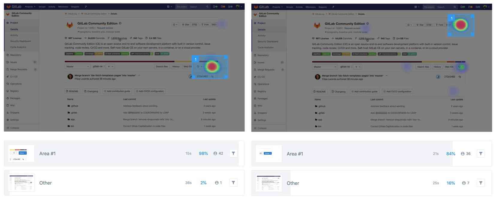 The results of the new design on the left and the current one on the right.
| Version | Correct answers | Time required |
|---|---|---|
| New | 98% | 15s |
| Current | 84% | 21s |
Almost all participants (98%) answered correctly in the new design compared to 84% in the current design. And in the new design it took them six seconds less to answer – 15 seconds instead of 21. So this means it makes sense to move the clone button to the file tree controls and reintroduce it on the repository page. It’s a win-win. No compromises there. But what can we do when the repository of a project is empty? We show different information on that page when a repository is empty and the layout of the page is slightly different too.
Cloning an empty repository
So we solved one part of the problem and now it was time to solve the other part. When the repository of a project is empty we show instructions on how to use it.
Cloning instructions are included as well but there’s no button in the cloning instructions or anywhere close. So far we didn’t really need one as we had one in the header.
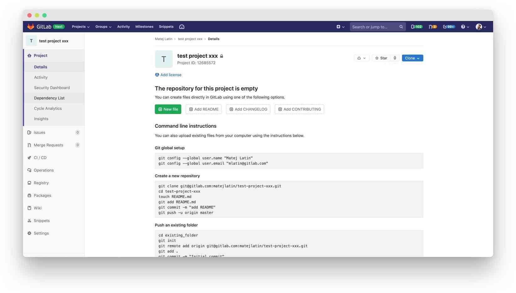 Current empty repository project overview page.
But moving that button down to the file tree controls now meant we wouldn’t have a button in the header anymore. This same scenario applies to the empty repository too! So what should we do? What would happen if we completely removed it?
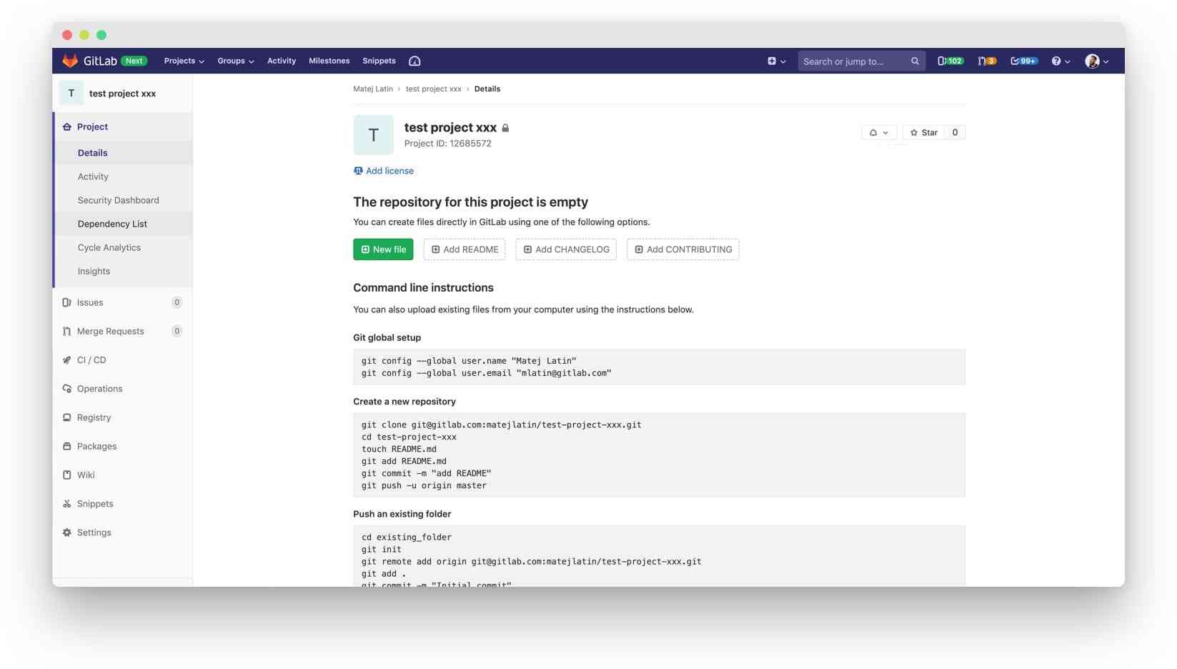 Empty repository project overview page without the clone button. Will removing it have a profoundly negative effect on user experience?
This was another question we could answer with a quick test. I created two variations of the test – one with the button in the header (current design) and one without it (new design). We would show one of the variations to a participant and ask: Where would you find the information for copying (and syncing) this repository to your local machine?
You’re probably thinking the result of this test should be obvious – the variation with the button should win. We were thinking that too, but we wanted to see what the difference was.
We wanted to quantify it so we could make an informed decision. If the results were really bad, we would consider adding a clone button to the instructions area. This solution felt a bit odd so we wanted to make sure it was the right thing to do.
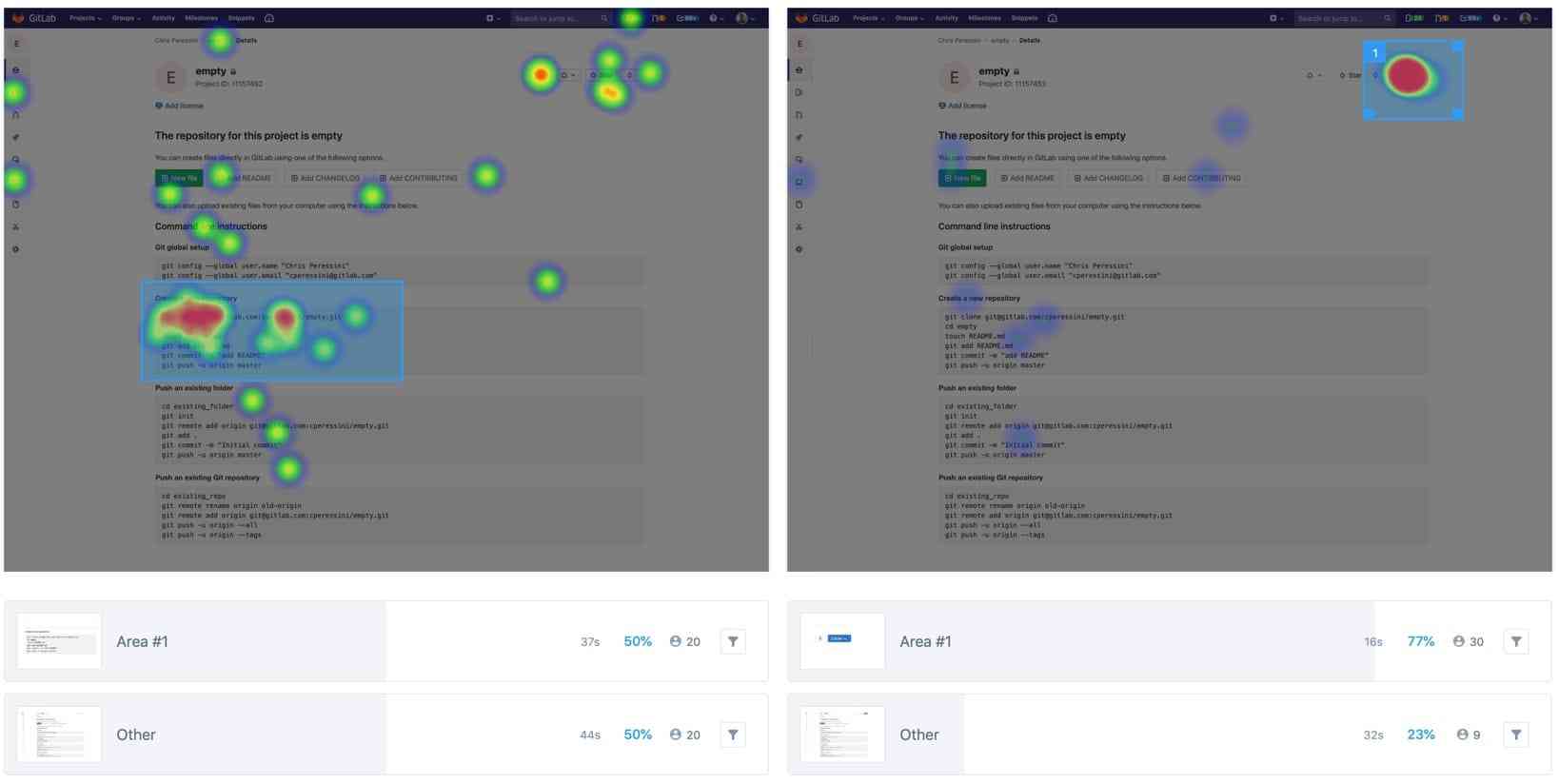 Results of the new design (without the button) on the left and the current design (with the button)
on the right.
And yes, the results were what we expected. Just over three-quarters of users (77%) answered correctly in the current design and it took them 16 seconds. Removing the button altogether meant only 50% of users found the cloning information and it took them 37 seconds. That’s 21 seconds longer! We concluded removing the button had a very negative impact on user experience so we decided to introduce a clone button in the instructions area.
| Version | Correct answers | Time required |
|---|---|---|
| New | 50% | 37s |
| Current | 77% | 16s |
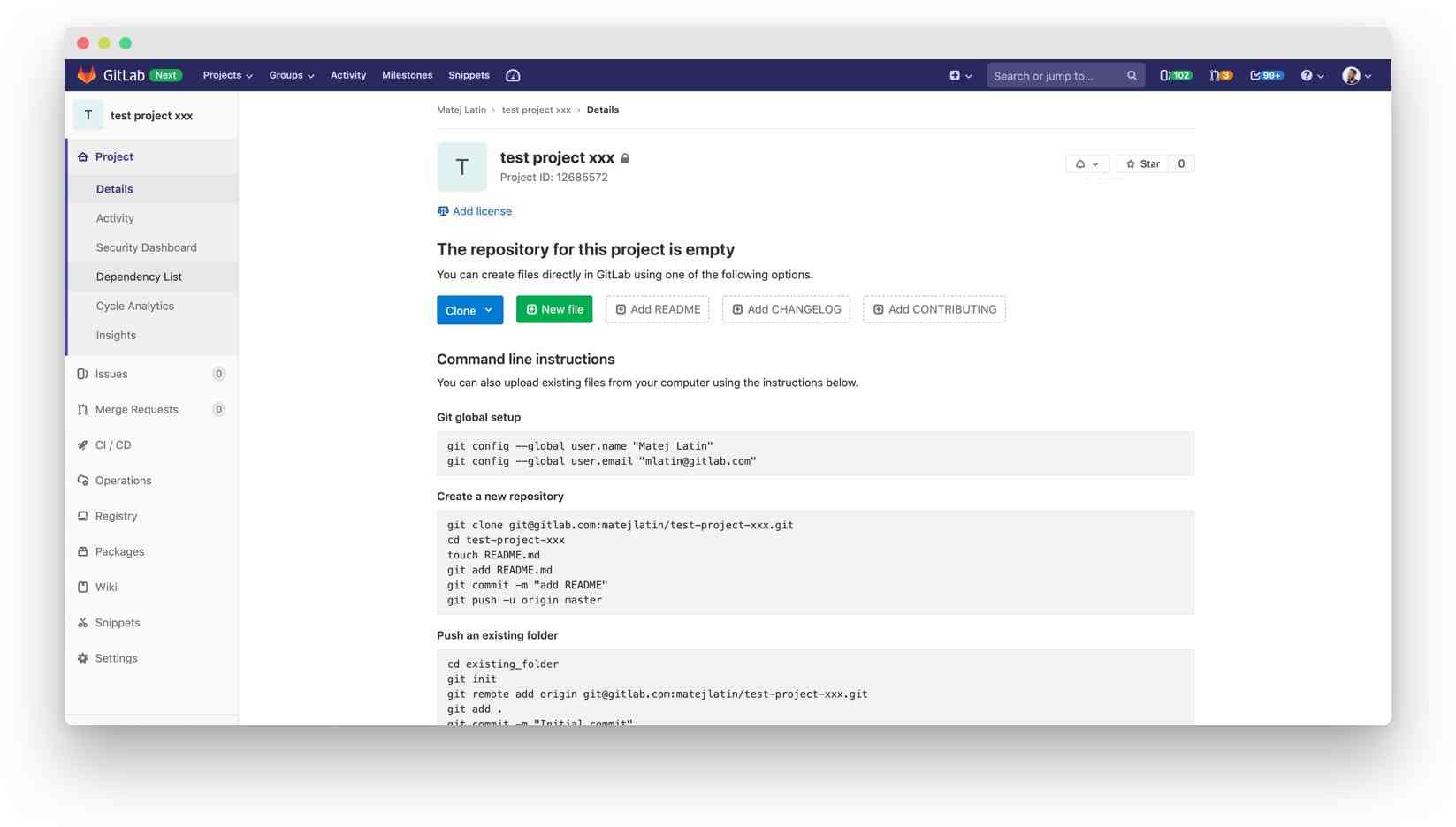 In the end, we decided to add the clone button on top of the instructions sections, where all other buttons already are.
The solution is currently being implemented by a member of our awesome community and we’re looking forward to seeing this change live!
Read my previous Quantifying UX blog post about redesigning GitLab's settings pages.
Cover image by David Travis on Unsplash
We want to hear from you
Enjoyed reading this blog post or have questions or feedback? Share your thoughts by creating a new topic in the GitLab community forum.
Share your feedback50%+ of the Fortune 100 trust GitLab
Start shipping better software faster
See what your team can do with the intelligent
DevSecOps platform.