Published on: October 5, 2021
4 min read
Why we built GitDock, our desktop app to navigate your GitLab activities
Life is full of moving parts. We get it. And that's why we created GitDock so you can keep track of all things GitLab right from your desktop.

Keeping track of everything that is happening in your GitLab projects and groups can be quite overwhelming. Often times you care about not only one project, but multiple ones. Even worse, these projects might even belong to different groups, making everything more complex.
As an example, product designers at GitLab might work on all of these different projects over the course of just one week:
- gitlab-org/gitlab (our product)
- gitlab-com/www-gitlab-com (our handbook)
- gitlab-org/gitlab-design (space for discussions)
- gitlab-org/gitlab-services/design.gitlab.com (our design system)
- gitlab-org/ux-research (research studies)
User-centric vs. project-centric navigation
One of our product design managers (@jackib) created a visualization that shows the current project-centric navigation model that we have in place.
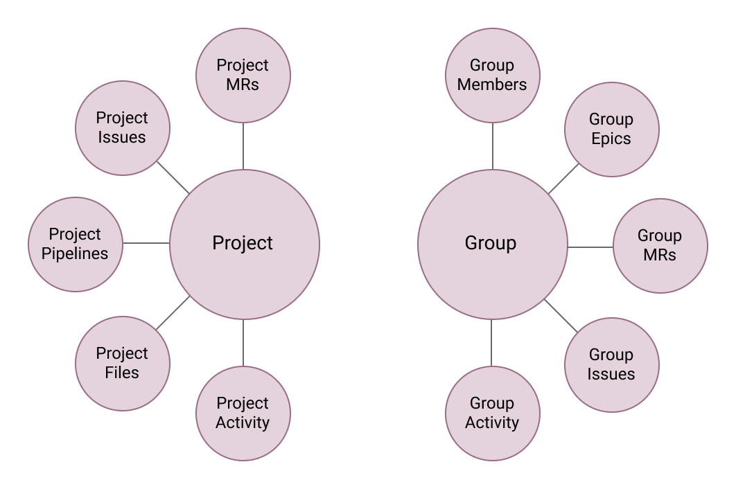
This model puts the burden of keeping track of your activities and the work you care about on the user. We would rather look for opportunities where we can enable a more user-centric navigation.
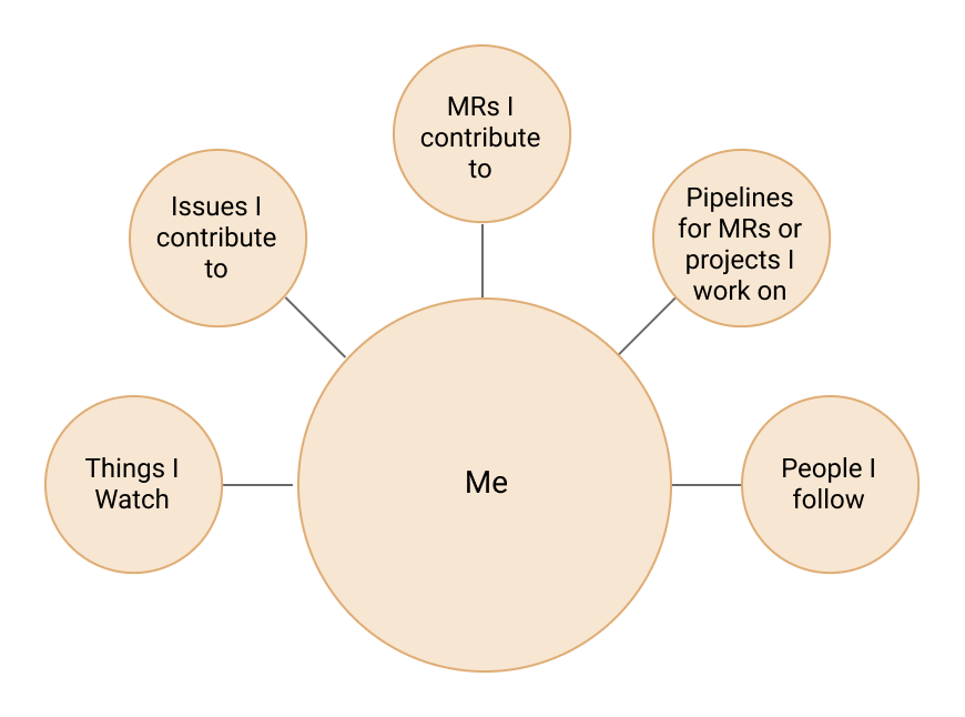
Why do we care about this?
Users already have different ways to stay up to date, for example email notifications, our "to-dos," or custom systems they have set up for themselves. However, when we ran a UX research study, we noticed these tools often times only show a small subset of the things that users are curious about or the tools have to be checked multiple times during the day.
A short summary of the main points we learned from this study:
- Maintainers care about what happened to their project since they last looked at it.
- Users repeatedly check their pipelines to see the results.
- Often times users need to jump back into issues/MRs they have recently contributed to.
What is GitDock?
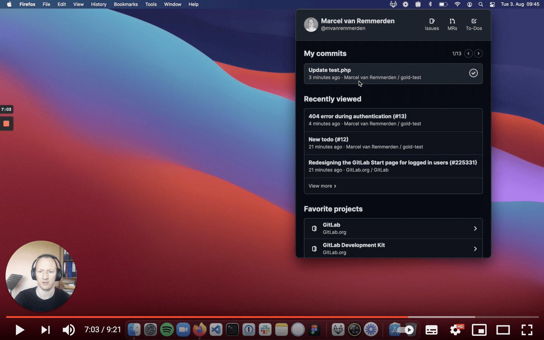
GitDock is a desktop app you can install on your macOS/Windows/Linux machine (download latest release). When installed, you will have an icon on your menu bar that brings up a small window.
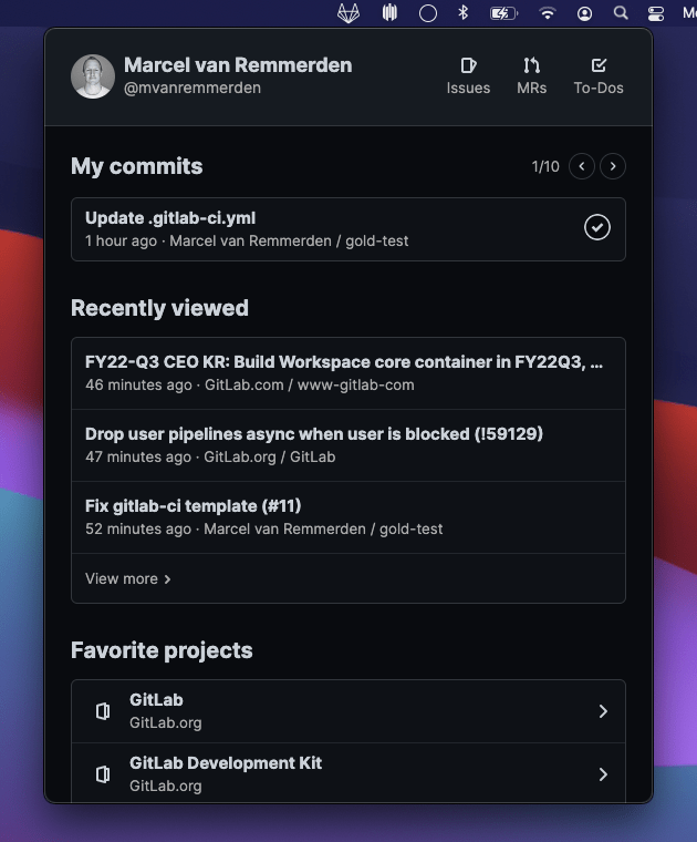
From there you will have direct access to the following information:
- The last pipelines you triggered
- Your recently viewed GitLab objects (MRs, Issues, Epics, etc...)
- Favorite projects
- Your most recent comments
- Bookmarked items
GitDock also sends you a system notification whenever a pipeline completes, or when a new to-do was created for you.
All of these features try to put the user at the center. You can see me walk through all functionality in this overview video:
You can also see the entire code in our GitDock project and download the newest release for your machine.
Why didn't we make this part of our Web UI?
The main goal for GitDock is to help us learn how users want to navigate in this more user-centric approach. We decided to build this minimum viable change (MVC) in a separate product as it allowed us to move faster and use a few shortcuts, e.g. relying on the local browser history for the recently viewed items instead of storing these in our database. It also permitted us to cut some corners on performance as our API is not yet optimized for this approach. Here's one way example of how it's not optimized: getting the last pipeline you triggered requires three API calls to different endpoints.
One other advantage is that it gives us a space to test new ideas that we are curious about without having to fully commit to them (e.g. bookmarks).
What are the next steps?
We want to use the learnings and data from this project to help us build a better start page for GitLab. Right now this page is configurable and can show you different content, but almost 99% of users keep the default "Your projects" list as start page. We don't think users do this because it is truly the most useful option, and we want to create a better experience for this.
That's why we are still looking for feedback. Let us know what you think about GitDock and what other content would be helpful for you in a start page, or other navigation feature.


