
is now in public beta!
Published on: October 15, 2024
4 min read
GitLab dark mode is getting a new look
GitLab is enhancing dark mode for a cleaner, more polished experience, with incremental updates to improve usability and visual consistency. Get a sneak peek at this new design.


Dark mode has become an essential feature, providing a darker background with lighter content to reduce eye strain, enhance readability, and maintain continuity with system-wide settings. While we currently offer an experimental version of dark mode in GitLab, customers requested some improvements. We’ve taken that feedback seriously and now we’re excited to share our vision for the future of dark mode on the DevSecOps platform, and how we plan to roll this out over the next several months.
Challenges with the current dark mode
GitLab’s dark mode, launched in 2020, has remained in an alpha state, largely due to its initial approach of algorithmically inverting colors. While this method allowed us to quickly offer a basic dark background with lighter text, there are several issues that require taking a different approach.
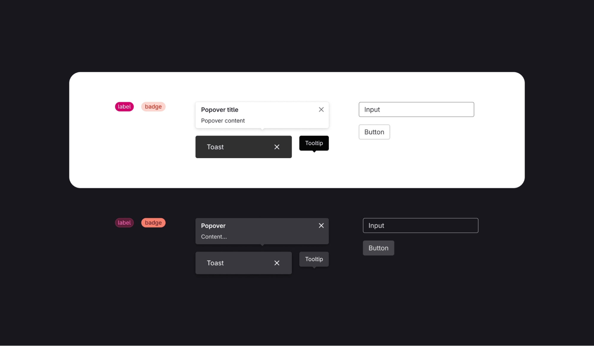
The current dark mode suffers from inconsistent visual hierarchy — some elements, like alerts, stand out too much, while others fade into the background. An overuse of color also makes certain elements, such as alerts and badges, overly saturated, distracting from key content. Additionally, some elements emit too much light, causing visual strain for those using GitLab for long periods of time.
Due to these issues and the complexity of implementing fixes, our experimental dark mode has remained below our standard of quality, with many one-off adjustments adding unnecessary complexity. We know there’s room for improvement, and that’s why we’re committed to enhancing this experience in a way that feels seamless, comfortable, and visually appealing.
Principles guiding the new direction
To create a more cohesive dark mode, we’ve developed several design principles that will guide the new iterations. Similar to our work on a Dark UI for GitLab’s Web IDE, these principles and ideas helped us focus on ensuring the experience is not only aesthetically pleasing but also functional and accessible.
To see how these principles are applied in practice with examples watch this walkthrough by Jeremy Elder, a staff product designer working on dark mode.
1. Forward elements are lighter, receding ones are darker
This mimics natural light behavior: brighter elements come forward, while darker ones recede. In dark mode, brighter elements create depth, ensuring important content stands out without relying heavily on borders or shadows.

2. Reduced color saturation
In a dark UI, color naturally stands out more, so we’re reducing the amount of color used. Instead of flooding backgrounds with color, we’re using color more selectively to draw attention where it’s needed.
3. Dimmed, not inverted
We’re approaching dark mode as “dimming the lights” rather than fully inverting the interface. This means we’re making careful decisions about which elements to darken and which to brighten, so the content remains clear while the background recedes appropriately.
Iterative implementation
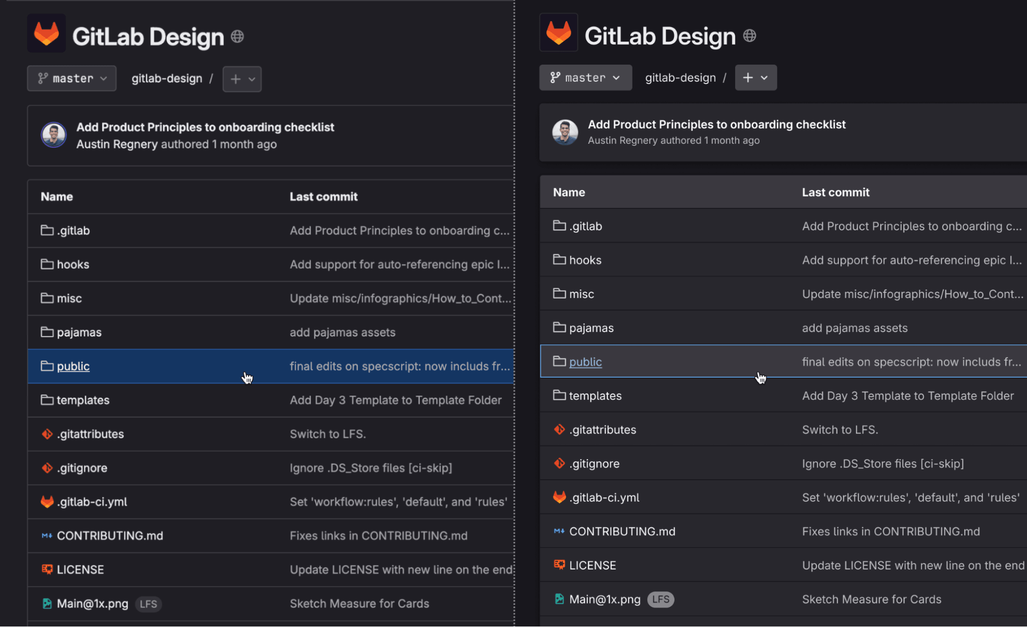
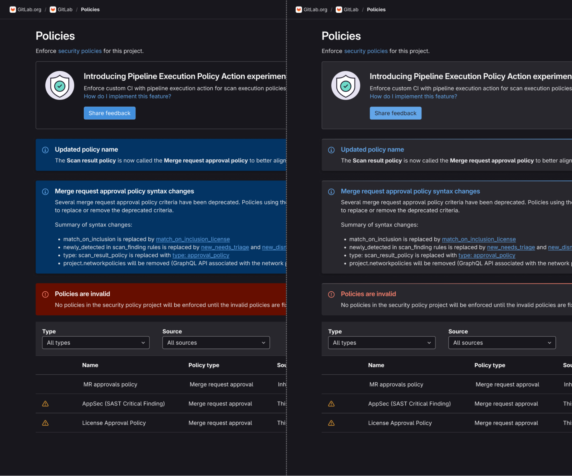
The new GitLab dark mode won’t be rolled out all at once. Instead, we’re taking an iterative approach, releasing updates incrementally. This process will begin with elements of the Pajamas Design System and gradually expand across the rest of the product. If you’re using the current dark mode, you’ll start to notice subtle changes to colors, contrast, typography, and component styling, all working towards our vision of a more polished, cohesive dark mode.
Follow our progress in the dark mode epic as we continue working towards this vision.
Read more
We want to hear from you
Enjoyed reading this blog post or have questions or feedback? Share your thoughts by creating a new topic in the GitLab community forum.
Share your feedback