Designers like to create beautiful UIs. That’s no surprise.
But visual design can be really difficult to maintain in an open source product like GitLab, where we have thousands of contributors and a strikingly fast feature velocity.
Why it’s hard
We deliberately keep the contribution barrier for GitLab as low as possible, which means small UI bugs tend to slip into the product. We’ve also had a historical tendency to focus our efforts more on value-added delivery than visual refinement.
Velocity and feature delivery are really important, so this mindset isn’t a bad thing. But, aesthetics are important, too. They have a real and meaningful impact on usability and credibility, both of which are key concerns for GitLab’s UX team.
What we’re doing about it
We’re working hard to make GitLab the most usable DevOps tool on the market. Part of that effort is making our UI as visually pleasing as we can without sacrificing speed. At a high level our plan is to:
1. Focus on tactical fixes that can happen right away
This blog post includes some examples of what we’ve already accomplished and shows you where to find what we’re doing next.
2. Update our visual design strategy
Visual design trends evolve at a pretty rapid clip, and we’re due for an update. That’s why we’re so pleased to have Jeremy Elder join our team as a senior product designer with a dedicated focus on visual design. Along with being an excellent visual designer, Jeremy brings a deep background in illustration and design systems. He’s already jumped in to help refine a number of UI issues (after only one month of being on the team). We can’t wait to see where he takes us!
3. Build out our design system
Today, Pajamas is more of an idea than a reality, but not for much longer. We’re aggressively designing, documenting, and building out reusable components that will bring refinement and consistency to our UI and enable our product designers and frontend engineers to move much faster. That only means good things for our future velocity!
More about tactical fixes
In June 2019, a small team of GitLab product designers, Annabel Gray, Marcel van Remmerden, and Jarek Ostrowski, went heads down for almost three weeks on a UX spike. During this period, they rapidly closed 43 issues in our Beautifying our UI epic (take a look to see what we’re still planning to do).
They addressed a lot of issues during the UX spike, but I’d like to highlight a few that are especially exciting:
New threaded discussion design
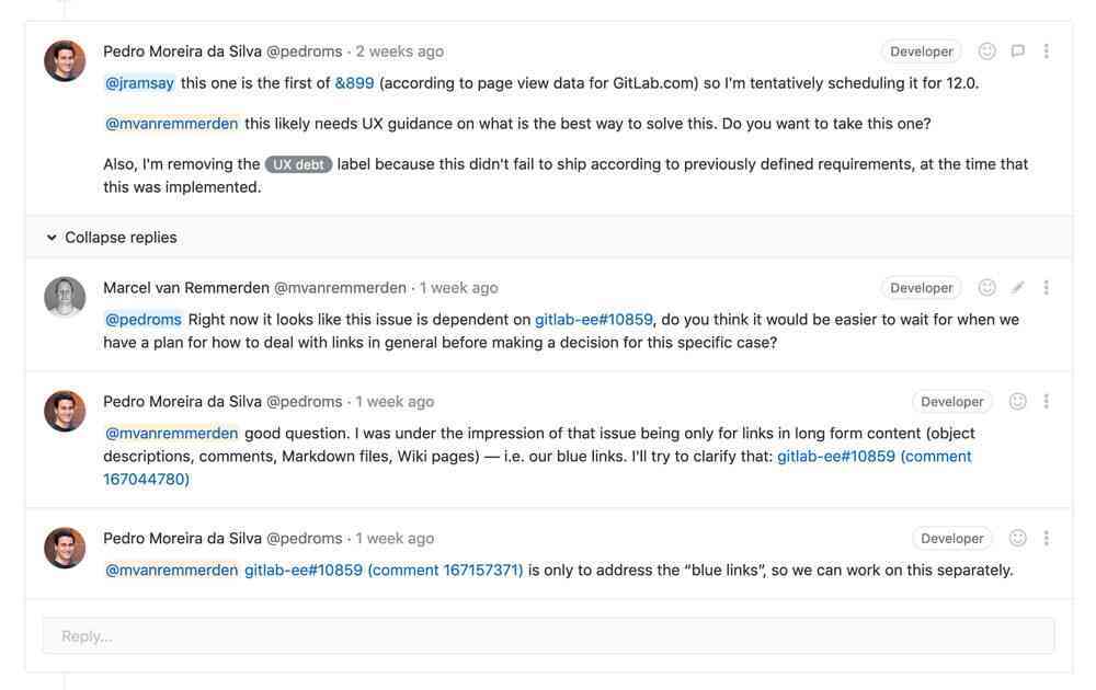
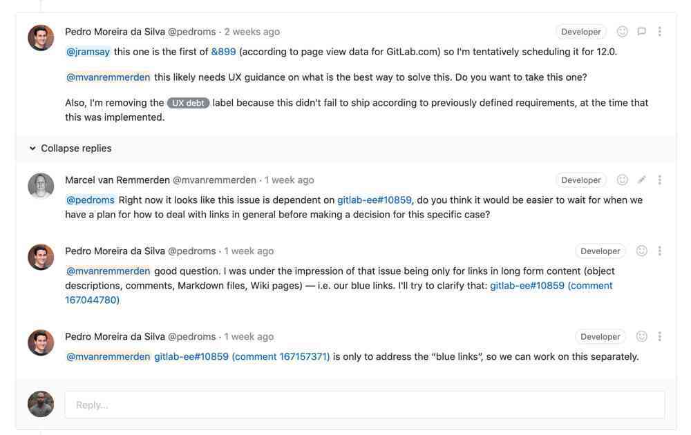
Our previous design for threaded discussions included a lot of boxes and borders, making it difficult to quickly scan the page to find related content. Marcel removed some of the visual cruft and used subtle background colors to help users distinguish between components more easily.
While we have other long-term changes we’d like to make to discussions, this was a great start.
 Before
 After
After
We're happy to see that members of the wider GitLab community noticed the effort on this change and responded positively.
Thanks @gitlab for quick/easy upgrade to GitLab 12.0, glad to see discussions UI design cleaned up https://t.co/Va28ssb20Y
— David Puplava (@DavidPuplava) June 24, 2019
Prioritized merge request “changes” in the content hierarchy
In a merge request, Changes is one of the most-clicked tabs. Unfortunately, at certain breakpoints, the tab was hidden, requiring users to scroll to see it (or sometimes they were even forced to resize their window).
Annabel fixed the tab component throughout the product, accounting for all breakpoints, whether or not one or both sidebars are open, and whether or not the tab bar includes buttons. This ensures that the resolved discussions component wraps to the next line on smaller screen sizes, leaving more room for Changes to always display correctly.
 Before
 After
After
Align merge request icons
As a final example, Jarek focused on correctly aligning the icons on the merge request page. It’s a subtle change that refines the visual design and makes the page easier to scan (scheduled for release in 12.1).
![]() Before
Before
![]() After
After
We’re excited to do more
This recent spike was a great start, but we’re all excited to make more improvements to GitLab's UI. We’re currently exploring how we could make the UI for our discussions easier to understand and the best ways to display threads. We’re also in the process of creating new default avatars.
If any of these topics interest you or if you have some feedback on our ideas, please chime in and let us know what you think of the UI as it evolves, we would love to hear from you!
Photo by Martin Reisch on Unsplash.


