Published on: September 1, 2020
4 min read
A tale of two file editors
How UX Research revealed unexpected patterns in how people use two GitLab file editors: the single-file editor and the Web IDE.

This blog post was originally published on the GitLab Unfiltered blog. It was reviewed and republished on 2020-11-13.
This study began the way many do – with a conundrum and a theory.
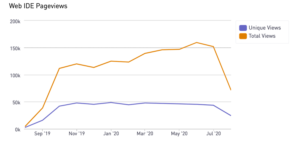
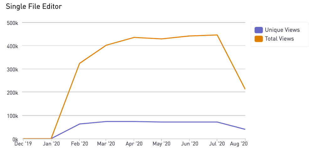
The Create: Editor group originally had the goal of deprecating the single-file editor in favor of the new and improved Web IDE. But after looking into usage data, we discovered that the single-file editor was being used at higher rates than the Web IDE, and in fact had quadruple the page views. This was a concerning discovery with the potential of becoming a real inflection point, raising questions like: Do we have a discoverability problem, or do we have a usability problem? Has our investment in the Web IDE been moving us in the wrong direction?


As you can see above, the single-file editor significantly outperforms the Web IDE in terms of page views. The single-file editor also receives more visitors who are coming to and from merge requests.
Our theory
We initially thought the single-file editor got more usage than the Web IDE due to discoverability problems. Since people should be able to accomplish everything they need within the Web IDE, maybe they just don’t know it exists. Or, maybe the “edit” button on the single-file editor seems like the obvious choice for what people want to do, whereas “Web IDE” sounds more complicated. There’s also always a nagging concern that people have tried the Web IDE and found it to be a bad experience, opting instead to stick with the alternative.
Our research plan
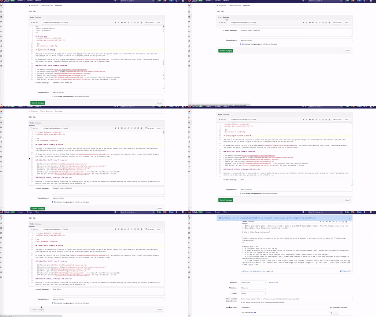
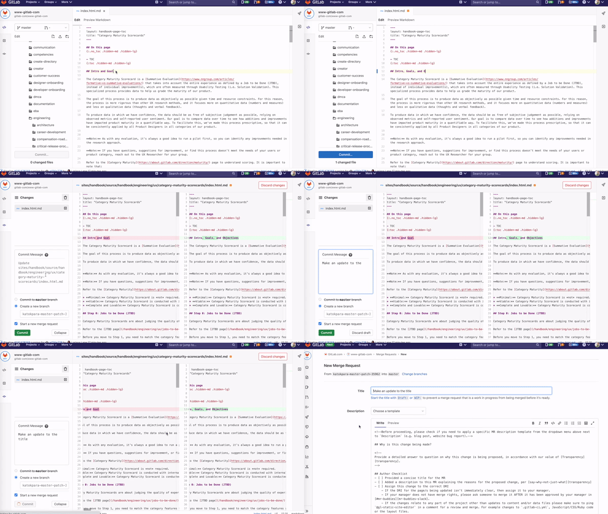
We developed a survey to hammer out whether people know how to edit a file in GitLab, why they choose the editor they do, and why, if ever, they choose the other one. For reference, here’s what they both look like:
Exhibit A: Single-file editor

Exhibit B: Web IDE

Results
After reviewing the survey results, we started seeing clear patterns that indicate people actually have distinct use cases for each editor. They’re not using the single-file editor because they can’t find the Web IDE; they’re purposefully selecting an editor based on the complexity of what they need to accomplish. People prefer the single-file editor when they need to make very simple changes to a single file. It’s aptly named in that sense! Alternatively, people choose the web IDE when they want to edit multiple files, or when they want to make changes that require context from other files. These changes might include hotfixes, creating templates, and making changes related to GitLab CI files.
We also learned that people want the ability to edit in context. Today, people choose an editing mode and then switch between screens to navigate to other project areas, which isn’t the best experience. What people really want is the ability to toggle editors and easily access navigation while in the Web IDE:
"Let me toggle between editors (e.g. if I start with Editor and realize I need to edit another file, I can switch to Web IDE – with any changes made carried over)."
What’s next
I love this study because it so clearly demonstrates the value of research. Had we gone ahead with our original theory, we would have been solving a perceived discoverability problem that people aren’t really having. Instead, we disproved our theory and have several proposed improvements already in the works. Instead of removing the single-file editor in favor of promoting the Web IDE, we’ll explore a simplified editing workflow that consolidates the Edit and Web IDE buttons so that a dropdown allows people to choose their preferred mode. You can see mockups for the next potential iterations below.
| Description | Mock |
|---|---|
| Web IDE option chosen (default) |  |
| Edit option chosen |  |
| Dropdown |  |
What do you think about the proposed change? Come talk to us on Twitter, and join our UX research program to participate in future studies.
Read more about UX at GitLab
- How holistic UX design increased GitLab.com free trial signups
- How we created a dark UI for GitLab's Web IDE
- Designing in an all-remote company
Katherine Okpara contributed to this post.
Cover image by Gastón Blaquier on Unsplash.

